Home Blog Design How to Make a Presentation Graph

How to Make a Presentation Graph

Visuals are a core element of effective communication, and regardless of the niche, graphs facilitate understanding data and trends. Data visualization techniques aim to make data engaging, easy to recall and contextualize while posing as a medium to simplify complex concepts .
In this article, we’ll guide you through the process of creating a presentation graph, briefly covering the types of graphs you can use in presentations, and how to customize them for maximum effectiveness. Additionally, you can find references on how to narrate your graphs while delivering a presentation.
Table of Contents
What is a Presentation Graph?
Types of graphs commonly used in presentations, how to select a presentation graph type, design principles for effective presentation graphs, working with presentation graph templates, integrating the graph into your presentation, common mistakes to avoid when making a presentation graph, final words.
A presentation graph is a visual representation of data, crafted in either 2D or 3D format, designed to illustrate relationships among two or more variables. Its primary purpose is to facilitate understanding of complex information, trends, and patterns, making it easier for an audience to grasp insights during a presentation.
By visually encoding data, presentation graphs help highlight correlations, distributions, and anomalies within the dataset, thereby supporting more informed decision-making and discussion.
Various types of graphs are commonly used in presentations. Each type serves specific purposes, allowing presenters to choose the most suitable format for conveying their data accurately. Here, we’ll discuss some common examples of presentation graphs.
Check our guide for more information about the differences between charts vs. graphs .
A bar chart is a visual tool that represents data using horizontal bars, where the length of each bar correlates with the data value it represents. This type of chart is used to compare discrete categories or groups, highlighting differences in quantities or frequencies across these categories.
For more information check our collection of bar chart PowerPoint templates .

Column Graphs
Column graphs are a variation of bar charts. They display data through vertical columns, allowing for comparing values across different categories or over time. Each column’s height indicates the data value, making it straightforward to observe differences and trends.

Line Graphs
Line graphs depict information as a series of data points connected by straight lines. They are primarily used to show trends over time or continuous data, with the x-axis typically representing time intervals and the y-axis representing the measured values. Line graphs highlight the rate of change between the data points, indicating trends and fluctuations.
For more information check our collection of line chart PowerPoint templates .

Circle Graphs
Circle graphs, commonly known as pie charts or donut charts, present the data distribution as fractions of an entity. They provide a quick understanding of the relative sizes of each component within a dataset. Pie charts are particularly effective when the goal is to highlight the contribution of each part to the whole data.
For more information check our collection of circle diagram templates .

Area Graphs
Area graphs are similar to line graphs, but the space below the line is filled in, emphasizing the volume beneath the curve. They represent cumulative totals over time through the use of sequential data points, making it easier to see total values and the relative significance of different parts of the data.
For more information check our collection of area chart PowerPoint templates .

Cone, Cylinder, and Pyramid Graphs
Three-dimensional graphs, such as cones, cylinders, and pyramids, create a dynamic visual impact on presentations. While not as common as the other types, they are used for their ability to add depth and dimension to data representation. These graphs create a visually engaging experience for the audience, although sometimes they sacrifice accuracy for the sake of visuals.
For more information check our collection of pyramid diagram PowerPoint templates .
As a presenter, you must be aware of both the topic’s requirements to discuss and your audience’s needs. Different graphs fulfill distinct purposes, and selecting the right one is critical for effective communication.
Line Graphs for Trends Over Time
A line graph is effective when you want to present trends or changes over a continuous period, like sales performance over months. Each point on the line represents a specific time, offering a clear visual representation of the data’s progression.
Bar Graphs for Comparing Quantities
If your goal is to compare quantities or values across different categories, such as sales figures for various products, a bar graph is suitable. The varying lengths of bars make it easy to compare the magnitudes of different categories.
Pie Charts for Showing Proportions
Use pie charts when you want to illustrate parts of a whole. For example, to represent the percentage distribution of expenses in a budget, a pie chart divides the total into segments, each corresponding to a category.
Follow these guidelines to create your presentation graph for the data you intend to represent.
How to Make a Presentation Graph in PowerPoint
Start by opening your presentation slide deck. For this tutorial’s purpose, we’ll work with a blank slide.

Switch to the Insert tab and click on Chart .

A new dialogue window will open, where you have to select the chart type and the specific representation type—i.e., for area charts, you can choose from 2D or 3D area charts and their distribution method.

If you hover over the selected chart, it will zoom in to check the details. Double-click to insert the chosen graph into the slide.

As we can see, a spreadsheet to edit the data is now available. If you accidentally close it, go to Chart Design > Edit Data.
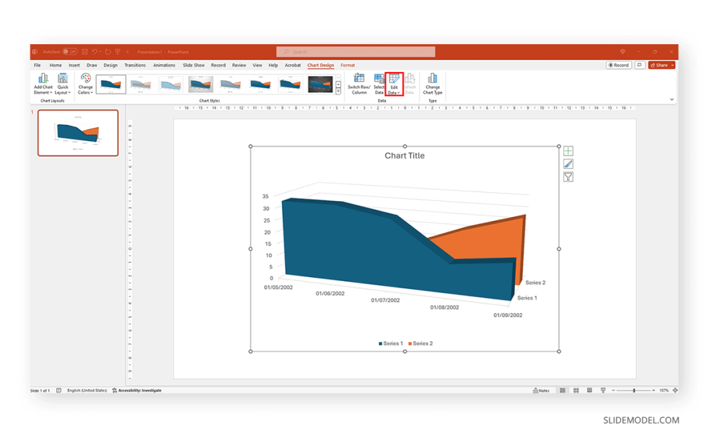
Replace the data in the numbers to reflect the data you need to showcase. The columns’ titles indicate the text the legend shows for each series. Then, we can close the spreadsheet and continue customizing it.

By clicking on the paintbrush, we access the Style options for the graph. We can change the background color, layout style, and more.

If we switch to the Color tab inside of Style , we can modify the color scheme for the presentation graph. And as simple as that is how to make a graph in PowerPoint.

How to Make a Presentation Graph in Google Slides
Now, let’s see how to create a graph in Google Slides. We start once again from a blank slide.

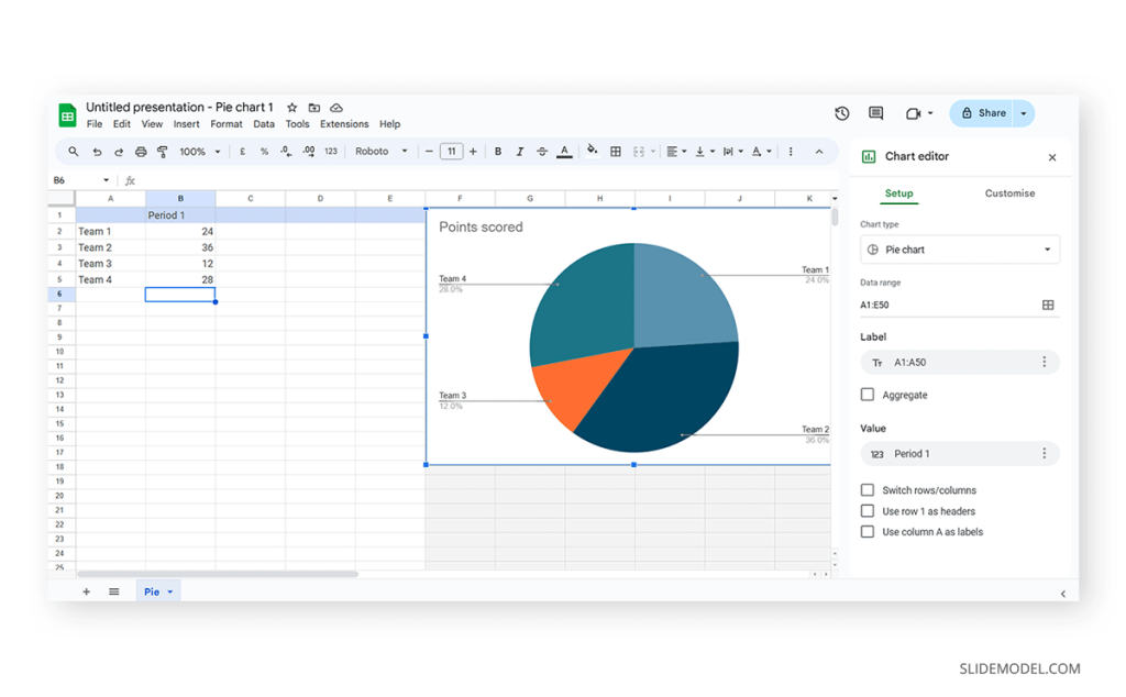
Go to Insert > Chart . Select your desired presentation graph option. In our case, we will work with a Pie Chart.

To change the placeholder data, click on Edit Data .

If you missed the emergent tab, you can go to the three points in the graph, click on them, and select Open Source .

The graph will most likely cover the data spreadsheet, so move it to one side to see the entire data range. In this case, the auto-generated graph is wrong as the sum gives 110%. We’ll correct that now.

And this is how it looks with the corrected data.

Next, we click on the three dots on the chart and select Edit the Chart . This shall open all customization options.

At the Setup tab, we can change the chart style and select from various options.
The data will refresh in that case and adapt its representation to the new style.

If we switch to the Customize tab (it says Customise, as the selected language is UK English), we can fine-tune our presentation graph starting from the background color.

Activate the 3D checkbox to change to a 3D pie chart (applicable to any graph).

We can find tailored settings for the Pie Chart to convert it to a donut chart, with settings like the donut hole size.

The Pie Slice section helps us change the color scheme for each one of the slices.

We can change the title and axis titles in the Chart and axis titles section.

Finally, the Legend section offers many customization options to alter the legend’s format.

Once the customization process is completed, close the Google Spreadsheets tab, go to your presentation chart, and click Update .

Google Slides will refresh the data for your created presentation graph with the last synced data.

Adhering to certain design principles is imperative for creating graphs and communicating information effectively.
Simplicity and Clarity
A graph should be clean and free from unnecessary details. Clear graphs have visible data points and helpful short texts for better understanding. Even if it looks simple, it can still show important information. To make it easy to understand, avoid adding distortions, shading, weird perspectives, too many colors, unnecessary decorations, or 3D effects [2]. It is also essential to ensure the plotted data points are clear, not hidden or covered.
Use of Color and Contrast
Thoughtful use of color and contrast enhances visual appeal and distinguishes different elements within the graph. Colors can effectively improve the chart presentation in three ways: highlighting specific data, grouping items, and encoding quantitative values. However, do not use fancy or varying colors in the background. We suggest resisting decorating graphs excessively, as it can hinder clear data presentation [4]. Only use different colors when they highlight important differences in the data.
Labeling and Legends
Accurate labeling is crucial to provide context and understanding. While designing graphs, we don’t expect the viewer to guess. Instead, we clearly label titles and axes. Clear labeling means displaying both axes on your graph, including measurement units if needed. Identify symbols and patterns in a legend or caption [3]. Legends explain symbols and patterns in a graph.
Scale and Proportion
For more clarity, we keep the measurement scales consistent and avoid distortions for accuracy. This ensures the exact difference between all the values. It will present data relationships and prevent misinterpretation due to skewed visual perceptions.
Tips for Customizing Graphs
PowerPoint provides various customization options—Right-click on elements like axes, data points, or legends to format them. You can also change colors, fonts, and styles to match your presentation’s look.
Coloring Your Data
When you want to make different parts of your chart stand out, click on a bar or line. Then, right-click and choose “Format Data Series.” Here, you can pick a color that helps each set of data pop. Do this for each part of your chart to make it visually appealing.
Changing the Chart Background
If you want to change the background color around your chart, right-click on the white space. Choose “Format Chart Area” and change the background color to something that complements your data.
Customizing Line Styles
Change the appearance of your lines for a unique look. Click on a line in your chart, right-click, and select “Format Data Series.” Experiment with different line styles, such as solid, dashed, or dotted.
Fine-tuning Axis Appearance
To make your chart axes look polished, right-click on the X or Y axis and choose “Format Axis.” Adjust properties like line color, tick marks, and label font to suit your design.
Perfecting Legends
Legends can be tweaked for a more integrated look. Right-click on the legend, select “Format Legend,” and adjust options like placement, font size, and background color to enhance the overall appearance.
Creating graphs in PowerPoint or Google Slides from scratch can be time-consuming, and ultimately, it won’t yield the same results as professional-made designs. We invite you to discover some cool designs for presentation graphs PPT templates made by SlideModel.
1. Dashboard Presentation Graph for PowerPoint & Google Slides

Don’t worry about how to make a graph in PowerPoint – let’s us bring the resources in the shape of a cool dashboard layout. Ideal for any kind of e-commerce business, you can track expenses or income, evaluate metrics, and much more.
Use This Template
2. Infographic Donut Chart Presentation Template

Explain concepts in different hierarchy levels, or processes that require a set of sequential steps by implementing this donut chart PPT template. Each segment has a bubble callout to expand further information for the areas required.
3. Presentation Graph Slide Deck PPT Template

All that’s required to create a data-driven presentation is here. Customize donut charts, funnels, histograms, point & figure charts, and more to create professionally-designed presentation slides.
4. PowerPoint Charts Slide Deck

If you’re looking for clean layouts for column graphs, area charts, line graphs and donut charts, this is the template you need in your toolbox. Perfect for marketing, financial and academic reports.
Consider its relevance to the content when incorporating your graph into the presentation. Insert the graph in a slide where it logically fits within the flow of information.
Positioning the Graph Appropriately in the Presentation
Deciding where to put your graph in the presentation is essential. You want it to be where everyone can see it easily and where it makes sense. Usually, you place the graph on a slide that talks about the data or topic related to the graph. This way, people can look at the graph simultaneously when you talk about it. Make sure it is not too small. If needed, you can make it bigger or smaller to fit nicely on the slide. The goal is to position the graph so that it helps your audience understand your information better.
Ensuring Consistency with the Overall Design of the Presentation
Align the graph with the overall design of your presentation to maintain a cohesive visual appeal. You can use consistent colors, fonts, and styles to integrate the graph seamlessly. The graph must complement the theme and tone of your slides. Therefore, you should avoid flashy or distracting elements that may deviate from the established design. The goal is to create a harmonious and professional presentation where the graph blends naturally without causing visual disruptions. However, we recommend you use bar chart templates already available for presentation.
Narrating Your Graph
When explaining your graph during the presentation, start by providing context. Clearly state what the graph illustrates and its significance to the audience. Use simple and direct language, avoiding unnecessary jargon. It is important to walk through the axes, data points, and any trends you want to highlight. Speaking moderately allows the audience to absorb the information without feeling rushed. You can take pause when needed to emphasize crucial points or transitions.
You can learn more about creative techniques to narrate your graph in our data storytelling guide.
Overloading with Information
One common mistake is presenting too much information on a single graph. Avoid filling the graph with excessive data points or unnecessary details.
Misleading Scales or Axes
Scale mistakes, such as uneven intervals or a bar chart with zero baselines, are common graphical mistakes [5]. Misleading scales can distort the interpretation of the graph and lead to incorrect conclusions. Scales should accurately present the data without exaggerating certain aspects.
Inappropriate Graph Types for the Data
Selecting an inappropriate graph type for your data is a mistake to avoid. Choose a graph type that effectively communicates the nature of your data. For instance, a pie chart for time-based trends might not be the most suitable choice. Match the graph type to the data characteristics to convey information accurately.
Working with presentation graphs may feel challenging for a beginner in presentation design software. Still, practice makes the master. Start by clearly stating your objectives in terms of data representation—this will make the presentation graph-type selection process much easier. Customize the graph by working with appropriate color combinations (you can learn more about this in our color theory guide), as this can also help highlight relevant data sections that may influence an informed decision.
Everything depends on your creative skills and how you want to showcase information. As a final piece of advice, we highly recommend working with one graph per slide, unless you opted for a dashboard layout. Ideally, graphs should be seen from a distance, and working with reduced sizes may hinder accurate data representation.
[1] https://uogqueensmcf.com/wp-content/uploads/2020/BA Modules/Medical Laboratory/Medical Laboratory Courses PPT/Year III Sem II/Biostatistics/lecture 1.pdf (Accessed: 06 March 2024).
[2] Five Principles of Good Graphs. https://scc.ms.unimelb.edu.au/resources/data-visualisation-and-exploration/data-visualisation
[3} Guide to fairly good graphs. Statistics LibreTexts. https://stats.libretexts.org/Bookshelves/Applied_Statistics/Biological_Statistics_(McDonald)/07%3A_Miscellany/7.02%3A_Guide_to_Fairly_Good_Graphs
[4] Practical rules for using color in charts. https://nbisweden.github.io/Rcourse/files/rules_for_using_color.pdf
[5] https://iase-web.org/islp/documents/Media/How%20To%20Avoid.pdf [6] Duquia, R.P. et al. (2014) Presenting data in tables and charts , Anais brasileiros de dermatologia . 10.1590/abd1806-4841.20143388

Like this article? Please share
Data Analysis, Data Science, Data Visualization, Presentation Approaches Filed under Design
Related Articles

Filed under Design • March 20th, 2024
Understanding Data Presentations (Guide + Examples)
Elevate the quality of your message by learning how to work in data presentations effectively. Insights, examples, and PPT templates here.

Filed under Presentation Ideas • February 29th, 2024
How to Make a Fundraising Presentation (with Thermometer Templates & Slides)
Meet a new framework to design fundraising presentations by harnessing the power of fundraising thermometer templates. Detailed guide with examples.

Filed under Presentation Ideas • February 15th, 2024
How to Create a 5 Minutes Presentation
Master the art of short-format speeches like the 5 minutes presentation with this article. Insights on content structure, audience engagement and more.
Leave a Reply
- Insert a picture in PowerPoint Article
- Edit pictures Article
- Add SmartArt to a slide Article
- Put a background picture on your slides Article
- Add a background picture to slides Article
- Use charts and graphs in your presentation Article
- Insert icons in PowerPoint Article

Use charts and graphs in your presentation
You can make a chart in PowerPoint or Excel. If you have lots of data to chart, create your chart in Excel , and then copy it into your presentation . This is also the best way if your data changes regularly and you want your chart to always reflect the latest numbers. In that case, when you copy and paste the chart, keep it linked to the original Excel file .
To create a simple chart from scratch in PowerPoint, click Insert > Chart and pick the chart you want.

Click Insert > Chart .

Click the chart type and then double-click the chart you want.

Tip: For help deciding which chart is best for your data, see Available chart types .
In the worksheet that appears, replace the placeholder data with your own information.

When you’ve finished, close the worksheet.
Create an org chart in PowerPoint
Create charts in Excel

Need more help?
Want more options.
Explore subscription benefits, browse training courses, learn how to secure your device, and more.

Microsoft 365 subscription benefits

Microsoft 365 training

Microsoft security

Accessibility center
Communities help you ask and answer questions, give feedback, and hear from experts with rich knowledge.

Ask the Microsoft Community

Microsoft Tech Community

Windows Insiders
Microsoft 365 Insiders
Was this information helpful?
Thank you for your feedback.
Charts & Diagrams
Transform complex data into clear visuals with our extensive collection of 1,279 Charts & Diagrams templates for PowerPoint and Google Slides. Choose from flowcharts, mind maps, data-driven graphs, organizational charts, and more to engage your audience and enhance your presentations.

6-Layer Pyramid Projection
Google Slides , PPTX

5-Layer Pyramid Projection

4-Layer Pyramid Projection

3-Layer Pyramid Projection

8-Blade Pinwheel Diagram

7-Blade Pinwheel Diagram

6-Blade Pinwheel Diagram

5-Blade Pinwheel Diagram

4-Blade Pinwheel Diagram

3-Blade Pinwheel Diagram

STP Marketing Model

RACE Marketing Model
Search templates by categories, search templates by colors.
Love our templates? Show your support with a coffee!
Thank you for fueling our creativity.
Text & Tables
Graphics & Metaphors
Timelines & Planning
Best-Ofs & Tips
Terms and Conditions
Privacy Statement
Cookie Policy
Digital Millennium Copyright Act (DMCA) Policy
© Copyright 2024 Ofeex | PRESENTATIONGO® is a registered trademark | All rights reserved.

To provide the best experiences, we and our partners use technologies like cookies to store and/or access device information. Consenting to these technologies will allow us and our partners to process personal data such as browsing behavior or unique IDs on this site and show (non-) personalized ads. Not consenting or withdrawing consent, may adversely affect certain features and functions.
Click below to consent to the above or make granular choices. Your choices will be applied to this site only. You can change your settings at any time, including withdrawing your consent, by using the toggles on the Cookie Policy, or by clicking on the manage consent button at the bottom of the screen.
Thank you for downloading this template!
Remember, you can use it for free but you have to attribute PresentationGO . For example, you can use the following text:
If you really like our free templates and want to thank/help us, you can:
Thank you for your support
How-To Geek
How to create a graph in google slides.
You can add more visuals than just images and videos to your slideshow.
Quick Links
Create a graph in google slides, edit the chart and data in google sheets, update the graph in google slides.
A chart or graph is a terrific way to show a snapshot of your data. So when you couple a chart with another visual tool like Google Slides , you can create the perfect presentation of data to your audience.
You can certainly make a graph in Google Sheets and then insert it into your Google Slides presentation . But you can also do the reverse and start the chart from Slides. Here's how to create a graph in Google Slides.
Visit Google Slides , sign in, and open your presentation. Go to the slide where you want to insert the chart . Because the graph will cover the entire slide by default, you may want to start with a blank slide. You can then resize and move the chart afterward as needed.
Open the Insert menu, move to Chart, and choose the type you want to use from the pop-out menu. You can use the most common kinds of graphs like bar, column, line, and pie.
You'll then see a default chart with sample data pop onto your slide. You'll also notice a brief message at the bottom letting you know that you can edit the chart in Google Sheets. Click the Edit in Sheets link in the message to go directly to the chart in Google Sheets.
If the message vanishes before you can click the link, don't worry. Select the chart and then click the arrow on the top right of it. Pick "Open Source" and Google Sheets will open in a new browser tab right to the chart and its data.
You can use the sample data for the graph if it fits your purpose. If not, simply use the cells above the chart in the Google Sheets to add your own data.
To adjust what displays on the chart, click the three dots on the top right of it and pick "Edit Chart." This opens the Chart Editor sidebar for you to adjust the axes, series, and other elements on the Setup tab.
To customize the appearance of the chart, select the Customize tab in the sidebar. You can expand the categories depending on your graph type to change things like the chart style, legend, and series.
When you finish setting up the data, adjusting the chart, and customizing the appearance in Google Sheets, return to the Google Slides tab in your browser.
Back to your slide, you'll see an Update button appear on the graph. Click this to apply the changes you made to the chart and data in Google Sheets.
Moving forward, you can update the chart data or the chart itself by opening the corresponding Google Sheet. Again, you can do this by clicking the arrow on the top right of the chart in Google Slides and picking "Open Source."
But you can also visit Google Sheets directly or Google Drive. The name of the spreadsheet will be the same name as your Slides presentation plus the chart type.
If you want to convert the graph to a static image, you can simply unlink it from the Google Sheets source. Click the arrow on the top right of the chart and pick "Unlink."
Just note that you cannot update the chart or its data using Google Sheets if you unlink it. It will appear as a static image on your slide .
Adding a chart to your Google Slides presentation might be just the visual you need to enhance the slideshow or show the exact data necessary.
For other types of visuals for your slideshow, take a look at how to add videos and customize the playback or how to draw on Google Slides .
Related: How to Add Videos and Customize Playback in Google Slides
Jazz Up Your Presentation: 6 Ways to Put an End to Ugly Charts and Graphs
Updated on: 22 December 2020

People often add charts and graphs to their presentation trying to make it more interesting. Unfortunately, most efforts to make it unique usually end up having the exact opposite effect.
Often, the enormous collection of slides with colorful presentation charts and graphs blows up your brain by the end of the presentation rather than arousing your interest in the data. You don’t want to be the person who puts his audience through this agonizing experience every time you fire up your laptop.
So, is there a way to jazz up your presentation with beautiful charts and graphs?
The short answer to this question is ‘Yes.’ Here are 6 ways to improve your presentation charts and graphs to effortlessly strengthen your message.
Refrain from Using Backgrounds
When it comes to decorating the graph background, you should avoid using gradients of color or varying the background color in any other way.
It not only undermines your ability to present the data unambiguously but also adds distraction. The context surrounding an object often influences our perception of it.

See the two graphs above, the grey background in the left graph doesn’t provide any information. On the contrary, it doesn’t contrast sufficiently with the object. As a result, it undermines the visibility of the objects in the graph. So, make sure the background is consistent with the slide background.
If you always use the default slide background, you should use ‘No Fill’ ‘or White’ background color as it matches the slide background.
Eliminate Redundant Labels
Why do you want to waste the space on redundant labels? Most graphs charts are quite self-explanatory. Repeated axis labels and legend are the two things that occupy the space for no reason.
In fact, they are taking up space that would be better spent on the graph. So, make sure to remove duplicate labels. The graph on the right looks better than the original graph to the left, as it is much easier to understand.

Alternatively, you can also label the bars directly. However, if you do, remove the Y-axis completely. As the exact value of each element is displayed, you don’t need to use the grid lines either.

Mind the Border Formatting
When it comes to graphs and charts, less is more. You should format the graph background to reduce the lines as far as possible while retaining the meaning of the data presented in it.
Though the default gridlines and borders are a sensible choice, they are a distraction as your audience is most likely not interested in knowing the exact figures for each data point.
If you want to display exact values, label the bars directly as discussed in the previous point. Removing the lines highlights the data and the pattern dramatically. So, remove all of the outer borders as well as grid lines as shown below.

Use Colors Meaningfully
Contrary to the popular belief, you should avoid using bright colors for presentation charts and graphs as far as possible. In fact, you should use natural colors to display general information and use the bright color only to highlight information that demands attention.
Using same colored bars on a graph makes it easier to compare the data. Use different colors only if they correspond to different elements in the data.
Sometimes, however, you can use different colors to highlight particular data or assemble different parts. In other words, you need to use colors meaningfully and with caution. The following examples will help explain the points mentioned above.
A) Using Natural Colors for Easier Comparison

B) Using Bright Colors to Pop Important Data

C) Using Different Colors to Point out Differences in Data Elements

Avoid Using Special Effects (Shadowing and Shading)
Avoid using special effects such as shadowing, shading, and 3D effects when creating presentation charts and graphs, especially for professional purposes. They just make it hard to compare the elements and confuse the reader.
You should, however, stick to presenting only essential information. So, keep it simple and avoid flashy special effects.

Text and Font
Using bold font isn’t going to make much difference in your graph. As far as possible, avoid using bold, underline or italic fonts. Keep the font size and type consistent throughout the presentation.
Avoid effects such as shading, outline, and 3D letters. Always lighten secondary data labels. The less you format the better.

Have More Tips for Creating Better Presentation Charts and Graphs?
When it comes to creating an attention-grabbing presentation , the rule of thumb is to display the data in a simple and clear way.
With the help of these 6 tried and tested tips, your presentation charts and graphs will look phenomenal without compromising your data. What about you? What tricks have you used to make your graphs look unique? Feel free to share your ideas and suggestions in the comments box below.
About the Author
Swati Kapoor is a qualified dietitian at Practo . She has a Masters degree in Dietetics and Food Service Management. She is a strong believer in spreading the goodness of ‘nutrition through healthy eating’. As a responsible dietitian, Swati examines her patients’ health history carefully before recommending any diet or workout regimen, because everybody has different requirements.
Join over thousands of organizations that use Creately to brainstorm, plan, analyze, and execute their projects successfully.

More Related Articles

Leave a comment Cancel reply
Please enter an answer in digits: 16 + twelve =
Download our all-new eBook for tips on 50 powerful Business Diagrams for Strategic Planning.

< Go back to Login
Forgot Password
Please enter your registered email ID. You will receive an email message with instructions on how to reset your password.

How to Make a Chart in Google Slides Presentations?
Charts and graphs are essential components of statistics. They are the most effective means of visually representing the slow deterioration of a state or its progressive advancement. For instance, Google Slides provides a great built-in function.
Google Slides has a built-in tool to create charts and graphs. Creating slides with graphs displaying information easily is necessary for data-driven presentations. Like other presentation tools, Google Slides lets you insert graphs and offers all the formatting options required to assist in visually communicating vital information. In this article, we will learn how to make a chart in Google Slides and edit it.
Types of Charts/Graphs in Google Slides Presentations
Different charts and graphs are available to suit different types of presentation requirements. Charts and graphs help you effectively showcase complex business information. Here are some different charts and graphs you can easily create in Google Slides.
Different types of Graphs are:
- Bar Graph: Ideal for comparing quantities across categories.
- Line Graph: Shows trends and patterns over a continuous interval of time.
- Bullet Graph: Demonstrates a goal’s progress, contrasts it with another metric, and offers context as a performance grade.
Different types of Charts are:
- Pie Chart : Displays the proportion of each category about the whole.
- Column Chart: Comparable to a bar chart, representing data as a vertical column.
- Line Chart: Depicts trends and changes over a continuous interval.
- Bar Chart : Compares individual values across categories.
- Area Chart: Emphasizes the cumulative total of data over time.
- Scatter Plot: Displays the relationship between two variables.
- Bubble Chart : Like a scatter plot but includes a third dimension with bubble size.
- Histogram : Represents the distribution of a dataset.
- Radar Chart: Displays multivariate data on a two-dimensional chart.
- Org Chart : Illustrates hierarchical relationships within an organization.
- Map Chart : Displays data on a geographical map.
- Gantt Chart : Illustrates project schedules with tasks and timelines.
You can choose any chart or graph that suits your presentation requirements. These charts and graphs are easily editable which helps in creating visually stunning presentations.
How to Create a Chart in Google Slides?
Follow the steps below to make a chart in Google Slides:
- Open Google Slides and select the slide on which the chart is to be inserted.
- Go to the “Insert” option and select “Chart”. You can choose from several alternatives in the drop-down menu, including column, line, pie, and bar. Select the option that best meets your needs.
- Your slide will now include the chart as a picture. When you select “Edit” a pop-up window will appear in the lower left corner.
- Choose “Open source” by clicking the “Link” options drop-down menu. There will be a new Google Sheets document.
- The designs and data are modifiable. Then, to implement the modifications, return to Google Slides and select the “Update” button.
- You can also copy and paste the chart into your presentation using the Ctrl/Cmd + C keyboard shortcut.
- By using the “Link to Spreadsheet” option that shows up after pasting, you may link the chart to the original spreadsheet.
TIP: You can include a chart from an already-existing Google Sheets document.
How to Create a Chart in Google Slides
How to Edit a Graph in Google Slides?
You’ll likely want to use Google Slides to make more edits to your chart, such as changing the colors or format. Choose the chart and then click “Format Options” in the upper toolbar to accomplish this. Here is how to edit a graph in Google Slides:
- Choose the chart in your Google Slides presentation that you wish to edit.
- Any chart created with Google Slides will be displayed as an image.
- To make changes in the chart, click “Link” > select “Open Source”. It will open in a Google Sheets document. Make changes to the default-generated data.
- Go to the three vertical dots and click on “Edit Chart”. Select your desired element and change the chart or backdrop colors.
- From the “Setup” tab you can choose the data range, alter the chart type, add features, and decide whether or not to utilize the first row as headers. You may change how the data is shown in the chart by clicking the “Stacking” drop-down arrow.
- You can change various parameters on the “Customize” tab of the Chart editor panel.
- You can enter the title text and choose the font, size, format, and color under the Chart & axis titles submenu. Only the titles will be affected; the “Chart style” submenu’s options will be overridden.
- You can modify the font, change the background color, and alter the chart border color (or leave it uncolored) in the “Chart Style” submenu. Other options include maximizing the chart, turning it into three dimensions, and activating the “Compare” mode.
- You can adjust the icon’s format and position under the “Icon” submenu.
- When working with a bar chart, you can change the period colors by selecting the “Series” submenu. There are further settings to enable the error bars and data labels.
- Click the “Update” button in the upper right corner of your Google Slides presentation to make the changes effective. Using Ctrl/Cmd + C, you may copy the chart from Google Sheets and put it into your presentation.
TIP: If you are utilizing a bar or line chart, the submenus for the horizontal and vertical axes will also be accessible. These let you change the chart’s axes and the label format. Specifying the number and color in any chart is also possible. You can enable the grid lines in the Gridlines submenu. With all these options, you can easily edit chart in Google Slides.
How to Edit a Graph in Google Slides
Here is a summary of all the edits that you can perform:
- Size and Rotation: By choosing the width, height, width scale, and height scale, this menu allows you to change the chart’s size and rotation. Additionally, you may use drag and drop to rotate and change the size of the chart.
- Position : By choosing a position from the provided drop-down menu, you can align your chart to the top left or center.
- Recolor : Choosing a color scheme from the provided menu allows you to recolor the chart, as the name implies.
- Modifications: This option allows you to change the chart’s brightness, contrast, and transparency.
- Drop Shadow : You can apply a drop shadow to the chart using this menu. The shadow’s transparency, angle, blur radius, and distance can change.
- Reflection : By choosing this menu, you can style the chart by adding a reflection. This menu allows you to alter transparency, distance, and size.
Effective data transmission in Google Slides presentations greatly depends on thoughtful application of graphs and charts. These graphic components provide the content with more depth and clarity, whether you are comparing trends, demonstrating relationships, or exhibiting proportions.
With SlideUpLift’s pre-made chart Google Slides templates , maximizing the potential of dynamic data visualization in your Google Slides presentations is a breeze. You can view various pre-made presentation templates carefully created to incorporate expertly created charts. It’s easy to download and include these templates in your Google Slides presentation. Explore Now!
What is the first step for creating a chart in Google Slides?
The first step is opening Google Slides, selecting a slide, and going to the “Insert” menu to choose “Chart.”
What is the final step for creating a chart in Google Slides?
To create a chart in Google Slides, the final step is clicking “Insert” after adding your data and customizing the chart to add it to your slide.
How to make a pie chart in Google Slides?
To create a pie chart in Google Slides, go to the “Insert” menu > select “Chart” > choose “Pie chart” > input your data, and customize as needed.
How to make a line graph in Google Slides?
To create a line graph in Google Slides, go to “Insert” > select “Line chart” > input your data in the linked spreadsheet, and customize as needed.
How to make a bar graph in Google Slides?
To create a bar graph in Google Slides, go to “Insert” > select “Bar chart” > input your data in the linked spreadsheet, and customize as needed.
How to make a hierarchy chart in Google Slides?
To create a hierarchy chart by using Shapes or SmartArt in Google Slides, go to “Insert” > add text > arrange elements hierarchically.
Table Of Content
Related presentations.

Project Team Organization Chart Google Slides Template

Animated Procurement Flow Chart Google Slides Template

Web Analytics Dashboard Google Slides Template
Related posts from the same category.

29 Dec, 2023 | SlideUpLift
How to Make Checkboxes in Google Slides?
Google Slides is one of the most widely used presentation tools today. It is used for creating simple text and picture presentations and complex presentations. You can create surveys and

25 Aug, 2023 | SlideUpLift
How to Insert Clock/Timer in Google Slides Presentations?
Ever wondered how to insert a clock into Google Slides? Adding a clock can give you an understanding of how much time to spend on each portion during your presentation.

27 Mar, 2024 | SlideUpLift
How to Create An Org Chart in Google Slides Presentation?
An org chart represents a company’s hierarchical structure and shows the relationships between different positions and departments within an organization. Org charts can be helpful when introducing your team, discussing

18 Nov, 2023 | SlideUpLift
How to Select Multiple Slides in Google Slides Presentations?
The feature to select multiple slides in Google Slides is a game-changer for anyone looking to boost efficiency in presentation creation. It enables you to make bulk edits, apply consistent

23 Sep, 2022 | SlideUpLift
How To Add Drop Shadows In Google Slides
Google Slides provide effects like drop shadows, which is an effective feature for presentation design. They can assist in making a flat image, text, or object more interesting by making

12 Sep, 2022 | SlideUpLift
How To Make Google Slides Vertical
While building/presenting a presentation on Google Slides, presenters often have this question- How to change Google slides to portrait? This query not only includes the standard 4:3 slide design, but

1 Dec, 2022 | SlideUpLift
How to Add a Border in Google Slides
Google Slides is an incredible presentation tool that enables you to craft proficient, eye-catching business presentations. This tool offers users a variety of ways to enhance their presentations, including the

21 Oct, 2021 | SlideUpLift
How To Insert PDF Into Google Slides Presentations?
PDFs are versatile containers of content, often used for detailed documents, reports, or complex visuals. By inserting PDF into Google Slides, you can provide a cohesive presentation to your audience

27 Dec, 2023 | SlideUpLift
How To Insert A Calendar In Google Slides?
Google Slides, a powerful cloud-based presentation tool, offers a variety of features to enhance your slideshows and engage your audience. One such feature that can significantly improve your presentation is

24 Jan, 2024 | SlideUpLift
How To Insert A Fraction in Google Slides?
Google Slides is not just a versatile tool for conveying ideas and strategies but also numbers and complex data. Some numbers and data are part of advanced equations, including fractions.
Related Tags And Categories
Forgot Password?
Privacy Overview
Necessary cookies are absolutely essential for the website to function properly. This category only includes cookies that ensures basic functionalities and security features of the website. These cookies do not store any personal information
Any cookies that may not be particularly necessary for the website to function and is used specifically to collect user personal data via ads, other embedded contents are termed as non-necessary cookies. It is mandatory to procure user consent prior to running these cookies on your website.
20+ Best PowerPoint Templates for Charts + Graphs 2024
One of the best ways to add more credibility to your presentations and build trust in your audience is to use numbers and statistics in your slideshows.
When you add charts, graphs, and diagrams to your presentations it not only helps reinforce your claims but also shows the level of your knowledge in the industry. Simply put, it shows your audience that you know what you’re talking about.
As designers, we always encourage adding more charts and infographics to your presentations. There’s no need to design them yourself. We’ve got templates for that.
In this collection, we have lots of different types of PowerPoint templates with charts and graphs. There are templates with org charts, gantt charts, flow charts, and so much more.
These charts are easily customizable so you can add your own numbers and data in to the charts with just a few clicks. Take a look and start downloading.
2 Million+ PowerPoint Templates, Themes, Graphics + More
Download thousands of PowerPoint templates, and many other design elements, with a monthly Envato Elements membership. It starts at $16 per month, and gives you unlimited access to a growing library of over 2,000,000 presentation templates, fonts, photos, graphics, and more.

Modern PPT Templates
New & innovative.

Maximus Template

Business PPT Templates
Corporate & pro.

Mystify Presentation

Pitch PowerPoint
Explore PowerPoint Templates
Chart – Dashboard PowerPoint Chart Templates

When presenting data, the designs you use is very important. Because when you go that extra mile to design beautiful charts and diagrams, it’s much easier to attract attention. This PowerPoint template is made with that goal in mind. It comes with lots of beautifully designed charts in light and dark slide designs. There are 35 unique slides in the template.
Timeline, Maps & PowerPoint Chart Templates

Maps and timelines are great for showcasing demographics and product roadmaps. This PowerPoint charts template comes with plenty of those slides for you to choose from. It includes 25 different slides with modern timelines, maps, and chart designs. Each slide can be easily customized to your preference as well.
Bar Charts & Infographic PowerPoint Template

Looking for slides with bar chart infographics to show off the progress you’ve made? Then be sure to download this PowerPoint template. It gives you 40 different slides with various styles of bar chart infographics to choose from. Each slide comes in dark and light color themes as well as more than 90 custom color options.
Organizational Hierarchy Org Chart PowerPoint Template

Org charts are used by big companies to streamline and organize the company structure of its employees and their roles. This PowerPoint template comes with lots of beautiful slides you can use to design better-looking org charts for your company. There are 50 unique slides in 10 different color themes in this template, making it a total of 500 slides.
Animated Flow Charts PowerPoint Template

With 20 different styles of flow charts to choose from, this PowerPoint template is a must-have for making professional-looking business and marketing charts. Each slide in the template is also available in 50 color variations. You can easily edit the charts and customize them to your preference.
Free Doodle Flowcharts PowerPoint Template

This is a fun and free PowerPoint template featuring flowcharts made in doodle-style designs. It’s perfect for presenting data with a casual and friendly manner. The template includes 30 unique slides.
Free Process Diagrams PowerPoint Templates

With this free PowerPoint template, you can create beautiful diagrams to streamline the process behind your projects. It also includes 30 different slides with lots of creative diagram layouts.
Pie Chart PowerPoint Templates

Designing pie charts is always fun as it gives you the opportunity to get creative with the chart design. This PowerPoint template is a good example that shows how creative you can get with pie charts. It includes 40 different styles of pie chart designs with colorful and cool-looking layouts. They are available in light and dark color themes as well.
Office & Custom Charts PowerPoint Template

With this PowerPoint template, you can go into office meetings always prepared. It gives you a collection of 20 different charts to present data and statistics like a pro. Each slide can be customized with more than 90 color variations. The charts are also easily editable as well.
Org Charts PowerPoint Templates

Another PowerPoint template full of org charts for you to showcase your company hierarchy. This template features beautiful org charts with modern and minimal designs. There are 32 different chart slides included in the template with easily editable objects, shapes, and graphics.
Gantt Chart PowerPoint Templates

A must-have chart in project management presentations, Gantt charts are one of the more difficult chart types to design. This PowerPoint template will make the process easier for you. It includes 30 unique Gantt chart slides and you can choose from 10 different color variations as well.
Company Hierarchy PowerPoint Org Charts

You can use this PowerPoint template to design more modern-looking org charts for your presentations and various other projects. It comes with 30 unique slide layouts featuring org charts in 5 different color schemes. No animations are included but you can add them yourself if you want.
Free Venn Diagrams PowerPoint Template

If you’re a fan of Venn diagrams, this free PowerPoint template is a must-have for you. It features 30 different slides with stylish Venn diagrams for you to use in various presentations.
Free Linear Flowchart Infographics for PowerPoint

Another free PowerPoint charts template featuring a collection of flowchart designs. These flowcharts have beautiful linear style designs that will make your presentations look even more attractive.
Hexagonal, Line & Flow Chart PowerPoint Template

This PowerPoint template includes some of the most creative chart slides we’ve seen. It has multiple styles of chart designs including hexagonal, line, and flow charts for you to present data in various ways. There are 20 unique slides in the template with 90 color variations to choose from.
Chart Data Infographic PowerPoint Template

With this PowerPoint template, you’ll get a mix of several different types of charts for your marketing and research presentations. There are pie charts, bar charts, timelines, and many other types of chart slides in this template. It has 30 unique slide layouts with fully customizable designs.
Modern Flowchart PowerPoint Templates

A huge collection of chart slides for PowerPoint. This template features more than 60 different slides with various styles of flowchart designs. Each slide also comes in 25 color schemes as well as light and dark themes. You can edit each slide with just a few clicks to add your own data as well.
Excel Charts Animated PowerPoint Template

This PowerPoint template also features a collection of beautifully animated chart slides. There are several different types of chart designs in this template, including bar charts, pie charts, and infographics. The 18 slides in the template also come in light and dark color themes.
Smart PowerPoint Charts Templates

There are 20 unique chart designs in this PowerPoint template for showcasing your statistics and data in a professional way. It features hand-crafted infographics and chart designs that have colorful and fully customizable layouts. The slides are available in 10 different color schemes as well.
Free Org Charts PowerPoint Templates

You can download this PowerPoint template for free to get a collection of high-quality org chart designs. It has 30 different org chart slides with colorful and fully customizable layouts.
Free Pie Chart Infographics for PowerPoint

This PPT is also free to download. It comes with lots of different pie chart designs for showing off your stats and numbers in style. There are 31 unique slides in this template. And it’s available in Google Slides format as well.
Chart Analysis PowerPoint Charts Template

Whether you’re working on a presentation for a startup or a marketing project, this PowerPoint template will help you add more convincing chart slides with modern designs. It lets you choose from over 60 slides, featuring 30 light and 30 dark designs. Each slide comes with a unique chart analysis design.
Graphs and Charts for PowerPoint

This PowerPoint template includes 30 unique charts and graphs with clean and minimal designs. They are perfect for presenting data in business, corporate, and marketing meetings. Charts are fully customizable to your preference.
If you’re looking for infographic templates, be sure to check out our best infographic PowerPoint templates collection.
Researched by Consultants from Top-Tier Management Companies

Powerpoint Templates
Icon Bundle
Kpi Dashboard
Professional
Business Plans
Swot Analysis
Gantt Chart
Business Proposal
Marketing Plan
Project Management
Business Case
Business Model
Cyber Security
Business PPT
Digital Marketing
Digital Transformation
Human Resources
Product Management
Artificial Intelligence
Company Profile
Acknowledgement PPT
PPT Presentation
Reports Brochures
One Page Pitch
Interview PPT
All Categories
15 Interesting Ways to Use Graphs in a Presentation [Templates Included]
![15 Interesting Ways to Use Graphs in a Presentation [Templates Included]](https://www.slideteam.net/wp/wp-content/uploads/2020/10/size1001-436-10-1001x436.jpg "slide presentation graph")
Remember childhood days, when most of us hated mathematics like anything on this planet? The Pythagoras theorem, never-ending formulas of trigonometry, knot theory, and some other backbreaking algorithms. Oh! What a roller-coaster ride the mathematical equations and terms have given us! Even though attending the mathematics class was a real traumatic experience, we can’t ignore the most interesting yet important chapter- graphs . Yes, the x-axis and y-axis! Graphs are visually effective tools for displaying the relationship between numerous data points. They make complex problems much simpler and easy to understand.
From childhood to us being professionals, graphs have been of great help. In this fast-paced world, there’s not enough time for entrepreneurs to give an in-depth explanation of their financial situation or structure to the spectators. Remembering a bulk of monetary statuses and telling respective authorities about it is not at all easy. That is the reason why professionals take the help of presentations, which consists of in-built graphs and charts. To be more precise, entrepreneurs love to incorporate charts and graphs in their presentations as they are the easiest and the most flexible to showcase facts or figures. Undeniably, graphs bring out the clarity in every information that a presenter needs to convey to his audience. Therefore, using graphs in business presentations is effective. Also, there are multiple ways a graph can be used in a presentation. Here, in this blog, we will talk about 15 vivid portrayals of charts and graphs along with a few added tips. The ways are demonstrated via our professionally designed templates.
So, without any further ado, let’s see what our 15 interactive graph templates have to offer you!
15 Graph Templates To Download and Use
The template that has a dark color in the background is always a game-stealer. Just take a look at this attractive graph template with so many colors in it. The slide is pre-designed to tailor all your needs. You only have to edit the content. That’s it! Download this template in a single click and see how your viewers get attracted to your proposed information.

Download Combo Chart Growth Rate Finance PPT PowerPoint Presentation
This template will fulfill all your business requirements. This engaging slide is a combination of both a pie chart and a graph. In this template, you can see the graph overlapping with a pie-chart which is the best option for you to display your financial summary. The color scheme that our experts have applied in this template is so appealing. Grab this slide and start filling in your information.

Download Business Women With Column Pie Chart PowerPoint Graph
As you can see in the template given below, the colors used in the slide soothes the eyes, which is a plus point. Readers often get attracted to the presentation that has pleasing backgrounds and lucrative images. With the help of this graph template, you can show the growth of your business over the past years.

Download Business Person With Column Chart PowerPoint Graph
Take advantage of this eye-catching column chart or graph template that allows you to monitor your business statistics appropriately. This slide is attainable in excel sheets as well, which gives you the benefit of editing your data quickly. The cookie point you will receive after utilizing this template is that it comes up with ample space where you can place your companies’ logo for making the presentation more recognizable.

Download Box Plots Business Column Chart PowerPoint Graph
This visually-attractive triangular chart or graph template helps you in jotting down your revenue status so far. The psychology of colors used in this slide is really aesthetic. You can add or delete the content as per your needs.

Download Triangular Chart For Data Driven Result Display PowerPoint Slides
The slide shown below is so colorful that it holds your audience's attention at once. You can customize the template and highlight the data that you want to share with your audience.
Download Pie Chart With Line Graph Icon
This triangular-shaped bar graph template will help you in displaying your data effectively. Also, the shape and colors this slide has will impress the viewers in one-go. The graph template allows you to segregate your data and present your information precisely.

Download Data Driven Triangular Bar Graph PowerPoint Slides
You already have an idea of how line charts work. Using this line chart template, you can easily compare the data values over specific time intervals. The color contrast will make the comparison of your quantitative data even more visible.

Download Line Chart For Data Analysis PowerPoint Graph
This graph template comes in soothing colors and hues that will make your data more interesting than ever. The slider bar chart template helps you in showcasing your data analytics proficiently. The slide consists of amazing fonts and styles that will add more creativity to your presentation.

Download Slider Bar Chart With Target PowerPoint Graph
Template 10
This beautifully designed butterfly graph template is here to categorize your different data. With this, you can monitor the changes occurring in each business category over the two consecutive years. And also, which section needs to be focused more. You can color the graph of yearly categories as per your choice.

Download Butterfly Bar Chart For Business Performance PowerPoint Graph
Template 11
The green tone used in this bar graph template can win your audience’s attention effortlessly. You can put this template in your presentation, and without adding many effects, you are good to present the business dynamics before the viewers.

Download Column Chart With Growth Line PowerPoint Graph
Template 12
This pastel-colored conical graph with black color in the background makes your presentation a winner. You can easily seek your audiences’ attention by visualizing every bit of data systematically.

Download Data Driven 3D Chart Shows Interrelated Sets Of Data PowerPoint Slides
Template 13
This unique patterned graph will make your complex data look simpler. Our eye-catching graph template will make your presentation extra stylish yet professional. Grab this template to input your data effectively.

Download Unique Pattern Sales Data Driven Chart PowerPoint Slides
Template 14
This amazing template that contains bar graphs and pie-chart will enable you to display your business matrix in a simpler form. The graphics present in this template do not pixelate and thus, aids you in creating the best presentation of your life.

Download Project Progress With Column And Pie Chart PowerPoint Graph
Template 15
The image shown in the template below visualizes the bar graphs along with the bulbs on top. Here, you can see the bulbs are of the same color except for the one. The highlighted bulb depicts leadership qualities. You can use this template in your presentation to portray the leadership and reputation your company has achieved over the years.

Download Light Bulb On Bar Graph With Leader On Top
The blog is not over yet! Along with the graph templates, here are some cookie points for you that will make your presentation game stronger. Learn more about how to add creativity in your graphs with the help of a few key-pointers explained below!
- Start from selecting a graph design
Firstly, segregate your data. When you create a presentation, go to the insert option and choose a graph according to your needs. The charts or graphs are of different types. Some of them are pie-chart, histogram, bar graph, waterfall, combo graph. So, select from any of these (or others) and put it on a presentation.
- Format the data
You can easily edit your proposed data and update it, later it can automatically be shown in your chart as well. Keep the data or facts intact. Do not clutter everything on a graph.
- Fill in some vibrant colors
To compare the data, make sure each section has different yet soothing colors in it. It will help the audience to understand the information better, and also you will be able to share your message across conveniently.
- Animation is the key
Instead of showing graph-sections all at once, use the animation option that highlights each section after a pause. This way will grab viewers' attention instantly. Also, animated effects will emphasize the information you want to convey to the spectators.
- Drawing tools are must
By using drawing tools and different shapes & arrows, you can emphasize the particular graph-section which you think needs to be focused.
Make a smart move in your business, create an interactive presentation, show your data & analytics through our graph templates to impress the viewers instantly. And yes, do not miss out on reading the ways explained in the blog which will definitely help in making your presentation stand out!
Related posts:
- Drive Customer Satisfaction With Our Top 20 Total Quality Management(TQM) Templates for PowerPoint!!
- Top 10 Free Business Plan Google Slides Templates!!
- Improve Your Organization’s Viability With Our Top 20 Business Model Canvas Templates in PowerPoint PPT!!
- Top 25 One Page Resume Templates To Win Over The Hiring Manager!!
Liked this blog? Please recommend us

[Updated 2023] 30 Best Gantt Chart PowerPoint Templates For an Effective Visualization of Your Project

Top 30 Excel Linked Data-Driven PowerPoint Slides and Templates

Top 10 Scorecards and Dashboards Google Slides Templates To Measure A Company's Overall Efficiency

Top 10 Metrics, Key Performance Indicators, and Dashboards Google Slides Templates For Business
![[Updated 2023] 25 Ways to Show Statistics in a Presentation [PowerPoint Templates Included]](https://www.slideteam.net/wp/wp-content/uploads/2020/09/size1001-436-9-335x146.jpg "slide presentation graph")
[Updated 2023] 25 Ways to Show Statistics in a Presentation [PowerPoint Templates Included]

Top 10 One Page Data and Statistics Templates To Make Your Business Decisions More Prominent

How To Create A Best-In-Class Competitor Analysis Report - 20 Best Examples Included
This form is protected by reCAPTCHA - the Google Privacy Policy and Terms of Service apply.

Digital revolution powerpoint presentation slides

Sales funnel results presentation layouts
3d men joinning circular jigsaw puzzles ppt graphics icons

Business Strategic Planning Template For Organizations Powerpoint Presentation Slides

Future plan powerpoint template slide

Project Management Team Powerpoint Presentation Slides

Brand marketing powerpoint presentation slides

Launching a new service powerpoint presentation with slides go to market

Agenda powerpoint slide show

Four key metrics donut chart with percentage

Engineering and technology ppt inspiration example introduction continuous process improvement

Meet our team representing in circular format

Got any suggestions?
We want to hear from you! Send us a message and help improve Slidesgo
Top searches
Trending searches

teacher appreciation
11 templates

memorial day
12 templates

13 templates

rain forest
23 templates

amusement park
5 templates
Line Chart Infographics
Free google slides theme, powerpoint template, and canva presentation template.
Slidesgo is back with a template full of line charts, one of the most common (and useful!) types of graphs. The designs play around with the representation of data, usually numeric, by the use of lines. Do you want a flat-styled one? We have it. Maybe one that looks 3D? We have it. Just download them and choose the one you prefer!
Features of these infographics
- 100% editable and easy to modify
- 30 different infographics to boost your presentations
- Include icons and Flaticon’s extension for further customization
- Designed to be used in Google Slides, Canva, and Microsoft PowerPoint and Keynote
- 16:9 widescreen format suitable for all types of screens
- Include information about how to edit and customize your infographics
How can I use the infographics?
Am I free to use the templates?
How to attribute the infographics?
Attribution required If you are a free user, you must attribute Slidesgo by keeping the slide where the credits appear. How to attribute?
Related posts on our blog.

How to Add, Duplicate, Move, Delete or Hide Slides in Google Slides

How to Change Layouts in PowerPoint

How to Change the Slide Size in Google Slides
Related presentations.

Premium template
Unlock this template and gain unlimited access

IMAGES
VIDEO
COMMENTS
Auto-generated Google Slides presentation graph. If you missed the emergent tab, you can go to the three points in the graph, click on them, and select Open Source. Option for editing the chart data. The graph will most likely cover the data spreadsheet, so move it to one side to see the entire data range. In this case, the auto-generated graph ...
To create a simple chart from scratch in PowerPoint, click Insert > Chart and pick the chart you want. Click Insert > Chart. Click the chart type and then double-click the chart you want. Tip: For help deciding which chart is best for your data, see Available chart types. In the worksheet that appears, replace the placeholder data with your own ...
Free PowerPoint charts, graphs, and tables templates. In this article, we have explored the benefits of incorporating visuals like charts, graphs, and presentation tables in PowerPoint. We also know how to add them and ensure they look good. Just remember to pick the right chart and keep your presentations consistent.
Discover an extensive range of ready-to-use charts and diagrams for PowerPoint and Google. Our vast library features over 1,207 free, editable, and easy-to-customize designs to elevate your visual data representation and engage your audience. Charts and diagrams can be used to enhance any presentation, whether it's for a business meeting, a ...
Visit Google Slides, sign in, and open your presentation. Go to the slide where you want to insert the chart. Because the graph will cover the entire slide by default, you may want to start with a blank slide. You can then resize and move the chart afterward as needed. Open the Insert menu, move to Chart, and choose the type you want to use ...
If you're interested in adding other charts to your Google Slides presentation, keep reading. 2. How to Quickly Create a Bar Graph With a Google Slides Template. Next, we'll look at how to quickly create a bar graph using a template in Google Slides. Below is what the graph looks like without any changes. You'll find the bar graph template on ...
Select the slide where you want to insert a chart. Click Insert → Chart. You'll see different options: bar, column, line and pie. There's also an option to add a chart from an already existing Google Sheets document. Select the one that best fits your data. Inserting a chart in Google Slides.
Text and Font. Using bold font isn't going to make much difference in your graph. As far as possible, avoid using bold, underline or italic fonts. Keep the font size and type consistent throughout the presentation. Avoid effects such as shading, outline, and 3D letters. Always lighten secondary data labels.
Excel document. Right-click the chart that you want to use and select Copy. You can also select it and press Ctrl/Cmd + C. Return to PowerPoint, select the slide where you want to paste the chart into and press Ctrl/Cmd + V.
Click on the Chart icon to launch the Insert Chart menu. The Insert Chart menu will open with a variety of chart templates. On the left side, you'll see a variety of PowerPoint chart types, such as Column, Line, Pie, Bar and more. Start by clicking on a chart type on the left side.
Top 25 PowerPoint PPT Chart & Graph Templates From Envato Elements For 2024. Envato Elements is the best place to find premium PowerPoint chart templates. Take a look at some of the best PPT chart templates. These are all included with a subscription to Elements: 1. Annual Startup Infographic - PowerPoint Template.
Title - The title of the graph should focus on the interpretation of the data, not the data itself. Remember that we are using a graph to help make a point, and the title will be a key factor in the audience interpreting the graph properly. For example, instead of a title like "Sales 1996-2001", you could say "Sales Up 42% '96-'01".
Download the "Bar Graph Infographics" template for PowerPoint or Google Slides and discover the power of infographics. An infographic resource gives you the ability to showcase your content in a more visual way, which will make it easier for your audience to understand your topic. Slidesgo infographics like this set...
Choose the chart and then click "Format Options" in the upper toolbar to accomplish this. Here is how to edit a graph in Google Slides: Choose the chart in your Google Slides presentation that you wish to edit. Any chart created with Google Slides will be displayed as an image. To make changes in the chart, click "Link" > select "Open ...
For a themed slideshow presentation on charts, you can insert elements like colorful bar graphs, line charts, pie charts, and data visualizations to make it more relevant. Additionally, you can include icons representing different data categories, a timeline to showcase trends, and a comparison table to highlight key statistics.
Gantt Chart PowerPoint Templates. A must-have chart in project management presentations, Gantt charts are one of the more difficult chart types to design. This PowerPoint template will make the process easier for you. It includes 30 unique Gantt chart slides and you can choose from 10 different color variations as well.
Therefore, using graphs in business presentations is effective. Also, there are multiple ways a graph can be used in a presentation. Here, in this blog, we will talk about 15 vivid portrayals of charts and graphs along with a few added tips. ... Download Data Driven Triangular Bar Graph PowerPoint Slides . Template 8 . You already have an idea ...
We have 30 different data diagrams for you. We have created a lot of different designs using different hues of blue: line, bars, pyramid or pie charts, together with different sorts of icons related to business, health or education, although you can edit and change them. No matter which type of chart you need, you'll find the perfect one here.
Presenting charts and graphs in a digestible and easy-to-understand way can also pose a challenge. Now, coming up with fun presentations is easy with Canva's visual chart presentation templates. These professionally-designed slides are ready for use, whether you're reporting to the board or in class.
Download the Bar Graph Infographics template for PowerPoint or Google Slides and discover the power of infographics. An infographic resource gives you the ability to showcase your content in a more visual way, which will make it easier for your audience to understand your topic.
Free Google Slides theme, PowerPoint template, and Canva presentation template. Slidesgo is back with a template full of line charts, one of the most common (and useful!) types of graphs. The designs play around with the representation of data, usually numeric, by the use of lines. Do you want a flat-styled one? We have it. Maybe one that looks 3D?