
Live vs. loan is a mobile app that explores how gamifying loan debt management can motivate users and encourage learning around finances. This case study was an independent capstone project in my Designlab UX Academy curriculum in March, 2017.

Introduction
This project was identified based on my own personal experience with managing and tracking student loan debt, and is a nationally pervasive problem:
- 44 million Americans have student loan debt
- 70% of students graduate with student loans
- National debt totals to $1.3 trillion; for borrowers between the ages of 20 and 30, the average monthly student loan payment is $351
- Student loan debt impacts a person’s long term financial plans, the pursual of personal interests, their family planning goals, and other major personal and professional life decisions and purchases
I began exploring opportunities to design a product that could potentially alleviate frustrations and reduce loan amount or shorten payoff timelines for borrowers, grounded in the following hypothesis:
If Americans with student loan debt are more informed about their financial options and more motivated to proactively manage their debt, then they will be empowered to lessen or pay off debt more quickly leading to faster financial freedom.

Final solution allows users to manage all of their loans on a unified dashboard and interact with loan repayment on a gamified interface.
Project ManageR
Project brief / timeline Research plan UX strategy blueprint
User Research
Literature review Competitive analysis In-person interviews Usability testing
UX Strategy
Personas IA / Application map Sketching Wireframes Prototyping & iteration
PRODUCT DESIGN
Feature analysis Design from inception to final interface Branding UI and IxD
Discovery: UX research
Research goals:.
- Understand current financial planning applications and competing systems
- Identify specific frustrations of people managing student loan debt
- Explore what features or services a debt-management app could provide that would improve user’s lives
- Better understand user motivations for using a student loan debt management app (what motivates users to download and use, and keeps them checking it consistently?)

Quotes from user interviews
I can’t do anything crazy [in life], I don’t have that freedom. Like if I wanted to try and start a business, I don’t feel compelled to go for it if I have this loan.
I wish they offered personal guidance... someone to say, “Did you know there were these other options you could be doing?,” or “You’re on the right track.”
[Lessening my debt] was a sloooww drip...Now that I’m really getting down, I’m REALLY motivated. I want this done and over with.
It went from a value that seemed out of reach, like 70K, or even 100K...and when it hit 50K, when it got down there, it felt like I could actually pay this off. When I threw that one chunk of money at it, and so much went away, it felt so great.
Key research takeaways
Interviews • competitive analysis • lit review.
- Millions of borrowers aren’t fully aware of critical information about loan repayment options
- Even after years of loan payments, users often feel like no progress is made, which can be unmotivating and demoralizing
- Design challenge: how can we motivate users by adding an element of fun into an otherwise unpleasant responsibility?
Identified Opportunities:
- Unified dashboard of usable and useful loan info
- Easy to find and understand information about repayment options
- Incentivize paying off loans
- Break total debt into smaller, more manageable goals, so users get the feeling of, “I’m definitely making progress”
- Provide rewards that impact users immediately

Personas and User Flows

Application map

Usability testing
In order to validate my design ideas, I created a wireframed protoype in InVision. I specifically wanted to test my assumptions about the onboarding process and loan sync user flow.
Some of the primary takeaways from testing were the successful completion of all tasks including the loan syncing feature, and small adjustments to visual elements, which informed my next wireframe iterations. I also decided that further testing was needed on the “Friends” feature to determine if this social accountability element were appropriate and/or motivating in the context of loan debt management.

Interaction and interface design
Gamified interface.
The decision to gamify the LVL App became pretty clear after feedback from user’s showed there was a significant lack in motivation to proactively payoff and learn more about student loan debt management options. Feelings of frustration, embarrassment, shame, guilt, and apathy surrounding student loan debt pointed to a unique opportunity to reframe the debt problem and created a challenge of designing an app that was not only useful but engaging and fun.
Gamified elements within the app design include:
- Indications of incremental progress, making total loan repayment feel more manageable/rewarding
- The ability to complete sub-challenges (outside of paying monthly bills) creates a structure of both long and short term aims, or main quests and side quests, to keep user’s more engaged
- Badges and points provide rewards for effort, both within the app and in the external world
Interaction Design
- Rapid, frequent, and clear feedback, such as the constant display and movement on user’s progress bar
- Game-like elements of uncertainty are incorporated, such as bonus challenges and surprises within the app
- The ability to connect with friends expands the goals and motivation of users to their social circles--whether for accountability purposes or for those motivated by friendly competition

UI kit and branding
After a brainstorm regarding my vision for the LVL brand, I arrived at some key words: RELIABLE, TRUSTED, SAFE, CHEEKY, FUN Grounded by these brand assets, I created a mood board, sketched logo designs, and created a visual style guide.

Style Guide
The visual style of the product aims to make managing student loan debt less “crippling” (a word used by a real user) and significantly more pleasant:
- Color palette is bright, vibrant, and juicy
- Color illustrations bring the visual parts of otherwise mundane financial goals to life
- Custom icons were designed that are both universally recognizable and also unique to the gamified-theme and LVL brand

Final designs

In addition to this project being a great learning experience, I also had a lot of fun with the topic, considering it started from my own personal frustrations with student loan debt. As mentioned previously, one challenge I had early in the process was developing a clear focus around what the problem was that I was attempting to solve. Had I started my research before clearly outlining the problem space and setting clear research goals, I could have been finding solutions to the wrong problem. In the end, it was clear that the problem was more than simply paying off loan bills, but a deeper connection to motivation (or lack thereof), despite loan bills being highly connected to users accomplishing other life goals. This focus informed my research goals and interview questions, which impacted the rest of my project priorities and product features. In hindsight it was also clear how important communication was as I regularly engaged in constant loops of design, feedback, and iteration. Check-ins with my mentor and group critique sessions helped me take a step back, hear from diverse perspectives, and improve on my designs.
- Brand Development
- Case Studies
- Digital Marketing
- Graphic Design
- Search Engine Optimization
- Social Media
- Web Development
Case study: streamlining loan applications with software ux overhaul

A client since 2016, Baker Hill has worked with TBH Creative on everything from website design to a complete company rebranding initiative. That’s why, when it was time to design a new, cutting-edge user interface and a better online form experience for their original online lending application, the team at Baker Hill was confident TBH Creative would deliver something both they—and their clients—would love, and that would:
- Streamline the customization process (It took Baker Hill’s team, who developed the original application, a significant amount of time to modify the base product for each client’s specific usage needs)
- Look modern and improve the outdated web form user experience (The previous application did not have a defined strategic UX. When clients asked the Baker Hill development team for UX advice, they weren’t able to confidently respond to those questions. With the new system, the Baker Hill team can now offer rationale for understanding how things are set up and what the best practices are)
- Refine content labeling and organization (The original application lacked easy-to-follow and helpful messages to guide users throughout the online loan application process)
The solution—
Looking for help to rework the app in order to better serve their clients and grow the lending software side of their business, Baker Hill hired TBH Creative to do work to fix the tool’s user experience and user interface problems, which included:
- Updating the application to be highly adaptable and easy to install
- Identifying what was needed to solve software UX issues and making those fixes
- Writing new concise, conversational, helpful text throughout
- Improving the basic user flow with navigation bar refinements, sequence adjustments, and content reorganization
- Creating a percentage complete indicator
- Designing a light and clean user interface based on a rationale, unified logic to achieve a cohesive customer experience
- Developing the front-end code and styles then executing the new markup around the original application to ensure a seamless hand-off to Baker Hill’s back-end developers
Launch date: Spring 2018
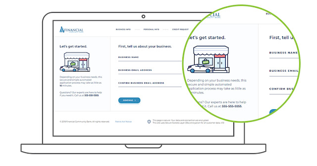
TBH Creative chatted via email about the project with Deidra Colvin, Baker Hill’s chief marketing officer; Rusty Garner, Baker Hill’s lead developer; and TBH Creative project lead Tatum Hindman. Their responses—below—have been condensed and edited.
What made this project unique?
Tatum Hindman: Baker Hill’s in-house developers created the original application, and we collaborated with their team—working around existing application code cautiously and maintaining the underlying logic and database—to completely overhaul the front-end, making practical improvements in the app’s design and messaging.
What worked well in this project?
Tatum Hindman: Baker Hill gave us complete creative control to make strategic design and organization recommendations to improve the web form user experience. The resulting solution is radically different from the starting point. The improvements we made strengthen Baker Hill’s small bank software solution offerings, and indirectly enhances their strategic partnerships. Deidra Colvin: We were very pleased with TBH Creative’s work and have gotten good feedback from clients on how much better it looks and on the user experience.
“We have had lots of demos, and people are really liking the new look and feel that TBH Creative designed.”
What did TBH do to meet the goals of this software ux redesign?
Tatum Hindman: We focused on the application’s end-user—small business owners applying for loans—and their needs: What do business owners need? What information do they have? What would make the loan application process less painful for them? Based on our research of similar applications, we mapped out a new process flow to significantly enhance the software UX while still giving banks the information they need to process the loan applications. When we delivered the product back to Baker Hill, it only needed a few final tweaks after their first review, and the finished application required very minimal time to implement on the client side.
What’s next?
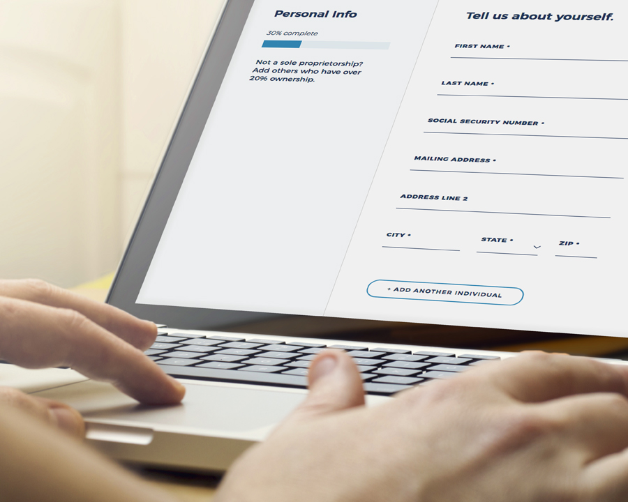
Rusty Garner: We have had lots of demos, and people are really liking the new look and feel that TBH Creative designed. Tatum Hindman: We equipped Baker Hill with a fully-functional demonstration package to use in their sales meetings. The demo allows them to show prospective customers the application and how the solution could look when customized around their needs. We are excited for phase two of this UI/UX project, which is slated to include adding a portal product for loan applicants to use to log in and see the status of their loan in real-time. Along with this improvement, we will integrate a username/password system to make it easy for applicants to come back later.
You might also like:
- Improving web forms: 6 tips for getting results
- 6 tips for writing better website copy

About the author | TBH Creative
TBH Creative is an award-winning marketing company specializing in web design/development, digital strategy, inbound marketing, and reporting. Since 2004, we’ve built multi-dimensional digital marketing campaigns and complex, enterprise-level websites for clients in a wide range of industries.
We believe in communicating clearly, delivering excellence, and beating deadlines. But beyond those ideals, what really drives the heart of our business is your business—helping our clients achieve more with comprehensive digital marketing and web design.
Our Indianapolis web design company is WBE-certified in the state of Indiana and the city of Indianapolis, and we’re also a Hubspot-certified inbound marketing agency.
View more posts by TBH Creative
Mastering Fintech UX: A Design Case Study
New fintech apps are changing how we see our investment goals and interact with financial institutions. This article reviews best practices for building trust without sacrificing fun or usability.

By Tejas Bhatt
Tejas designs impactful digital products and works with major Indian startups, including the world’s largest bank and credit card company.
PREVIOUSLY AT
Financial tools aren’t the most exciting products to use—they can feel cold, boring, and corporate. As complex tools with tons of functionality and customization, most provide insufficient training and education—and don’t even get me started on documentation.
While regulatory obligations often require that financial apps behave in a certain way, there are opportunities to make the experience fun and hassle-free for users while still keeping it professional and easy to use. With the appropriate context, financial apps can offer a pleasant and interesting user experience instead of following the drab status quo model.
With Fisdom —an investment app designed to make investing easy for people without an education in the Indian stock exchange, the client has three main goals:
- Resolve the high dropout rate that occurred before users started making investments.
- Research ways to improve the investment registration process (more on this later).
- Make the app more visually appealing—Fisdom is intended for anyone interested in investing, not just for commercial use.
Fisdom operates differently than most investment apps or services. Typically people invest in stocks, bonds, or a multitude of other things based on…well, anything! Sometimes it’s because they like the company, sometimes because they think it’ll do well, or perhaps because a financial expert recommended it.
In this app, the process is reversed. Users set an investment goal—an amount they want to accrue over a selected period of time. From there, the app suggests various options (using historical data and machine learning) and users can invest towards that goal with monthly deposits.
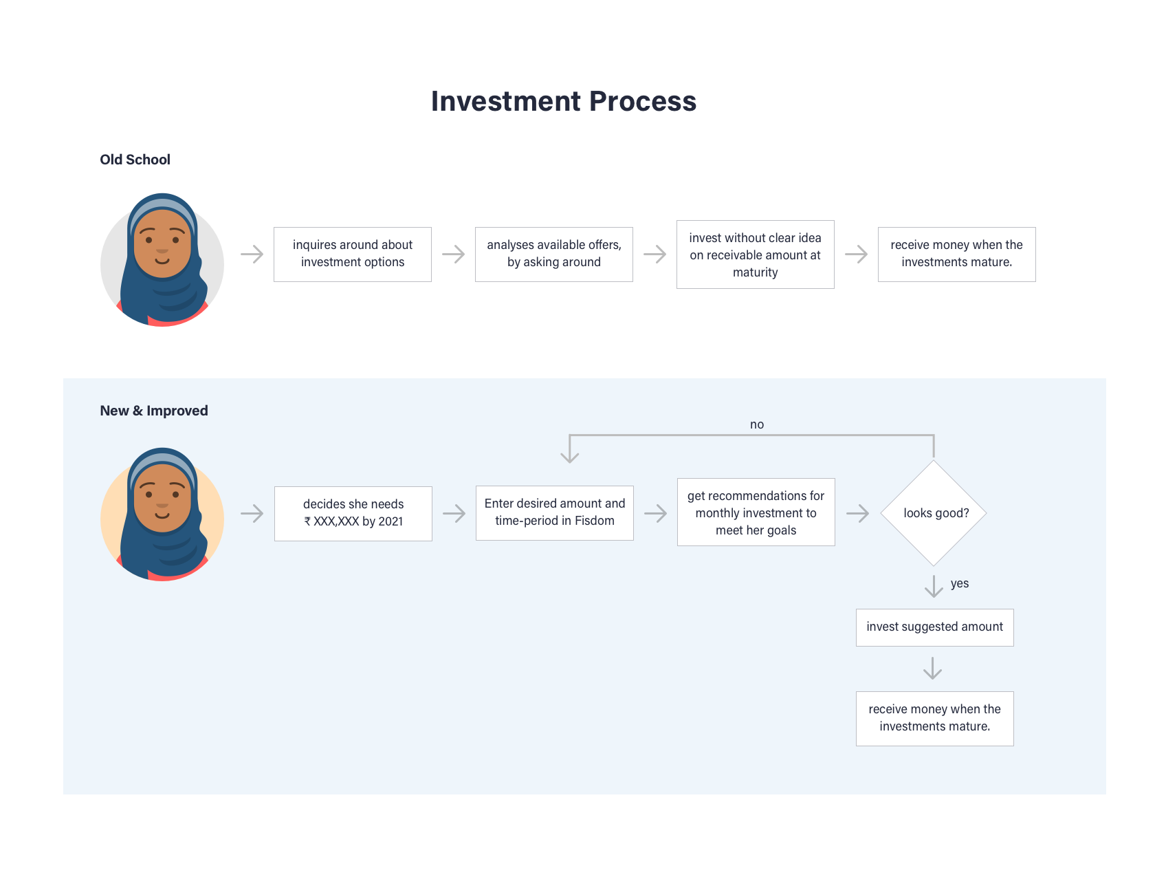
This investing method removes the complexity of choosing individual investments (though users can still invest in whatever they’d like), which makes it critical that the app builds trust with the user every step of the way. A simple misunderstanding of even basic features could theoretically lose users a lot of money!
Yet because of the wealth of alternatives, the initiative to make the app fun and engaging had to be taken into consideration throughout the entire process. This sharpened our focus on building trust through visual appeal and ease-of-use.

Show Them the Money
The investment process in India requires that investors complete a one-time K now Y our C ustomer (KYC) form. The form is five pages and requires a lot of information.
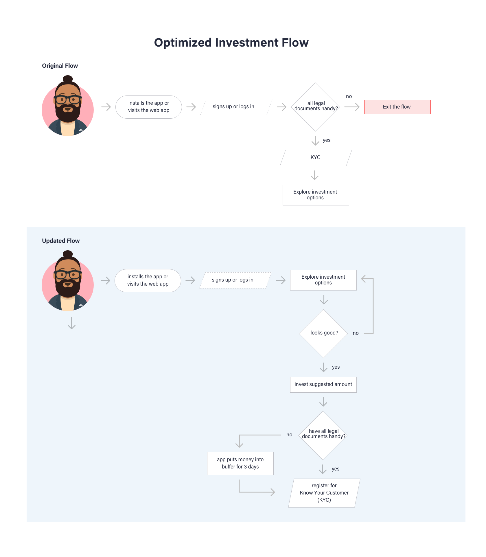
Originally, the KYC was a prerequisite for users to make an investment, but in our usability testing , we found a significant dropout rate during the process. It was obvious that the KYC was too cumbersome, and the process of completing the form needed an overhaul.
So we moved the requirement for KYC registration to the end of the process.
While regulatory requirements state all investors must complete the KYC, users needed time to build trust with the app first. To establish that trust, we turned the process inside-out: Allow users to try the app, make their investment decisions, and when ready to invest, complete the KYC form. In this way, users were given the opportunity to build rapport with the app.
We even went one step further and gave three days for users to complete the KYC after making their investment decision. Their money, safe in escrow, would be refunded if the form wasn’t submitted.
Design for Data Entry
This still left a significant challenge: Actually filling out the KYC is a ridiculous process. It’s five pages of a lot of personal information, all of which needs to be typed on the phone!
During the research phase, we found that there were a few government-approved APIs that scan for and provide essential personal information. Much of this data worked perfectly for the KYC, so users could save significant time by either scanning their tax permanent account number (PAN) card or by entering the PAN manually (all Indian citizens have a PAN).
This cut the time to enter required data into the KYC by half…at a minimum! Users who already completed the KYC were automatically 95% complete and only needed to confirm their information and provide a digital signature.
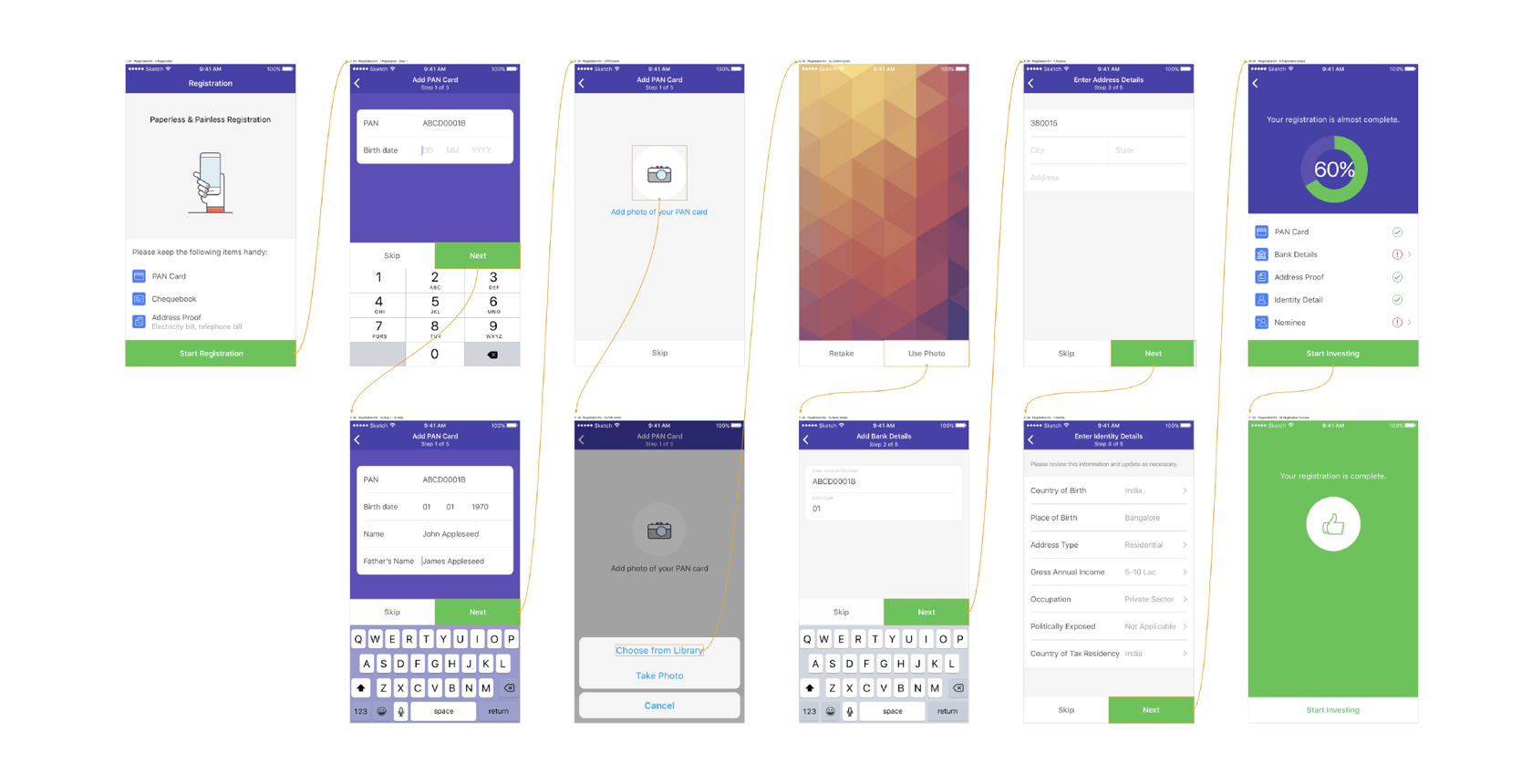
Users who didn’t complete the KYC still had to provide their essential information, so it was important to make input easy and fast. This included simple usability tricks like showing the number pad keyboard for number-only entry fields, using the camera to scan documents or cards where available, etc.
Fintech Apps Don’t Have to Be Boring
During the competitive analysis of other apps in the fintech space , it was clear most of them had bland color palettes and uninviting experiences.
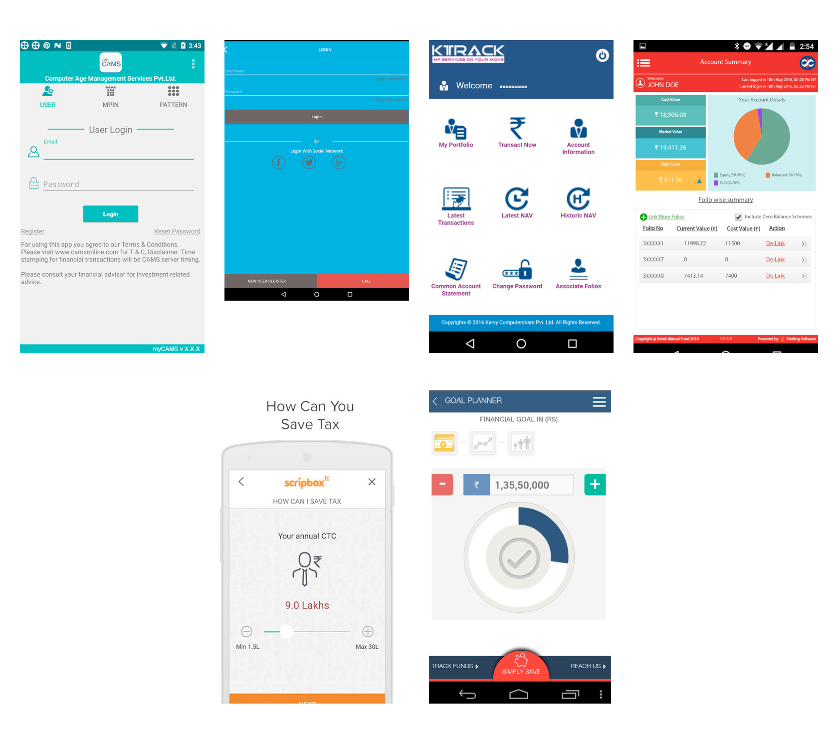
When learning anything new, being bombarded with information can be overwhelming, which makes most users leave before they begin. Minimalism in design is not about flat color palettes and non-skeuomorphic buttons—although often that helps—it’s about how information is structured and the cognitive load required to use the given features.
Investing is hard enough, so we made a conscious effort to keep things simple, both for process and interaction. Subsequently, the visual design turned out wildly different compared to other fintech tools.
“Investing” in the Visuals
We did so by creating a palette that sported bright hues to support the light and playful concept of the application.
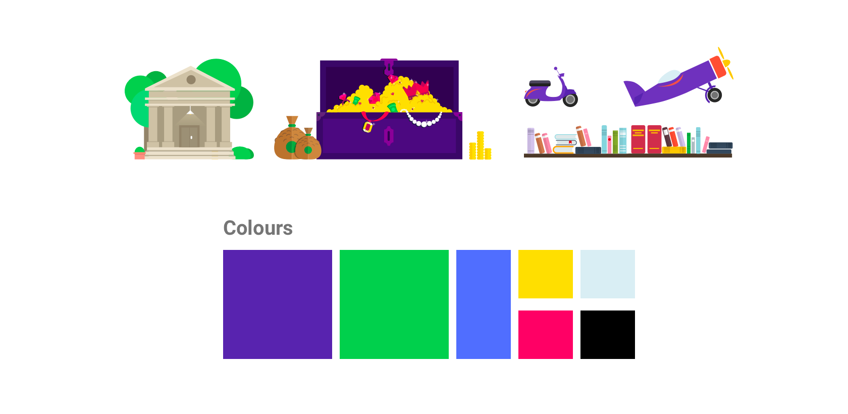
Vivid graphics and illustrations enhance the experience, which is important in order to make a dry subject like investing more exciting. This is especially challenging for an investing app, not only because the content needs to be open and easy to understand, but also engaging to promote usage.
From the get-go, it was important to set a playful tone—colorful sign-up screens convey a distinct personality and small transition animations help increase engagement. This level of customer experience was uncommon for the client, so we delivered detailed animations as specs to the development team so they could better understand our design strategy and how they should implement our designs.
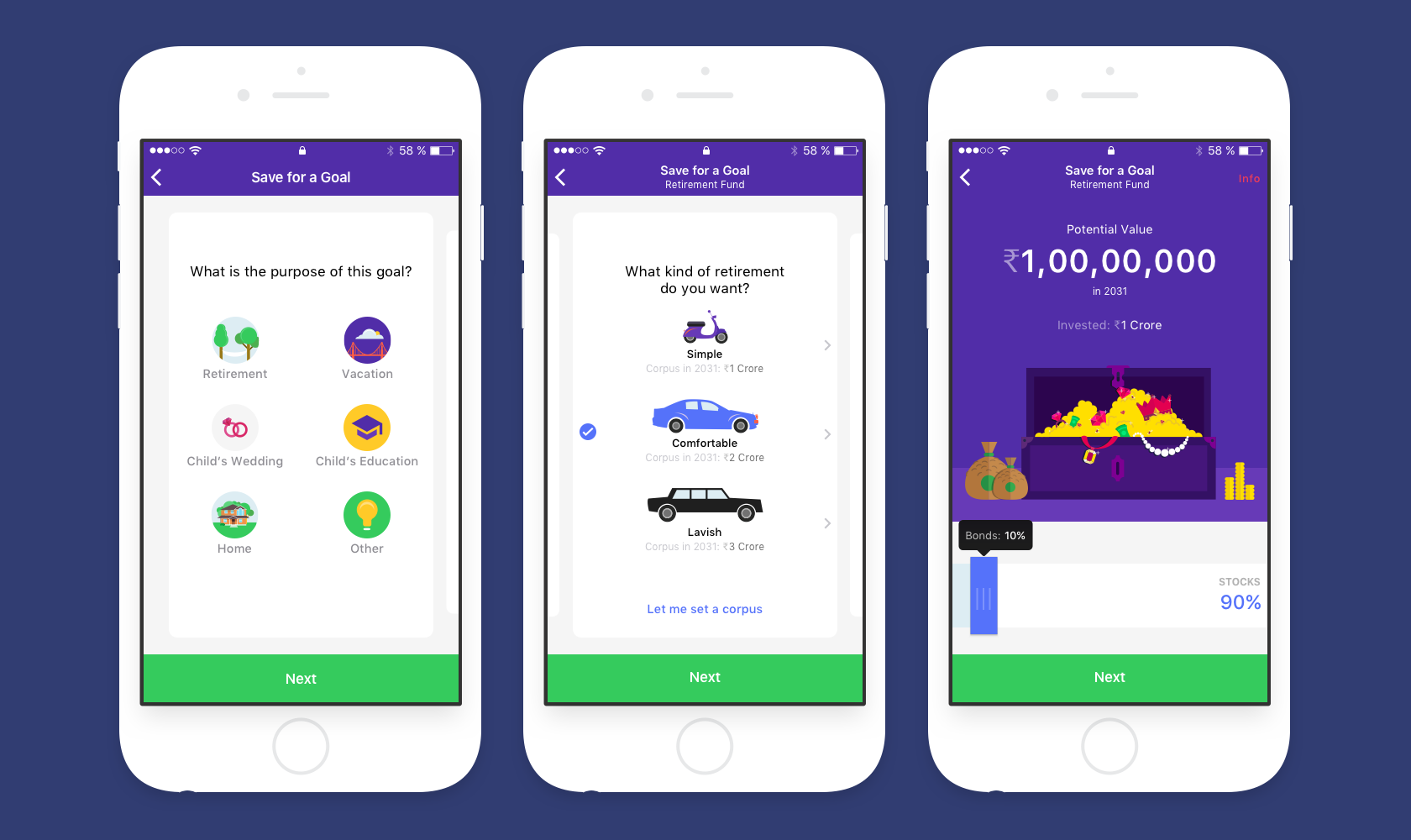
Investing long-term is daunting, and few of us know exactly where we want to be financially (aside from “I want to be rich”). To help simplify the process, we added visual associations to all financial goals. This made the choice easier to understand.
As a side benefit, visualizations also provide a way for users to learn about those options and make better-informed decisions for investing their money.
Respect Your User’s Level of Expertise
One overarching goal was to provide any user—regardless of experience—all of the information necessary to make wise investment decisions. The client’s concern was that a significant percentage of users would use Fisdom to make their first-ever investment, so it was critical to educate first-timers about the process without making the experience “too novice” for everyone else.
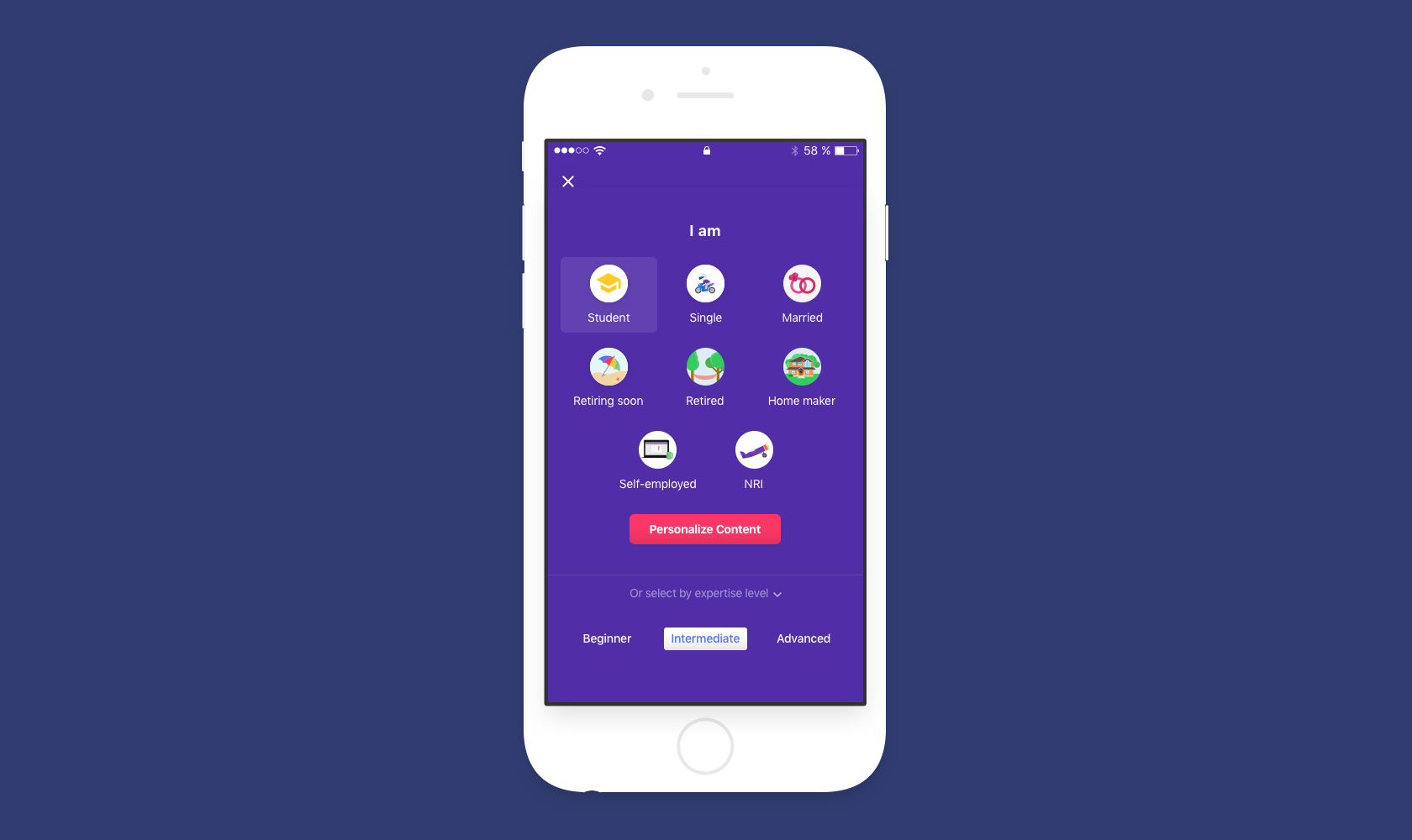
At nearly every step of the investing process, we provided heavily-curated content in the form of tooltips that users could see or skip. The knowledge base was organized to reflect various user personas (student, married, retired, homemaker, etc.) and levels of expertise. This way, users could read up on anything they didn’t understand and skip everything else.
Blank States, Language, Messages
Investing is challenging enough, so we focused on clear labeling to indicate when and where users were required to provide input or move forward. For any blank states (zero-data screens), we provided clear call-to-action buttons so users were sure about the next step.
With the app’s contextual tooltips, content was written to be fun yet direct. We tried to avoid the potential of users getting stuck because they were confused about the next step. This wasn’t just for clarity and keeping the app light-hearted; it was specifically to make sure users always had a path forward in order to complete a task, or go back, or read more about the feature.
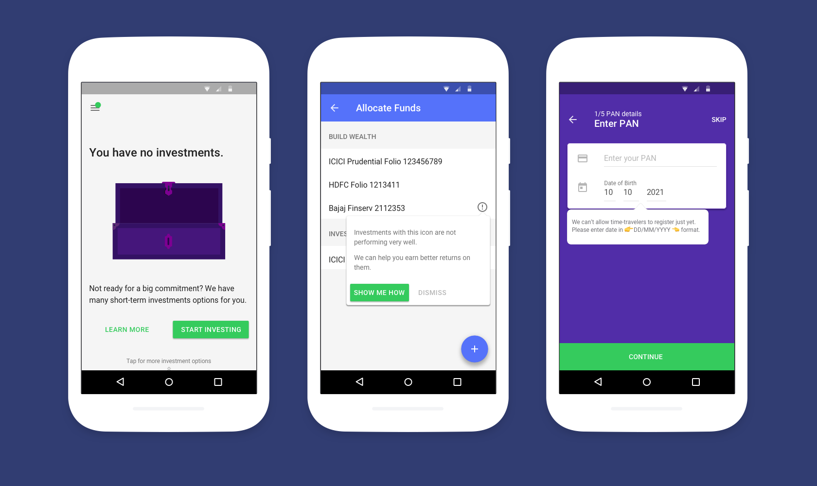
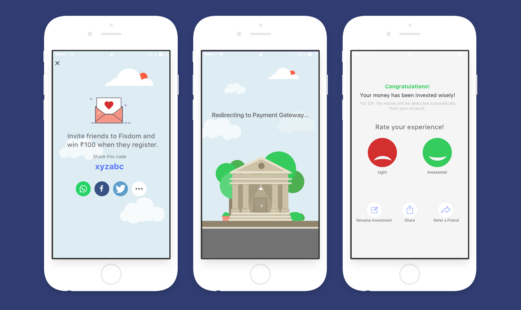
Multi-step processes were also made apparent by indicating progress with steps remaining, options to skip (when possible), and clearly showing a redirect, as seen below. This creates a sense of trust in users. At every step along the way, they can see what is happening, their current progress, and what’s next.
Closing Thoughts
Financial apps are seemingly at a disadvantage because of regulatory and legal requirements. Until recently, this has led to poorly designed, bland, and sometimes incoherent apps, features, and processes. However, in UX, these limitations can be a blessing and provide a structure for designers to work with. With a small amount of extra effort and thought, creating clear and simple experiences is actually made easier when requirements like regulations need to be followed.
This is where the new-age fintech products have an opportunity to score. By identifying their users and tailoring the experience towards a niche, the legal restrictions and requirements are a challenge to design for rather than a problem to circumvent. Those requirements also provide an opportunity to educate within the product in a fun and informative way.
With Fisdom and several other apps like Wealthy and Sqrrl , fintech apps in India are improving thanks to a user-centered design approach. Most still lack the clean interface design and refined user experiences that have become commonplace in other types of apps, but the change has already begun, and more apps and services are creating better defined, smarter experiences that address user needs.
In the Indian market, this design shift was risky; Fisdom was one of the first stylized personal finance tools, and other companies have only recently begun focusing on UX. Those risks paid off; the Fisdom app now has hundreds of thousands of installs (up from 1-5k pre-redesign) and a 4.2-star rating on the Google Play store.
Further Reading on the Toptal Blog:
- UI Design Best Practices and Common Mistakes
- Empty States: The Most Overlooked Aspect of UX
- Simplicity Is Key: Exploring Minimal Web Design
- Heuristic Principles for Mobile Interfaces
- Designing for Readability: A Guide to Web Typography (With Infographic)
Tejas Bhatt
Ahmedabad, Gujarat, India
Member since February 27, 2017
About the author
World-class articles, delivered weekly.
By entering your email, you are agreeing to our privacy policy .
Toptal Designers
- Adobe Creative Suite Experts
- Agile Designers
- AI Designers
- Art Direction Experts
- Augmented Reality Designers
- Axure Experts
- Brand Designers
- Creative Directors
- Dashboard Designers
- Digital Product Designers
- E-commerce Website Designers
- Full-Stack Designers
- Information Architecture Experts
- Interactive Designers
- Mobile App Designers
- Mockup Designers
- Presentation Designers
- Prototype Designers
- SaaS Designers
- Sketch Experts
- Squarespace Designers
- User Flow Designers
- User Research Designers
- Virtual Reality Designers
- Visual Designers
- Wireframing Experts
- View More Freelance Designers
Join the Toptal ® community.
- Get in touch
- Enterprise & IT
- Banking & Financial Services
- News media & Entertainment
- Healthcare & Lifesciences
- Networks and Smart Devices
- Education & EdTech
- Service Design
UI UX Design
- Data Visualization & Design
- User & Design Research
- In the News
- Our Network
- Voice Experiences
- Golden grid
- Critical Thinking
- Enterprise UX
- 20 Product performance metrics
- Types of Dashboards
- Interconnectivity and iOT
- Healthcare and Lifesciences
- Airtel XStream
- Case studies
Data Design
- UCD vs. Design Thinking
- Case Studies
Hero Fincorp SimplyCash: End to end digital lending platform
Hero FinCorp is India's most trusted brand and a non-banking financial company, which offers 2-wheeler loans, LAP, corporate & SME loans, as part of providing consumer finance and commercial lending. Think Design partnered with Hero Fincorp, to build an instant personal loan application which is coming of age and designed to simplify lending.
Banking & Financial Services
The Challenge
Simply Cash, a completely digitized personal loan app, powered by Hero FinCorp, helps users meet their personal finance goals through a simplified loan application journey requiring no physical documentation.
Hero Fincorp envisaged to create a best in the world, end to end customer experience from application, to servicing, to closure. In this context, the challenge was to create a need-based personal loan solution through a fully digital journey, without human interaction, for the target segment of creditworthy digital-savvy customers.
Ensuring real-time disbursal, negating the need for physical proofs within a constraint of minimized manpower cost, necessitated a completely digital solution. An easy journey, designed to engage and make lending effortless and convenient for customers was hence required to be built.
Our methodology.
Our engagement was marked by beginning to understand the needs of the relevant stakeholders, users, exploring factors which the users might care about most. User personas were created which further guided the creation of user journeys and task flows.
Our team carried out a competitive analysis of the other players in the market to identify the loan timelines, documentations asked and identify both the pros and cons of such portals. All insights generated through these activities fed in creating the design directions and deciding on the UI benchmarks for Simplycash.
Key insights, 1. ui for millennials.
An informal interface with minimum data entry was found to be more consumable and could bring in repeat customers from our most populated demographic.
2. Clean UI
More (Pictorial) selection, fonts which were aligned with the brand team and a consistent color schema were found preferred.
3. Seeding Trust
An application which was perceived secure and gave transparency to users was found to be greater in demand and usage among people.
KEY FEATURES
- SimplyCash provides real-time loan disbursement with no human intervention or physical documentation; through seamless and relevant process flows.
- Continuously harnessed customer insights are used to offer appropriate products during the life cycle.
- Features like loan calculator tool and one-stop loan dashboards to view loan status and get updated with EMI schedules have been added to build upon user engagement and trust

DESIGN ACTIVITIES
Consulting, Stakeholder Workshop, User Interviews, Wireframing, Visual System, Front End Development, Dev. Coordination.
Current status
Simplycash was launched Mid 2018.
Offbeat visual design to simplify loan processes
Extreme user interviews, task analysis, in-depth interviews, ui ux design, user & design research, service design.
We use cookies to ensure that we give you the best experience on our website. If you continue we'll assume that you accept this. Learn more
Recent Tweets
Sign up for our newsletter.
Subscribe to our newsletter to stay updated with the latest insights in UX, CX, Data and Research.
Get in Touch
Thank you for subscribing.
You will be receive all future issues of our newsletter.
Thank you for Downloading.
One moment….
While the report downloads, could you tell us…
Advisory boards aren’t only for executives. Join the LogRocket Content Advisory Board today →

- Product Management
- Solve User-Reported Issues
- Find Issues Faster
- Optimize Conversion and Adoption
21 UX case studies to learn from in 2024

UX case studies are the heart of your design portfolio. They offer a peek into your design process, showcasing how you tackle challenges, your methods, and your results. For recruiters, these case studies serve as a metric for evaluating your skills, problem-solving abilities, and talent.
If you’re considering creating your own UX case study in 2024 but don’t know where to start, you’re in the right place. This article aims to inspire you with 21 carefully hand-picked UX case study examples, each offering valuable lessons.
But before we dive into these examples, let’s address a question that might be lingering: Is a UX case study truly worth the effort?
Is it worth creating a UX case study?
The short answer is yes.
Remember how in math class, showing your workings was even more important than getting the correct answer? UX case studies are like that for designers. They are more than just showcasing the final product (the polished website or app); they detail the steps taken to get there (the research, user testing, and design iterations). By showing your design process, you give potential employers or clients a peek into your thought process and problem-solving skills.
A well-laid-out case study has many benefits, including the following:
Building credibility
As case studies provide evidence of your expertise and past successes, they can build credibility and trust with potential employers or clients.
Educational value
By showing your design process, you provide valuable insights and learnings for other designers and stakeholders.
Differentiation
A compelling case study can leave a lasting impression on potential recruiters and clients, helping you stand out.
Iterative improvement
A case study is like a roadmap of each project, detailing the highs, lows, failures, and successes. This information allows you to identify areas for improvement, learn from mistakes, and refine your approach in subsequent projects.
Now that you know why a stand-out case study is so important, let’s look at 21 examples to help you get creative. The case studies will fall under five categories:
- Language learning app
- Learning app
- Travel agency app
- Intelly healthcare app
- Cox Automotive
- Swiftwash laundry
- Wayfaro trip planner
- New York Times app redesign
- Disney+ app redesign
- Fitbit redesign
- Ryanair app redesign
- Forbes app redesign
- Enhancing virtual teaching with Google Meet
- Airbnb’s global check-in tool
- Spotify home shortcuts
- AI-powered spatial banking for Apple Vision Pro
- Sage Express
In this section, we’ll explore case studies that take us through the complete design journey of creating a digital product from scratch.
1. Language learning app
If you’re a designer looking to get your foot in the door, this is one case study you need to check out. It’s so well detailed that it helped this designer land their first role as a UX designer:
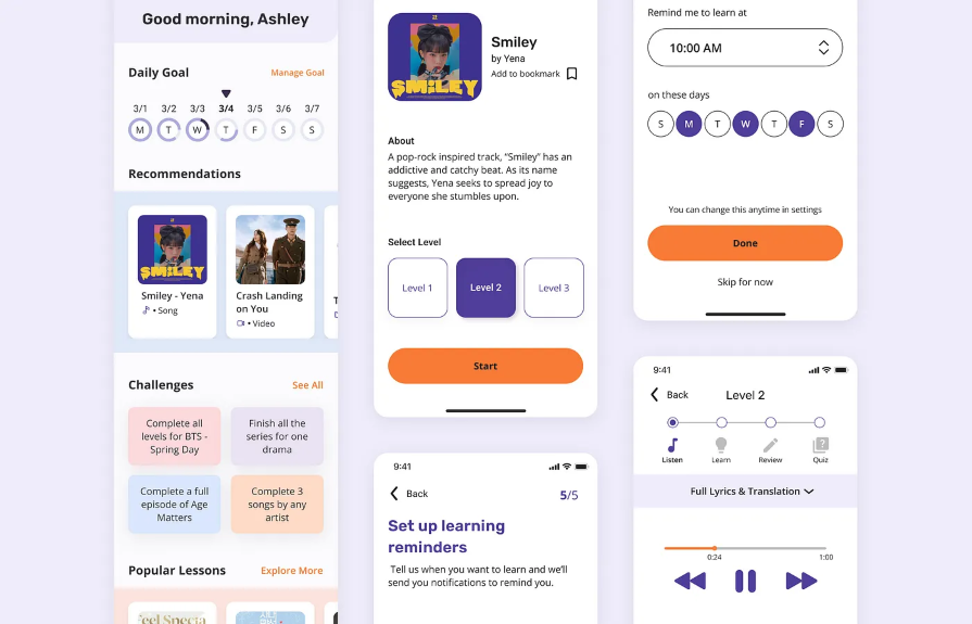
Created by Christina Sa, this case study tackles the all-too-common struggle of learning a new language through a mobile app. It takes us through the process of designing a nontraditional learning app that focuses on building a habit by teaching the Korean language using Korean media such as K-pop, K-drama, and K-webtoon.
Over 200k developers and product managers use LogRocket to create better digital experiences
Key takeaway
This case study shows how a structured design process, user-centered approach, and effective communication can help you stand out. The creator meticulously laid out their design process from the exploratory research phase to the final prototype, even detailing how the case study changed their view on the importance of a design process.
If you’re searching for a comprehensive case study that details every step of the design process, look no further. This one is for you:
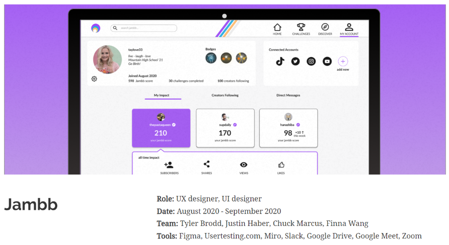
This impressive case study by Finna Wang explores the creation of a fan-focused responsive platform for Jambb, an already existing social platform. The creator starts by identifying the problem and then defines the project scope before diving into the design process.
This case study shows us the importance of an iterative problem-solving approach. It identifies a problem (pre-problem statement), creates a solution, tests the solution, and then revises the problem statement based on the new findings.
3. Learning app
If you need a highly visual case study that takes you through every step of the design process in an engaging way, this one is for you:
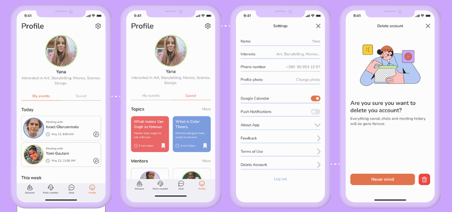
This case study walks us through the design of a platform where users can find experts to explain complex topics to them in a simple and friendly manner. It starts by defining the scope of work, then progresses through research, user journeys, information architecture, user flow, initial design, and user testing, before presenting the final solution.
This case study demonstrates effective ways to keep readers engaged while taking them through the steps of a design process. By incorporating illustrations and data visualization, the designer communicates complex information in an engaging manner, without boring the readers.
If you’re in search of a case study that details the design process but is also visually appealing, you should give this one a look:
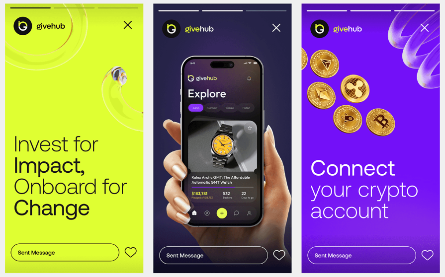
This case study by Orbix Studio takes us through the process of designing GiveHub, a fundraising app that helps users set up campaigns for causes they’re passionate about. It starts with an overview of the design process, then moves on to identifying the challenges and proposing solutions, before showing us how the solutions are brought to life.
This case study illustrates how a visually engaging design and clear organization can make your presentation easy to grasp.
5. Travel agency app
This case study is quite popular on Behance, and it’s easy to see why:
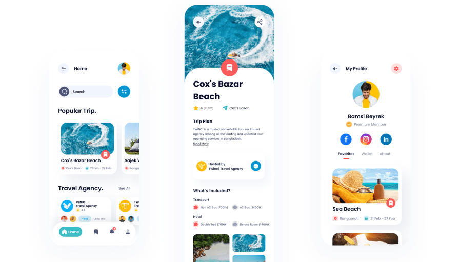
The case study takes us through the process of creating a travel app that lets users compare travel packages from various travel agencies or groups. The creators set out a clear problem statement, propose a solution, and then show us the step-by-step implementation process. The incorporation of data visualization tools makes this case study easy to digest.
This is another case study that shows the importance of using a clearly defined design process. Going by its popularity on Behance, you can tell that the step-by-step process breakdown was well worth the effort.
6. Intelly healthcare app
If you’re looking for a UX case study that explores the design journey for both mobile and desktop versions of an app, this is one you should check out:
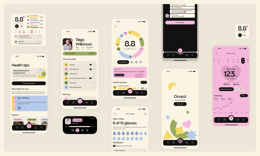
This case study explores the process of creating Intelly, an app that transforms patient care with telemedicine, prescription management, and real-time tracking. The case study begins with a clear design goal, followed by a layout of existing problems and design opportunities. The final design is a mobile app for patients and a desktop app for doctors.
This case study highlights the importance of proactive problem-solving and creative thinking in the design process. The creators laid out some key problems, identified design opportunities in them, and effectively leveraged them to create an app.
7. Cox Automotive
If you prefer a results-oriented case study, you’ll love this one:
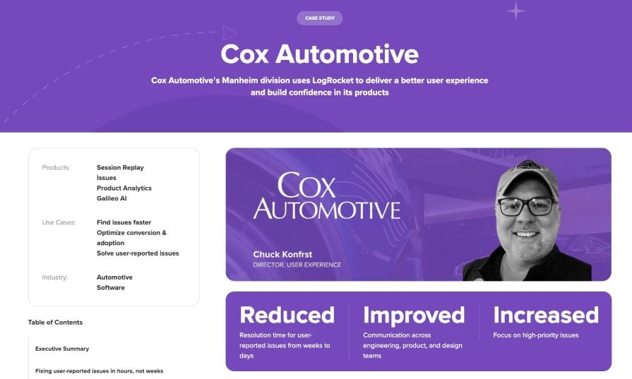
This case study delves into how Cox Automotive’s Manheim division, used LogRocket to optimize their customers’ digital experience for remote car auctions. It starts by highlighting the three key outcomes before giving us an executive summary of the case study. The rest of the case study takes us through the process of achieving the highlighted outcomes.
A key takeaway from this case study is the significance of using user data and feedback to enhance the digital experience continuously. Cox Automotive used LogRocket to identify and address user-reported issues, gain insights into customer behaviors, and make data-driven decisions to optimize their product.
These case studies are more focused on the visual aspects of the design process, teaching us a thing or two about presentation and delivery.
If you love a case study that scores high on aesthetics with vivid colors, cool illustrations, and fun animations, you need to check this one out:
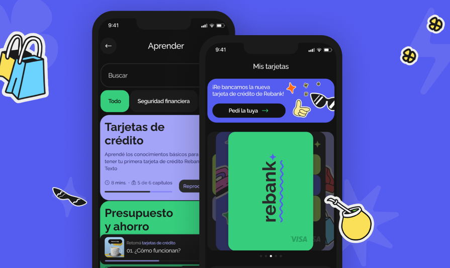
This case study takes us on a visual journey of creating Rebank, a digital product aimed at revolutionizing the baking industry. It starts with the research process, moves on to branding and style, and then takes us through the different screens, explaining what each one offers.
This case study illustrates the value of thinking outside the box. Breaking away from the conventional design style of financial products makes it a stand-out case study.
9. Swiftwash Laundry
If you’re looking for a case study that prioritizes aesthetics and visual appeal, you should check this one out:
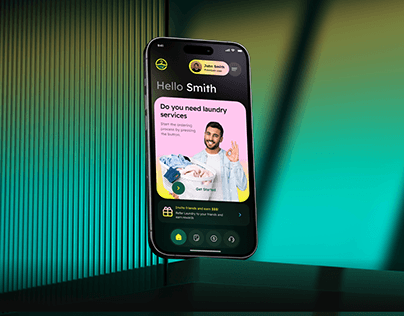
This case study by Orbix Studio gives us a peek into how they created Swiftwash, a laundry service app. It takes us through the steps involved in creating an intuitive, user-friendly, and visually appealing interface.
If there’s one thing to take away from this case study, it’s the value of presenting information in a straightforward manner. Besides being easy on the eye, this case study is also easy to digest. The creators lay out the problem and detail the steps taken to achieve a solution, in an easy-to-follow way, while maintaining a high visual appeal.
10. Wayfaro trip planner
If you’re looking for a concise case study with clean visuals, you should definitely check this one out:
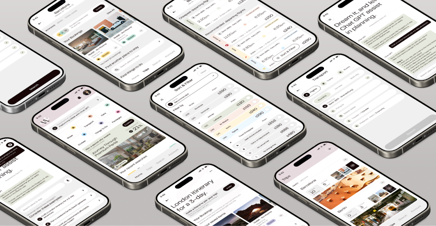
This Behance case study takes us through the design of Wayfaro, a trip planner app that allows users to plan their itineraries for upcoming journeys. The creators dive straight into the visual design process, showing us aspects such as branding and user flow, and explaining the various features on each screen.
This case study shows us the power of an attractive presentation. Not only is the mobile app design visually appealing, but the design process is presented in a sleek and stylish manner.
App redesign
These case studies delve into the redesign of existing apps, offering valuable insights into presentation techniques and problem-solving approaches.
11. New York Times app redesign
If you’re looking for an app redesign case study that’s impactful yet concise, this one is for you:
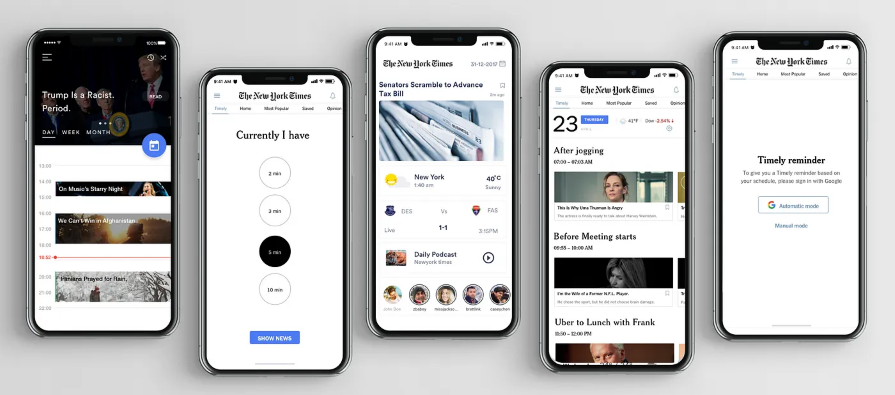
This study details the creation of “Timely,” a design feature to address issues with the NYT app such as irrelevant content, low usage, and undesirable coverage. It takes us through the process of identifying the problem, understanding audience needs, creating wireframes, and prototyping.
This case study shows us that you don’t always need to overhaul the existing app when redesigning. It suggests a solution that fits into the current information setup, adding custom graphics to the mobile app. Starting with a simple problem statement, it proposes a solution to address the app’s issues without changing what customers already enjoy.
12. Disney+ app redesign
If you’re looking for an engaging case study that’s light on information, you should check out this one:
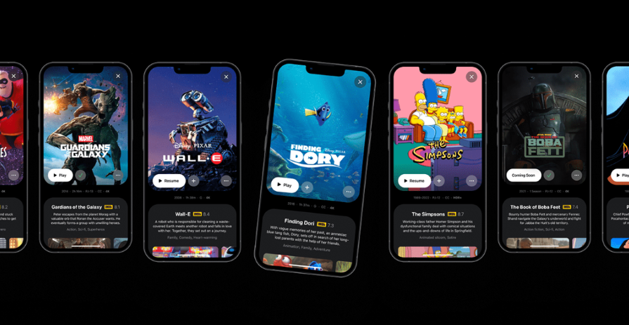
This case study by Andre Carioca dives right into giving the user interface a little facelift to make it more fun and engaging. By employing compelling storytelling and appealing visuals, the creator crafts a narrative that’s a delight to read.
Given how popular this case study is on Behance, you can tell that the designer did something right. It shows how injecting a little playfulness can elevate your case study and make it more delightful.
13. Fitbit redesign
If you want an in-depth case study that doesn’t bore you to sleep, this one is for you:
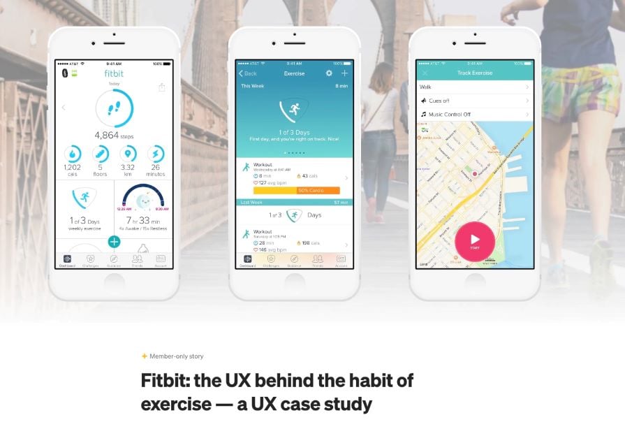
This case study by Stacey Wang takes us through the process of redesigning Fitbit, a wearable fitness tracker. The creator starts by understanding personas and what users expect from a fitness tracker.
Next was the development of use cases and personas. Through a series of guerrilla tests, they were able to identify user pain points. The redesign was centered around addressing these pain points.
This case study highlights the importance of clear organization and strong visual communication. The creator goes in-depth into the intricacies of redesigning the Fitbit app, highlighting every step, without boring the readers.
14. Ryanair app redesign
If you’re bored of the usual static case studies and need something more interactive, this app redesign is what you’re looking for:
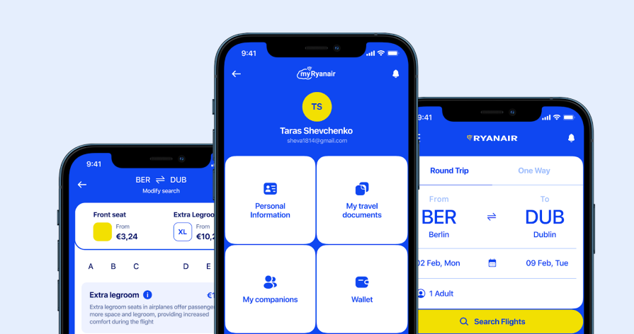
This case study takes us through the process of giving the Ryanair app a fresh look. Besides the clean aesthetics and straightforward presentation, the incorporation of playful language and interactive elements makes this case study captivating.
This case study shows how adding a bit of interactivity to your presentation can elevate your work.
15. Forbes app redesign
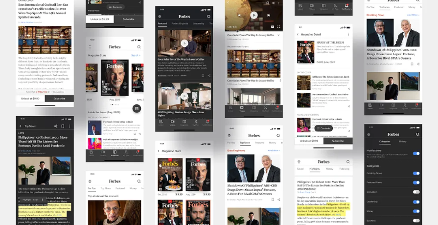
This case study starts by explaining why the redesign was needed and dives deep into analyzing the current app. The creator then takes us through the research and ideation phases and shares their proposed solution. After testing the solution, they made iterations based on the results.
When it comes to redesigning an existing product, it’s a good idea to make a strong case for why the redesign was needed in the first place.
UX research
These case studies are centered around UX research, highlighting key research insights to enhance your design process.
16. Enhancing virtual teaching with Google Meet
This case study by Amanda Rosenburg, Head of User Experience Research, Google Classroom shows us how listening to user feedback can help make our products more useful and inclusive to users.
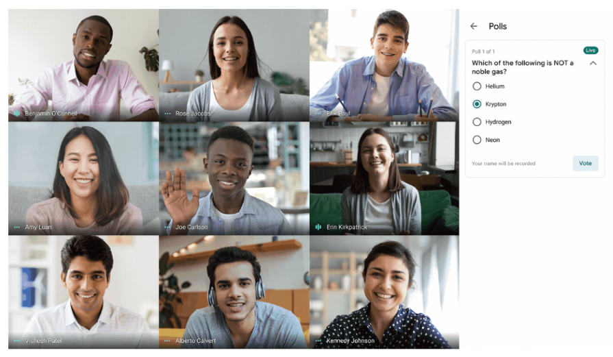
To improve the virtual teaching experience on Google Meet, the team spent a lot of time getting feedback from teachers. They then incorporated this feedback into the product design, resulting in new functionality like attendance taking, hand raising, waiting rooms, and polls. Not only did these new features improve the user experience for teachers and students, but they also created a better user experience for all Google Meet users.
When there isn’t room for extensive user research and you need to make quick improvements to the user experience, it’s best to go straight to your users for feedback.
17. Airbnb’s global check-in tool
This case study by Vibha Bamba, Design Lead on Airbnb’s Host Success team, shows us how observing user behaviors inspired the creation of a global check-in tool:
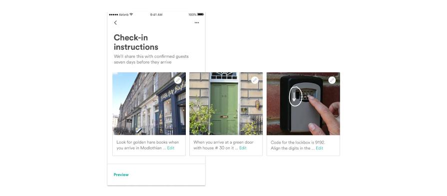
By observing interactions between guests and hosts, the Airbnb team discovered a design opportunity. This led to the creation of visual check-in guides for Airbnb guests, which they can access both offline and online.
There’s a lot to be learned from observing user behavior. Don’t limit yourself to insights obtained from periodic research. Instead, observe how people interact with your product in their daily lives. The insights obtained from such observations can help unlock ingenious design opportunities.
18. Spotify Home Shortcuts
This case study by Nhi Ngo, a Senior User Researcher at Spotify shows us the importance of a human perspective in a data-driven world:
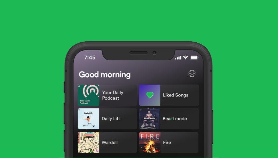
When the Spotify team set out to develop and launch the ML-powered Shortcuts feature on the home tab, they hit a brick wall with the naming. A/B tests came back inconclusive. In the end, they had to go with the product designer’s suggestion of giving the feature a name that would create a more human and personal experience for users.
This led to the creation of a humanistic product feature that evoked joy in Spotify’s users and led to the incorporation of more time-based features in the model, making the content more time-sensitive for users.
Although data-driven research is powerful, it doesn’t hold all the answers. So in your quest to uncover answers through research, never lose sight of the all-important human perspective.
Artificial intelligence
The following case studies are centered around the design of AI-powered products.
19. AI-powered spatial banking for Apple Vision Pro
If you want to be wowed by a futuristic case study that merges artificial intelligence with spatial banking, you should check this out:
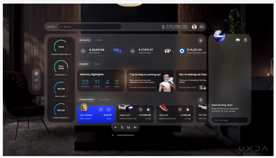
In this revolutionary case study, UXDA designers offer a sneak peek into the future with a banking experience powered by AI. They unveil their vision of AI-powered spatial banking on the visionOS platform, showcasing its features and their AI use cases.
This case study shows us the importance of pushing boundaries to create innovative experiences that cater to user needs and preferences.
20. Sage Express
If what you need is an AI case study that isn’t information-dense, this one is for you:
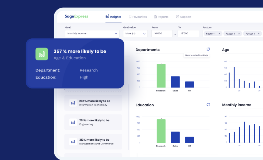
This case study by Arounda takes us through the design of Sage Express, an AI-powered data discovery tool that automatically extracts patterns, tendencies, and insights from data. It outlines the challenge, proposes a solution, and details the journey of bringing the proposed solution to life. But it doesn’t stop there: it also shows the actual results of the design using tangible metrics.
This case study underscores the importance of showing your outcomes in tangible form. You’ve worked hard on a project, but what were the actual results?
If you’re looking for a clean and well-structured AI case study, this will be helpful:
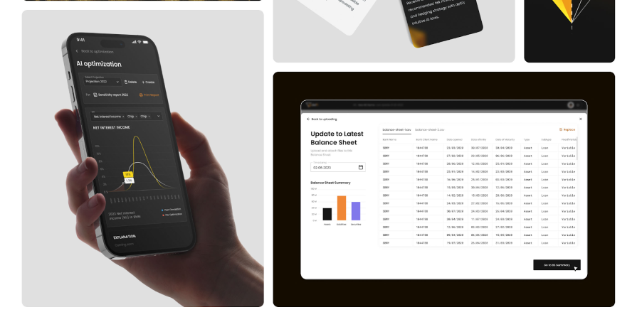
This case study takes us through the process of creating Delfi, an AI-driven banking financial report system. It details the entire design process from onboarding to prototype creation.
If there’s one thing to learn from this case study, it’s how a well-structured presentation can simplify complex information. Although the case study is heavy on financial data, the organized layout not only enhances visual appeal but also aids comprehension.
This article has shown you 21 powerful case study examples across various niches, each providing valuable insights into the design process. These case studies demonstrate the importance of showcasing the design journey, not just the final polished product.
When creating your own case study, remember to walk your users through the design process, the challenges you faced, and your solutions. This gives potential recruiters and clients a glimpse of your creativity and problem-solving skills.
And finally, don’t forget to add that human touch. Let your personality shine through and don’t be afraid to inject a little playfulness and storytelling where appropriate. By doing so, you can craft a case study that leaves a lasting impression on your audience.
Header image source: IconScout
LogRocket : Analytics that give you UX insights without the need for interviews
LogRocket lets you replay users' product experiences to visualize struggle, see issues affecting adoption, and combine qualitative and quantitative data so you can create amazing digital experiences.
See how design choices, interactions, and issues affect your users — get a demo of LogRocket today .
Share this:
- Click to share on Twitter (Opens in new window)
- Click to share on Reddit (Opens in new window)
- Click to share on LinkedIn (Opens in new window)
- Click to share on Facebook (Opens in new window)

Stop guessing about your digital experience with LogRocket
Recent posts:.
Service design in action: Creating memorable experiences for small businesses
Service design can help our organizations innovate customer experience and build brand loyalty — and it’s great for small businesses.

Combating addictive design is the UX challenge of 2024
Digital addiction is bad for your mental and physical health. Learn what trends encourage this concerning behavior and how to avoid it.
What is DesignOps? The essentials of DesignOps
DesignOps is a set of best practices and principles that aims to streamline the effectiveness of design teams.

Using Zeplin for design handoff: How does it compare to Figma Dev Mode?
Let’s compare Zeplin with Figma Dev Mode to find out which suits design handoff better for your software product team!

Leave a Reply Cancel reply

Flash Loan App - UI/UX design - Case study

Creative Fields

Product Design

Graphic Design
- user interface
No use is allowed without explicit permission from owner

IMAGES
COMMENTS
Loan Application Process. The loan application process was made simple. Choose and amount and put in all requested information and then the application automatically goes into processing. Our process is also tailored in a way that users can get their loans in under two hours! ... UX Case Study: Enhancing User Experience, Innovating WhatsApp ...
About cashpo. Currently, Cashpo has 1.7L 👥 active users & After launching Cahpo V2 we Improved it by ⬆️ 40.2 % (2.54L) active users. Cashpo takes 2-3min to complete the application ...
A User Research Case Study for a Fintech App. Disclaimer: This case study is a hypothetical assignment that I recently did for an imaginary fintech app. The primary research done is real. ... Expectations: Seamless and intuitive user experience Quick and easy loan application process Personalized loan options based on the financial profile.
UX Case Study: Optimizing Loan Applications. Context: The fintech platform Celsius offered retail users the ability to take loans backed by their own cryptocurrency as collateral. This was a high-priority product for the business but our analytics showed that, of the users who started the loan flow, only 12% completed it. Understanding the problem:
Replace the call to action "Borrow money" with "See loan offers". The primary users of the AellaCredit app live in West Africa. While testing the wireframes, I realized that "Borrow money" might not be the right call to action to use on the home-screen, given that Africans are generally averse to being identified as "borrowers".
Live vs. loan is a mobile app that explores how gamifying loan debt management can motivate users and encourage learning around finances. This case study was an independent capstone project in my Designlab UX Academy curriculum in March, 2017.
Case Study: UX of Tenure Selection in a Loan Application. Hello, I'm Gurpreet Singh, a product designer with 7 years of experience crafting exceptional user experiences for digital products. In this case study, I'll walk you through the process of translating stakeholder requirements into a well-informed design solution.
10,000+ Results. PayFast Loan App Project. Ojochoko Mary Ochuma. 12 243. Gold Loan UX Case Study. Multiple Owners. 8 93. PayPexi: A Mobile Banking App With Loan Services. Inya Rhoda.
Download on the App Store Get it on Google Play English Čeština Dansk Deutsch Español Français Italiano Nederlands Norsk Polski Português Pусский Suomi Svenska Türkçe 日本語 한국어 中文(简体) 中文(繁體)
Cafe App — UI/UX Case Study Note: This case study is a conceptual project developed as part of the Google UX Design Certificate course, and it does not represent an… 6 min read · May 16
Case study: streamlining loan applications with software ux overhaul. A client since 2016, Baker Hill has worked with TBH Creative on everything from website design to a complete company rebranding initiative. Look modern and improve the outdated web form user experience (The previous application did not have a defined strategic UX.
UI/UX,Interaction Design,Typography,Adobe XD,Miro,Google Docs
UX UI Case study. MVP design for French Fintech Start-up Mansa. Design of dashboard, personal account, payment calendar and follow up features. 2 week design sprint project, April 2021. ... bank account connection an easy loan application and a 24-hour decision turnaround time. When a loan is approved, Mansa's sales and customer service teams ...
Mastering Fintech UX: A Design Case Study. New fintech apps are changing how we see our investment goals and interact with financial institutions. This article reviews best practices for building trust without sacrificing fun or usability. authors are vetted experts in their fields and write on topics in which they have demonstrated experience.
Design Brief. The objective was to design an application that would help students in providing educational loans with the best rate of interest. The product aims to disrupt the education loans ...
Our Methodology. Our team carried out a competitive analysis of the other players in the market to identify the loan timelines, documentations asked and identify both the pros and cons of such portals. All insights generated through these activities fed in creating the design directions and deciding on the UI benchmarks for Simplycash.
Behind the Scenes. Now, let's dive straight into the interesting part — the screens! Getting onboard The onboarding screen focuses on 3 major features of the app — tracking spends, connecting multiple bank accounts, and setting budgets, which gives a brief overview of the app and its offerings. The next step is to link your bank account to start tracking and categorising your spends.
Lender Loan - UI UX Case Study - Mobile App. 56. 810. 7. Published: August 30th 2023. Multiple Owners. Follow All Following All Unfollow All. Owners. dakshnamoorthy G.s. Chennai, India. Follow Following Unfollow. aspira design. India. Follow Following Unfollow. Lender Loan - UI UX Case Study - Mobile App
To design a product that helps farmers get access to proper and hassle-free funding as easily and quickly as possible to ensure they scale their businesses. To help regular consumers have a low-risk environment they could invest their money for a profit after a stipulated time period. To create a simple and organized interface to make sure even ...
As people are closer to credit cards and online payments they get less contact with the cash and consequently less perception of the value of the money or even if there's any to spend. In this study, for example, they found that shoppers spend up to 100% more when using the credit card to pay, rather than in cash.
Improving the loan application & management on a lending platform — a UX case study. Loan app made easy for users. ... Terang's App— UX Case Study. An application that can help women create a supportive work environment and skill for career development.
420. 4. Published: September 5th 2022. The solution is to create a mobile application that can easily help people to find Home loan at low interest rates which satisfy the peoples problem, Should provide proper solution for all kind of problem occur in getting home loan.
If you're looking for a UX case study that explores the design journey for both mobile and desktop versions of an app, this is one you should check out: Image credit: Behance This case study explores the process of creating Intelly, an app that transforms patient care with telemedicine, prescription management, and real-time tracking.
UX Case study, Dance snap app designed by Mahsa Ranjbaran. Connect with them on Dribbble; the global community for designers and creative professionals. ... Link to download app: Dance-v14(1..2)-release. apk. app dance design ui ux. View all tags. Posted on Apr 21, 2024 9 0 0 0 View feedback. Mahsa Ranjbaran. More by Mahsa Ranjbaran ...
Download on the App Store Get it on Google Play English Čeština Dansk Deutsch Español Français Italiano Nederlands Norsk Polski Português Pусский Suomi Svenska Türkçe 日本語 한국어 中文(简体) 中文(繁體)