

4-Step Strategy Reporting Process (With Template)

Are you tired of struggling with collecting data from multiple sources and organizing them into meaningful strategy reports? Confused about how to effectively measure and communicate progress? Tired of having your strategies falling flat and lacking support?
Well, you're in the right place! We know that getting stakeholders on board can be like trying to herd cats. And don't even get us started on strategy execution , it's like trying to hit a moving target.
This article is here to help you navigate the common challenges of effective business strategy reporting. From collecting and organizing data into actionable insights to stakeholder engagement, we'll dive into the challenges and provide actionable solutions.
So, if you're ready to overcome the struggles of strategy reporting, make sense of all that data, and make your strategy a success, let's get started.

What Is Strategy Reporting?
Strategy reporting refers to the process of documenting and communicating the progress and effectiveness of a company's strategic plan .
This typically includes financial and operational metrics, as well as key performance indicators that measure progress toward achieving the company's strategic goals and objectives. Strategy reports help company executives analyze past performance and determine if the organization’s objectives and strategies are attainable. It also helps them identify and mitigate risks so they can steer the company in the right direction.
Strategy reporting is usually done on a regular basis, such as quarterly or annually, and is typically presented to senior management and the board of directors to provide an overview of the company's performance.
Challenges in Business Strategy Reporting
Despite its importance, creating strategy reports is a challenging and overwhelming task. Strategic teams must coordinate with various departments to collect data and develop a cohesive report, and many face several challenges, including:
- Collecting and analyzing data needed to measure progress toward strategic goals. This happens because departments across the organization use different manual systems or tools to measure their performance.
- Identifying the right metrics needed to measure the company’s strategic goals and objectives .
- Communicating results to produce clear and actionable insights, especially if these results are complex or technical.
- Ensuring data used is accurate and consistent across the different departments involved.
- Keeping the strategy updated and aligned with the business environment despite constantly changing internal and external factors.
- Managing the implementation of the strategy and ensuring that it is being executed effectively.
Using a proven template and the simple 4-step process on how to write a strategy report below will help address these challenges and make the process easier. It also ensures an output that is understandable and usable across the organization.
4-Step Strategy Reporting Process
Strategic reporting doesn’t have to be complicated or cumbersome. With the steps below, you can effectively create strategy reports that accomplish their purpose.
Step 1: Identify reporting stakeholders
The first step is determining the stakeholders who will consume and use the reports. Understanding this will help you narrow down the report’s content and identify the correct format that will help expedite their decision-making process.
Bear in mind that different stakeholders need the strategic report for various purposes. Identifying these “report personalities” will help the team develop specific templates that contain the correct data and are useful for the end consumer.
This streamlines the data collection and report preparation process, ensuring the team doesn’t waste time creating long-winded reports that are bloated and not useful for the designated stakeholder.
Step 2: Collect your data
It’s not unusual that data is scattered across the organization and contained in various tools such as legacy systems, Excel files, project management tools, and others. Collecting data is often a lengthy process with multiple back-and-forth steps among data owners. There’s also a lot of manual copy-pasting involved with little accountability, causing potential data disintegration.
It’s crucial that you are in control of this process and able to trust the integrity of the collected data.
👉How Cascade simplifies this step:
Cascade simplifies the data collection process using integrations across multiple business tools. Whatever productivity, project management, or business analytics tool your team uses, you can integrate them all within Cascade, creating a single powerful source of truth.
Data from various sources are fed automatically to Cascade so you can gather information accurately and create beautiful visualized reports using the correct data. You can also send automatic notifications to team members using email, Microsoft Teams, or Slack to remind them to update various elements they’re accountable for.
Cascade helps you integrate your strategy, data, and teams into a single platform. By doing so, Cascade ensures that you have the most reliable data to support your organization's strategic decisions.
Step 3: Make sense of the data
Once all the data is collected, it’s time to understand which data points are essential to include in strategic reports. You don’t want to overwhelm the person reading the report with lots of unnecessary data that bogs down their decision-making process. Strategic reports must contain the most vital and essential data to determine a strategy’s effectiveness.
It can be overwhelming to sift through mountains of data, especially if they are presented in different formats or require technical knowledge to visualize. But with the right strategy reporting tools, data analysis can become a much simpler process, allowing one to quickly and effectively make use of the information.
👉 How Cascade simplifies this step:
Cascade makes the process simple by letting you manipulate collected data into the format you need. Calculations are completed instantly, so you can quickly visualize how the overall collected data from different projects, departments, or business units impacts the organization as a whole.
Data collected are mapped to their corresponding strategic objectives so you can filter which are helpful to include in the strategic report. You can also view various data combinations using customizable charts. From a single KPI to the performance of a strategic portfolio, the different chart types provide you with an in-depth analysis of alignment with the organizational goals.
Step 4: Visualize and share strategy reports
Once you’ve determined the correct data to use, you must format them into visuals that can be easily consumed by the person reading the report. Strategic reports must be able to accurately visualize data to help stakeholders form valuable insights.
Everyone must have the same version of the same report, so they are on the same page when it comes to making decisions. However, teams often find it challenging to create cohesive reports when different stakeholders want different information. Customizing and manually updating strategy reports also take time and are prone to errors.
Cascade makes the process simple with strategic and powerful dashboards that are easily customized with beautiful widgets and data visualization tools. Dashboard owners can share the strategy report with anyone and quickly embed the right widgets to make the presentations simple, functional, and intuitive.
Stakeholders can quickly see how the organization is performing and if initiatives from different departments are helping achieve the company’s goals. They can quickly identify roadblocks and opportunities so they can adjust priorities in real-time and steer the organization in the right direction.
With intuitive and comprehensive strategy reports , everyone in the organization knows the impact of their initiatives on the company’s strategic goals. Using the RAG system, decision-makers can also quickly pinpoint areas that are on track, those that are lagging, and those that are at risk. As a result, they have the insights and data necessary to make informed decisions and move the business forward.
Strategy Reporting Example
Here’s an example of a strategy report you can create within Cascade. The report is fueled by real-time data insights collected across various organization departments and fed to a single Cascade reporting dashboard .
Despite the different data sources, Cascade can generate a valuable and useful strategic report that becomes the single source of truth for the company . Each data point can be traced back for accuracy and further insights. So don't worry, you won't have to scroll through a thousand spreadsheets to get the information you need!
The report is built using customized widgets that capture the essential data decision-makers need. This makes it easy to rebuild the report further to generate additional insights.
You can even save the report as a template and have it automatically updated every month. This saves time, ensures accuracy and consistency, and always keeps you in the loop with the most up-to-date information . Plus, using a template keeps the format and structure consistent month after month, making it easy for stakeholders to understand and compare progress over time.
Simplify Strategy Reporting with Cascade 🚀
Strategy reporting doesn't have to be a drag. With the right tools and approach, you can create accurate, useful reports that give you the insights you need to make smart decisions. And even if different departments use different tools and systems, you can still seamlessly integrate all that data with Cascade.
Cascade is like the Swiss Army Knife of strategy reporting tools. It has everything you need to streamline the process, automate data collection, generate strategy reports in a consistent format, and provide real-time updates. So you can focus on what really matters—making strategic decisions. And with Cascade, you'll be able to do it with precision and speed.
Think of Cascade as your secret weapon for strategy reporting. It's the tool that will give you the edge you need to stay ahead in today's rapidly changing business landscape. So don't waste any more time on tedious, time-consuming strategy reporting. Give Cascade a try and see the difference it can make for your business.
Get in touch for a free demo or get started for free.
Popular articles

12 Best KPI Software Options For 2025—Find Your Perfect Fit
.png)
30 Best Strategy Tools For Your Organization In 2025
.png)
Chief Strategy Officer (CSO): Myths, Realities & Responsibilities
.png)
What Is A Maturity Model? Overview, Examples + Free Assessment
Your toolkit for strategy success.

Present Your Data Like a Pro
by Joel Schwartzberg

Summary .
With so many ways to spin and distort information these days, a presentation needs to do more than simply share great ideas — it needs to support those ideas with credible data. That’s true whether you’re an executive pitching new business clients, a vendor selling her services, or a CEO making a case for change.
Partner Center
Building Strategy Consulting Slide Decks: The Complete Guide
Table of contents.
There’s something different about slide decks from strategy consulting firms like McKinsey, Bain or BCG . For some reason, they just seem more convincing. But it’s difficult to pinpoint exactly what makes those presentations good.
As a strategy consultant, you very quickly realize there are two important components of a compelling strategy presentation:
- The ‘thinking’. This is the rigorous problem definition, analysis, synthesis, and insight that happens before you open up PowerPoint. Without this, even the most well-crafted strategy presentation lacks impact.
- The presentation. This is the distinctive, structured, and clear way that strategy consultants build their slide decks. Without this, even the most powerful insights lose their force.
In this guide, we show you how to do both those things. In chapters 1-3, we discuss how to structure your slide deck, define your objective, and craft a compelling argument and storyline.
Then in chapters 4-6, we show you best practices for building your slides and reviewing your slide deck.
By the end of this guide, you’ll have the ability to craft a compelling strategy slide deck with a clear and compelling storyline that leads your audience to your desired conclusion.
Structure your slide deck
Before we get into the detail of building your slide deck, it’s important to understand how to structure your presentation.
There is a common structure that is used for almost all strategy presentations. It’s based on a concept known as the Pyramid Principle , which was popularized by Barbara Minto at McKinsey & Co.
According to Minto, there are three components to a well-constructed slide deck:
- The executive summary: Provides the reader a full summary of the argument and recommendations within your slide deck for readers that are more interested in the ‘so what’ than the detailed analysis.
- The body slides: Illustrates the analysis that supports each claim you make in your slide deck’s argument and thus slide objective.
- Next steps or recommendations slides: Clearly outlines the key implications or ‘so what’ of your slide deck, as well as any next steps required.
In this guide, we will walk you through how to tackle each of these sections one by one. But first, we start by setting the objective of your slide deck, and crafting your argument and storyline.
Define the objective of your deck
Let’s start at the beginning. The purpose of your slide deck isn’t to show off all the things you know… or how great you are at analysis… or how beautiful your slides are.
Instead, the purpose of your slide deck is to persuade your audience and lead them to an objective. And, as the author of the slide deck, you need to set the objective before you start building your slide deck.
Having a clear objective for your slide deck is important for a number of reasons:
- It helps you focus your research and analysis on things that are relevant to your objective.
- You can quickly test the quality of your content by testing whether it is sufficient to achieve your objective.
- It helps inform the tone and positioning of the messages in your slides.
Your objective can take many forms. For example, it could be simply to inform your audience, to gain endorsement for a decision, or to achieve a specific action or next step.
As the author of the slide deck, you must ensure that the objective is clear and agreed upon. All the work that you’re about to do to build your slide deck is guided by your objective.
Craft the argument and storyline
Now that you’ve determined the objective of your slide deck, you need to craft an argument and storyline that leads to your objective.
To some extent, your slide deck’s argument will naturally appear from insights gathered through research and analysis. As you conduct research, you’ll slowly uncover the “real state of affairs”, which will be supported by data.
It’s your job to translate this argument into a compelling story; one that grabs the attention of your reader and communicates your argument in a clear and easy-to-understand way.
To do this, you should use a situation-complication-resolution storyline .
This is a universal structure; it’s used in books, plays, films, advertising, religion, politics, and more. It looks something like this:
- The scene is set and the characters are introduced (situation)
- Something goes wrong (complication)
- They fix the problem and live happily ever after (resolution)
When storytelling in PowerPoint, you should use the same structure. But in the context of your slide deck, your storyline will look something like:
- This thing is important (situation)
- There is a problem with this thing (complication)
- Therefore, we need to respond — and here is how (resolution)
The dot-dash structure
Writing a storyline for your presentation doesn’t happen in PowerPoint. In fact, you don’t open up PowerPoint until you’re completely satisfied with your storyline.
Instead of jumping into PowerPoint, you start by writing out your storyline in a text document using the dot-dash structure .
By writing your slide deck’s storyline in a text document, you can easily identify any faulty or missing logic in your story and ensure that you have the data required to support each claim you make.
And when you’re completely satisfied with your storyline, you can move it into PowerPoint. Your storyline should be communicated in the slide lead-ins, like so:
And once you’ve built the skeleton of your slide deck with the storyline communicated “horizontally” across the leads-ins, you’re ready to start building individual slides and the “vertical flow”.
Build body slides
Before you jump into building individual slides, there are two main components of slides that you need to understand:
- The lead-in: The text at the top of your slide. This should be written as an action title that communicates the implication or ‘so what’ of the slide, not describes the content of the slide.
- The slide body: The content of your slide. You should only communicate one insight per slide and choose the simplest method possible.

There is a close relationship between the slide lead-in and slide body. And this relationship is best explained by the Golden Rule of slide building.
The Golden Rule of slide building is:
“One slide, one insight, fully articulated in the lead-in, and supported by the body”
In other words, each slide should only communicate one insight. That insight should be fully explained in words in the lead-in, and fully supported by data in the slide body.
In addition, there should be nothing in the lead-in that’s not in the body, and nothing in the body that’s not in the lead-in.
Data, charts, and other quantitative slides
Claims that are supported by data are naturally more compelling than claims supported by ‘expert’ opinions, focus groups, and other qualitative evidence.
Therefore, where possible, you should always prioritize quantitative slides over qualitative slides.
But don’t go overboard with your data visualization. Sometimes it can be tempting to show off our technical skills by choosing the most complex visualization available. This is bad practice.
Instead, you should always choose the simplest chart to demonstrate your insight. But it can be tricky to determine which chart to use. So we’ve put together a simple decision tree to ensure that you always choose the most appropriate chart for your data .
Text, conceptual, and other qualitative slides
There are some insights that simply cannot be communicated with charts or data. In these cases, you need to find the most appropriate conceptual chart.
Unlike qualitative slides, there are no simple guides for text and conceptual slides. And because of this, the ability to craft well-structured conceptual slides is the mark of a skilled consultant.
It’s surprisingly tricky to be able to communicate a qualitative insight in a clear and structured visual manner. The best way to build the skill is to practice. But you can also learn by exploring common qualitative slides used by strategy consultants .

Download 120+ strategy consulting presentations for free
Looking for slide inspiration? Download 120+ consulting slide decks from top strategy consulting firms, such as McKinsey, BCG and Bain!
Write the executive summary
An executive summary slide is the first slide in your presentation but the last slide you build.
The executive summary slide fully summarizes the argument, storyline, and supporting evidence of the body slides. Because we already need to have finished every other part of the slide deck, we write it last.
Executive summary slides help the reader “follow along” with your slide deck. There are a few main benefits:
- They provide context to help the reader understand why the topic of the slide deck is important.
- They communicate the high-level argument before the reader gets into the body of the slide deck. This helps the reader understand your more detailed body slides.
- They are a “map” that the reader can reference back to if they start losing the line of argument in the body of the deck.
A typical executive summary looks something like the following slides, which are from a BCG report on “Melbourne as a Global Cultural Destination” and can be downloaded here .
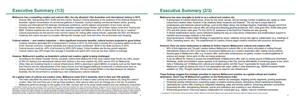
Good executive summaries follow three best practices:
- They are structured with bolded text for summary sentences and bullet points for supporting data. This ensures that every claim is clearly supported by data.
- The bolded summary sentences can be read alone to tell the slide’s storyline (i.e. you don’t need to read the supporting data in the bullet points).
- The bolded summary sentences reflect the SCR storyline structure of the slide deck
One other good practice (that you don’t see in the BCG example) is to reference the associated body slide throughout the executive summary. This helps direct a reader to the detailed analysis behind every claim in the executive summary.
Review your slide deck
Now that you’ve finished building all your slides and writing your executive summary, it’s time to review and finalize your slide deck.
There are three things that you need to check as you review your slide deck:
- Chart completeness : Check that your charts are comprehensively labeled, including chart titles, axis labels, units, time periods, etc.
- Text brevity : Review your slide text, including your lead-ins, and ensure that you make your points with the minimum number of words possible.
- Slide consistency : Review your slides and ensure that there is consistent formatting across the slides.
Reviewing your charts and visualizations
There’s a surprising amount of detail contained in charts and it’s quite easy to forget to key include key information.
Some examples of common charting mistakes include missing chart titles, labels, axes, units, dates, and legends. You should also consider how you highlights the implication of your charts.
To make this easier, you should use a charting checklist to methodically cross-reference your chart with best practice.
Refining your slide text
There’s an important place for text in slides. Not only can your use text to provide important context to support your visualizations, but also to communicate insights without data.
Most people use too many words in their slides. They tend to use fancy “consulting speak” or long, verbose explanations that actually obsure their message.
As you review your slide deck, you should review all of the text in your slides and savagely sharpen your text by removing unnecessary words .
Ensuring consistency across slides
Finally, you should use your last review to check for consistency across slides.
Start by ensuring that the formatting is consistent. For example, your slide format, spacing, fonts and slide numbers should all be consistent across the slides.
And then finish your review by ensuring all concepts are communicated consistently across slides. For example, if you’ve numbered or colored concepts a certain way, then ensure that they remain consistent throughout your slide deck.
Home Blog Business How to Create an Appealing Report Presentation (Guide + Templates)
How to Create an Appealing Report Presentation (Guide + Templates)
Sharing data, insights, and recommendations extracted from detailed analysis is a practice that consultants and heads of departments view as part of their everyday workload. Yet, effective communication techniques make a difference in whether the information disclosed is actionable, makes a lasting impact, or becomes critical for a decision’s outcome.
In this article, we will guide you through the process of creating a good report presentation, from general aspects to specifics by niche, recommended PowerPoint templates to use, and which aspects you should avoid in the presentation design process.
What is a Report?
What is a report presentation, business report presentations, academic report presentations, technical report presentations, sales report presentations, marketing report presentations, project report presentations, non-profit and ngo report presentations, healthcare report presentations, environmental report presentations, do’s and don’ts on a report presentation, recommended report powerpoint templates.
A report is a formal, high-level document that compiles data, research findings, and recommendations tailored to a specific topic. Its core purpose is to grant stakeholders a detailed understanding of a situation and provide background for decision-making processes.
We can define a report presentation as the visual and verbal method of communicating the key elements of a written report. Typically, report presentations happen in meeting or conference settings, where the scale of the report presentation depends on any of these three factors:
- Topic of the report presentation
- People or teams involved in the outcome of the report
- People or teams that must be aware of the information retrieved from the report
Depending on its topic, the amount of slides or specific slide design to include, which we shall mention in the upcoming section.
Types of Report Presentations
Business report presentations focus on a business’s performance, strategy, and operations, conveying important information to stakeholders for decision-making purposes. These presentation slides are used during board meetings, business plan presentations , quarterly reviews, strategic planning sessions, and investor meetings.
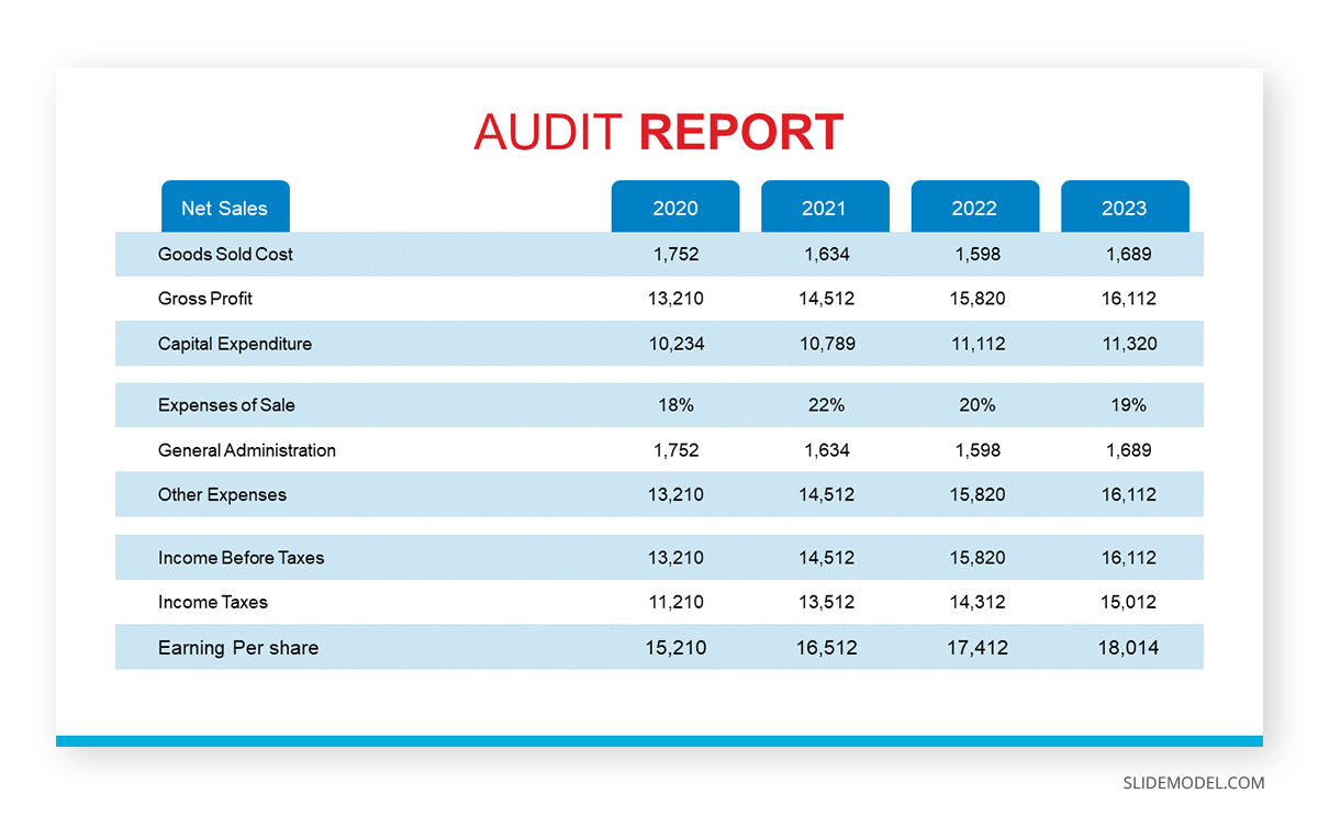
A typical business report presentation should contain the following slides on its slide deck:
- Title Slide : Title, presenter’s name, date, and company logo.
- Agenda Slide : Outline of main sections.
- Executive Summary Slide : Key takeaways and highlights.
- Financial Overview Slide : Revenue, expenses, profit, and loss.
- Performance Metrics Slide : Key performance indicators (KPIs).
- Strategic Initiatives Slide: Current and future projects.
- Market Analysis Slide : Market trends and competitive analysis.
- SWOT Analysis Slide: Strengths, weaknesses, opportunities, and threats.
- Recommendations Slide : Suggested actions and next steps.
- Q&A Slide : Invite questions from the audience.
- Conclusion Slide : Summary of key points.
Presenters must generally focus on clearly expressing the key points and insights, using charts and graphs to illustrate their findings easily. Opt for a SWOT analysis PowerPoint template to simply the SWOT representation process.
Academic report presentations communicate research findings, project outcomes, and scholarly work to academic peers and professionals. They are common at academic conferences, seminars, workshops, and in classrooms (post-graduate settings).
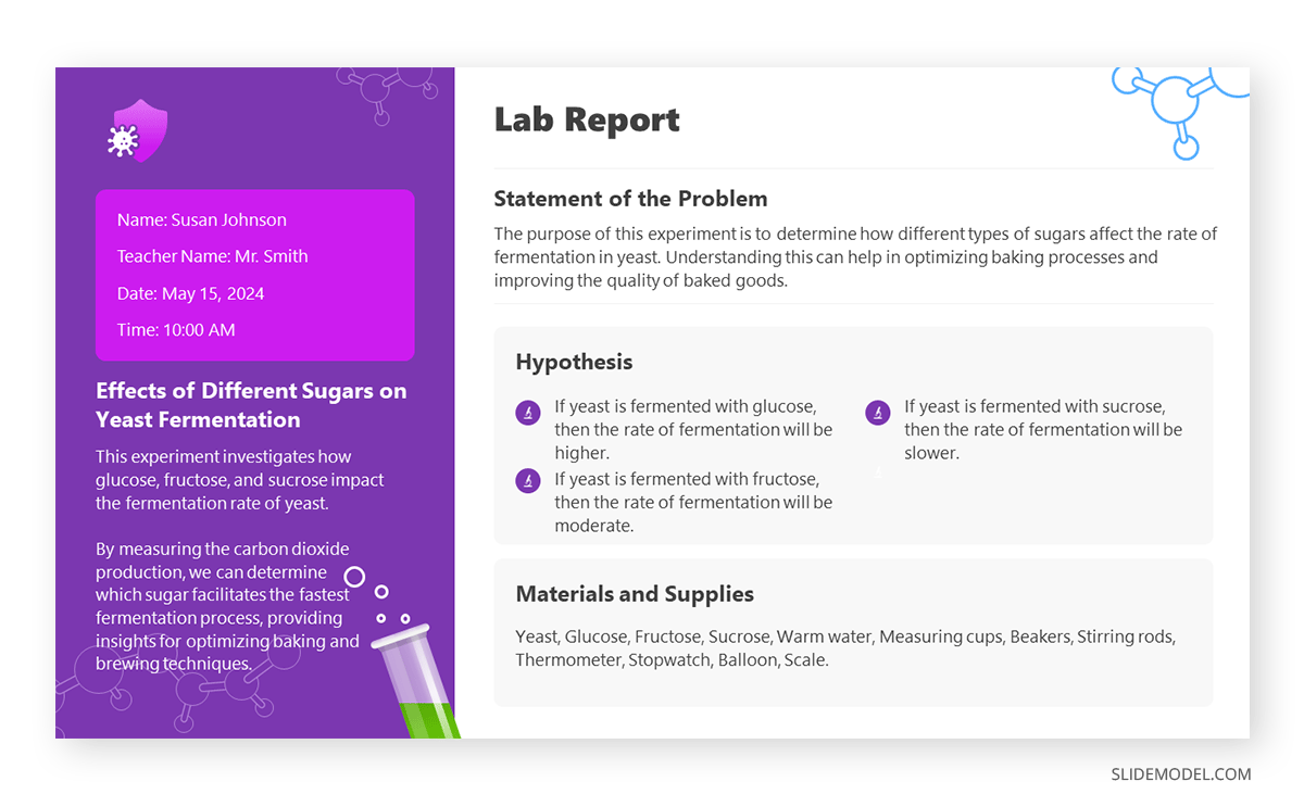
To build a high-quality academic report presentation, consider the following slides:
- Title Slide: Title, author’s name, institution, and date.
- Introduction Slide: Background and research question.
- Literature Review Slide: Summary of relevant research.
- Methodology Slide : Research methods and design.
- Data Slide: Key data and statistics.
- Analysis Slide: Interpretation of data.
- Results Slide: Main findings.
- Discussion Slide : Implications and significance.
- Conclusion Slide: Summary of findings and future research directions.
- References Slide: List of sources and citations.
- Q&A Slide
Avoid jargon at all costs unless specifically required by your tutor. Aiming to create an interactive presentation out of it can be a plus.
Technical report presentations detail technical data, research findings, and project updates (i.e., project status report templates ) to a specialized audience, often in fields like engineering, IT, and science. They are used in technical meetings, conferences, project updates, and during product development cycles.
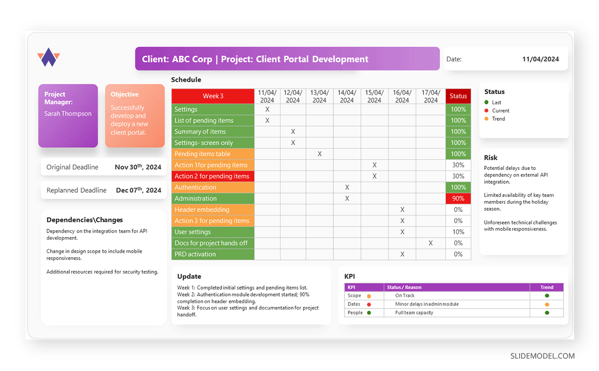
The slides a technical report presentation should include are:
- Title Slide
- Problem Statement Slide: Definition and scope of the problem.
- Objectives Slide: Goals of the technical work.
- Methodology Slide: Technical approach and procedures.
- Data Slide: Key data points and measurements.
- Analysis Slide: Interpretation of technical data.
- Results Slide: Main findings and outcomes.
- Technical Challenges Slide: Issues encountered and solutions.
- Recommendations Slide: Suggested actions based on findings.
- Future Work Slide: Next steps or future research.
- Conclusion Slide
Diagrams, infographics, and graphs are handy for explaining complex data. Presenters should encourage the audience to ask questions about the topic and break down the complex elements into easy-to-understand chunks of information.
Sales report presentations provide insights into sales performance, trends, and forecasts to understand market conditions and sales strategies . Presenters who are looking how to make a presentation in the sales niche can apply it for sales meetings, quarterly reviews, strategy sessions, and performance evaluations.
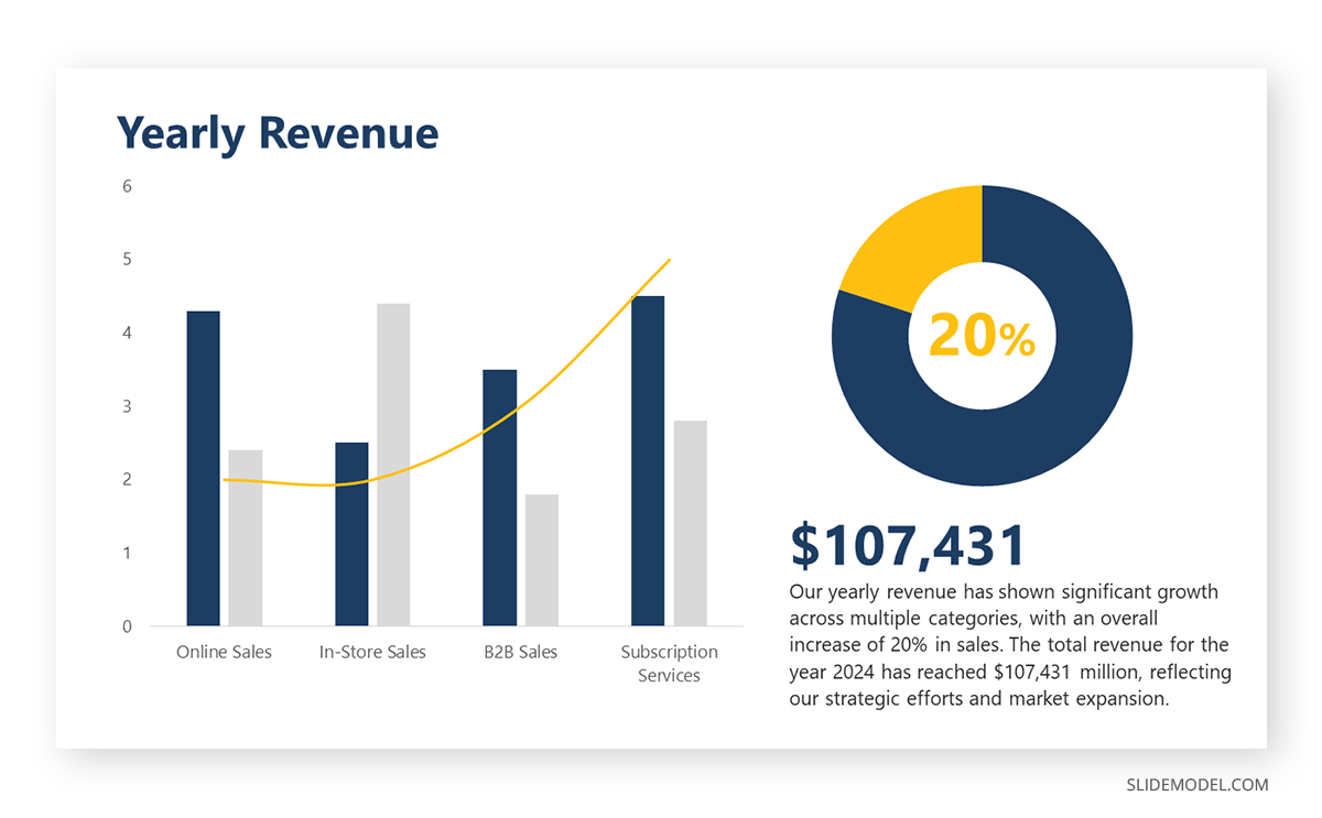
A successful sales report presentation features the following slides on its deck:
- Agenda Slide
- Sales Performance Slide: Sales figures and trends.
- Target vs Actual Slide: Comparison of targets and actual sales.
- Sales by Region/Product Slide: Breakdown of sales data.
- Sales Pipeline Slide: Status of sales leads and opportunities.
- Customer Insights Slide: Key customer trends and feedback.
- Competitor Analysis Slide: Competitive landscape.
- Strategies Slide: Current and future sales strategies.
- Recommendations Slide: Suggested improvements and actions.
As a recommendation, in our experience, it’s a good practice to include a sales dashboard slide highlighting the key sale metrics. It would be beneficial if a new sales strategy were implemented and the team wanted to extract conclusive data from it.
Marketing report presentations analyze marketing campaigns, strategies, and performance metrics to assess the impact and plan future initiatives. We can come across this kind of report and presentation in situations like marketing meetings, marketing plan presentations , campaign reviews, strategy sessions, and performance evaluations.
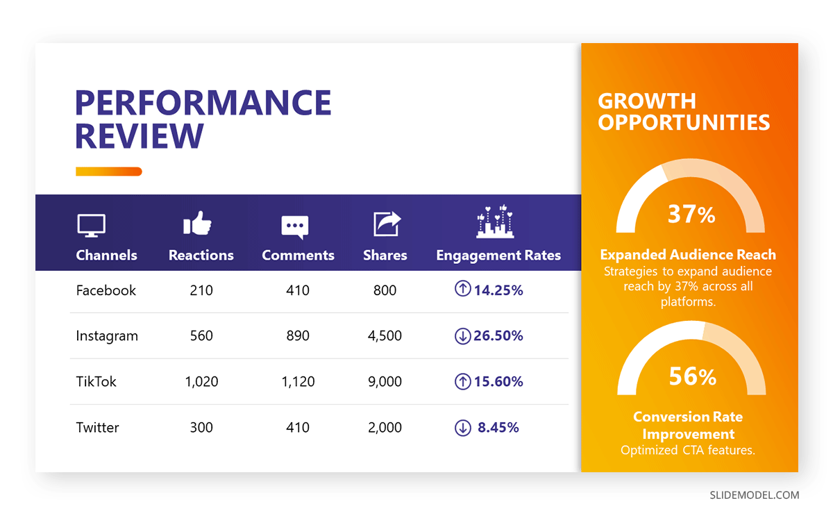
Consider to list the following slides to create an effective marketing report presentation:
- Campaign Overview Slide: Summary of marketing campaigns.
- Performance Metrics Slide: Key metrics like ROI, conversion rates, and engagement.
- Audience Insights Slide: Data on target demographics and customer behavior.
- Channel Performance Slide: Performance by marketing channel (e.g., social media, email).
- Competitor Analysis Slide: Competitive landscape and benchmarking.
- Strategies Slide: Current and future marketing strategies.
This is a type of report presentation where you should encourage audience participation due to the importance of the creativity factor in new campaigns. Use infographics to represent dense groups of data related to social media reports . Strategy presentation templates are also a good fit to enhance your report presentation slide deck.
Additionally, we include on this following link a Free Social Media Report PowerPoint template for users to create professional-looking slides in seconds.
Project report presentations detail project progress, challenges, and outcomes, providing updates to stakeholders and ensuring alignment with goals. Typical use cases of these report presentations are project meetings, status updates, and post-project reviews.
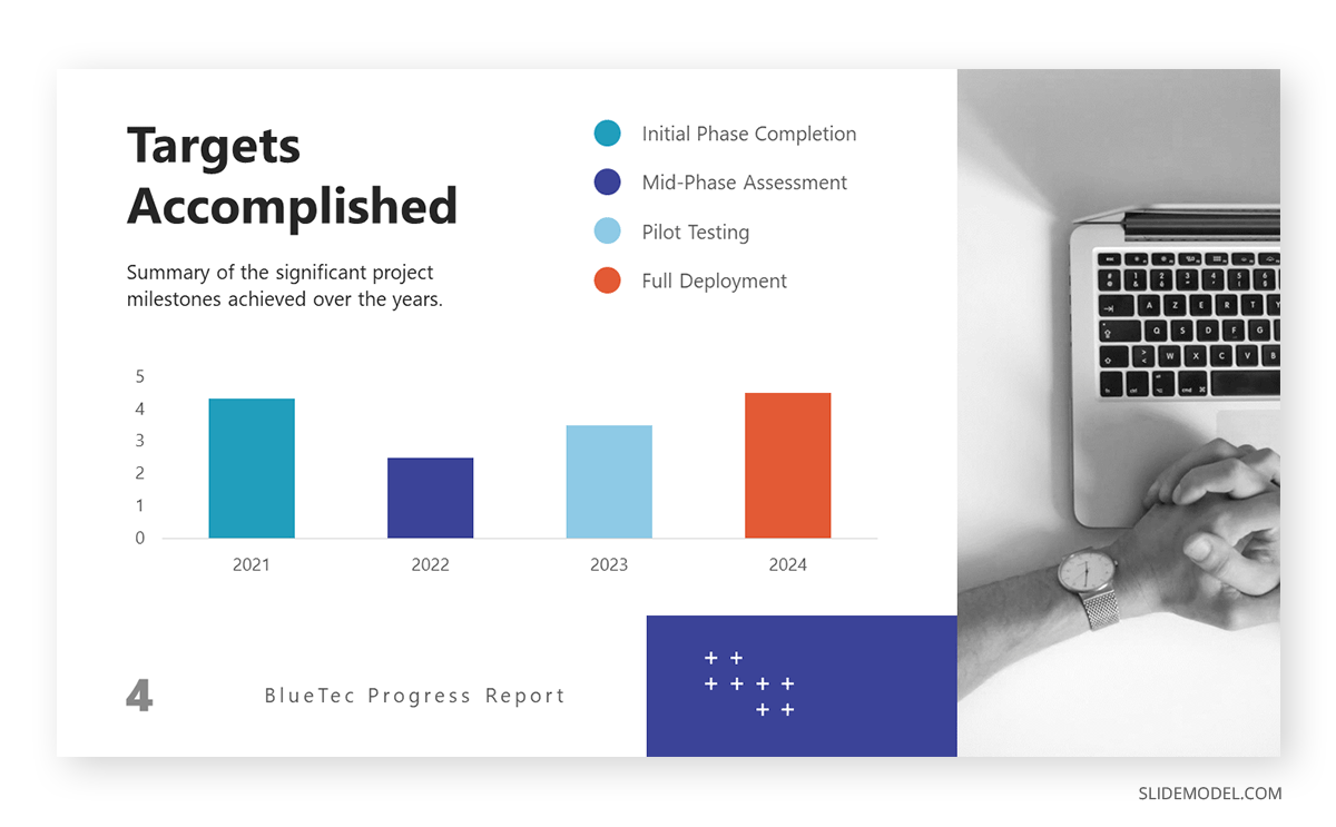
To create a slide deck for project report presentations, consider to include these slides:
- Title Slide: Title, presenter’s name, date, and project name.
- Project Overview Slide: Summary of project goals and scope.
- Timeline Slide: Key milestones and project schedule.
- Progress Slide: Status of project phases and tasks.
- Challenges Slide: Issues encountered and mitigation strategies.
- Budget Slide: Financial status and budget adherence.
- Risk Management Slide: Identified risks and their management.
- Next Steps Slide: Upcoming tasks and milestones.
Gantt charts , progress bars , and budget graphs are excellent presentation tools for showcasing key information in project presentations . Be sure to include the exact dates for project updates.
Non-profit and NGO report presentations highlight the organization’s activities, achievements, and financial status, communicating with donors, volunteers, and the public. They are a key element of transparency in relationships with the public and donors, and they are used in board meetings, fundraising events, annual reviews, and community outreach.
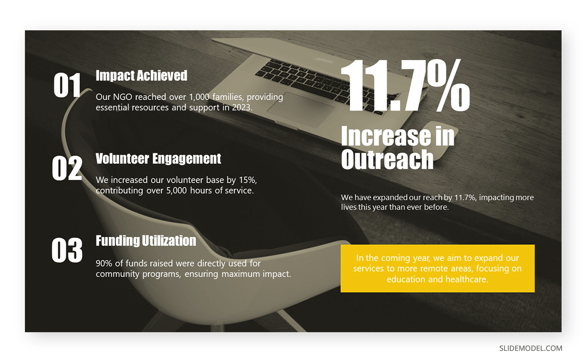
To create this kind of report presentation, we need to include these slides:
- Mission Slide: Organization’s mission and goals.
- Activities Slide: Summary of recent activities and programs.
- Impact Slide: Data on the impact and outcomes of programs.
- Financial Overview Slide: Income, expenses, and budget status.
- Donor Recognition Slide: Acknowledgment of key donors and supporters.
- Challenges Slide: Issues faced and solutions implemented.
- Future Plans Slide: Upcoming projects and initiatives.
Harness the power of storytelling . Include success stories, impact charts, infographics, and program photos. Highlight the outcomes and benefits this organization has brought to its target community. Annual Report PowerPoint templates can speed up the design creation phase of your report presentation.
Healthcare report presentations provide data on patient outcomes, research findings, and healthcare initiatives aimed at improving medical practices and policies. They are used in medical conferences, healthcare meetings, research symposiums, and policy briefings.
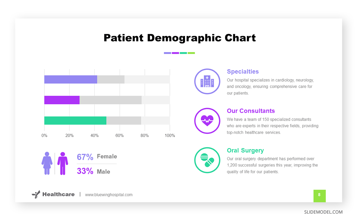
The slides we must count on for building an effective healthcare report presentation are:
- Background Slide: Context and objectives of the report.
- Methodology Slide: Research methods and data collection.
- Data Slide: Key statistics and findings.
- Analysis Slide: Interpretation of data and implications.
- Recommendations Slide: Suggested actions or policy changes.
- Future Research Slide: Areas for further investigation.
If you need to share a patient’s data concerning a newly developed technique or as findings from research, be sure you are authorized to disclose that information.
Finally, environmental report presentations focus on environmental research, sustainability projects, and ecological impact assessments to inform stakeholders and promote environmental protection. We can attend these kinds of presentations at ecological conferences, policy briefings, project reviews, and community meetings.
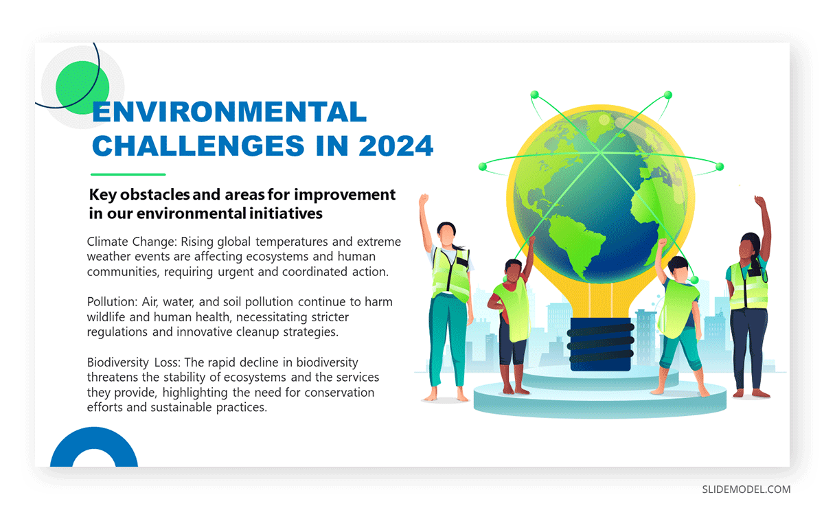
Include the following slides in your deck to create an outstanding environmental report presentation:
- Impact Slide: Environmental impact and sustainability metrics.
- Recommendations Slide: Suggested actions and policy changes.
Video presentations are ideal for adding an extra emotional factor and connecting with the audience about the importance of environmental causes, and they are also applicable to any kind of consulting report . Another key approach is to include testimonials from well-accredited sources or individuals affected by the environmental factor.
If you need a quick method to create a report presentation, check out our AI presentation maker . A tool in which you add the topic, curate the outline, select a design, and let AI do the work for you.
- Do start with a clear objective.
- Do use visuals to support your message.
- Do practice how to start your presentation .
- Do engage with your audience by asking questions and inviting feedback.
- Do end your presentation with powerful graphics
- Don’t overload slides with text.
- Don’t ignore your audience’s needs and interests.
- Don’t rush through the presentation.
- Don’t rely solely on the slides; use them to complement your speech.
How long should a report presentation be?
The length depends on the context and audience, but 15-30 minutes is a standard time for most report presentations.
What tools can I use to create a report presentation?
Common tools include PowerPoint, Google Slides templates , and Keynote. Specialized data visualization tools like Tableau can also be useful.
How can I make my report presentation more engaging?
Use storytelling techniques, interactive elements, and visual aids to engage your audience .
Should I distribute copies of the report?
It’s often a good idea to provide copies or a summary handout for the audience to follow along and refer to after the presentation.
In this section, you can find a list of curated report presentation slides to make your work easier. You can work with any of these designs or opt to use the ones presented above.
1. Expense Report Presentation Slide
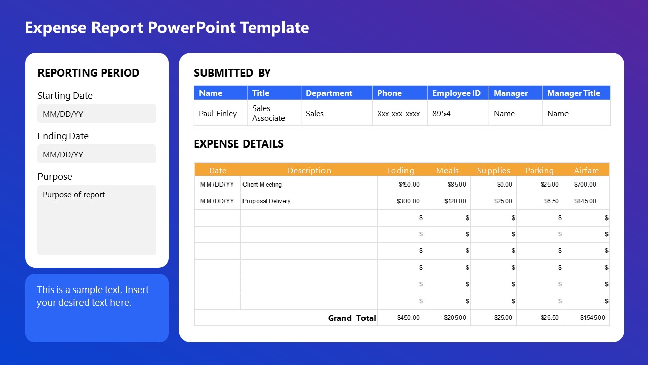
This Expense Report PowerPoint Template is perfect for detailed financial presentations. Easily document and display expenses, including lodging, meals, supplies, parking, and airfare, with clear sections for reporting periods, submission details, and expense descriptions. Ideal for corporate reporting, budget reviews, and financial audits, ensuring organized and professional presentations.
Use This Template

2. Business Progress Report Slides for PowerPoint
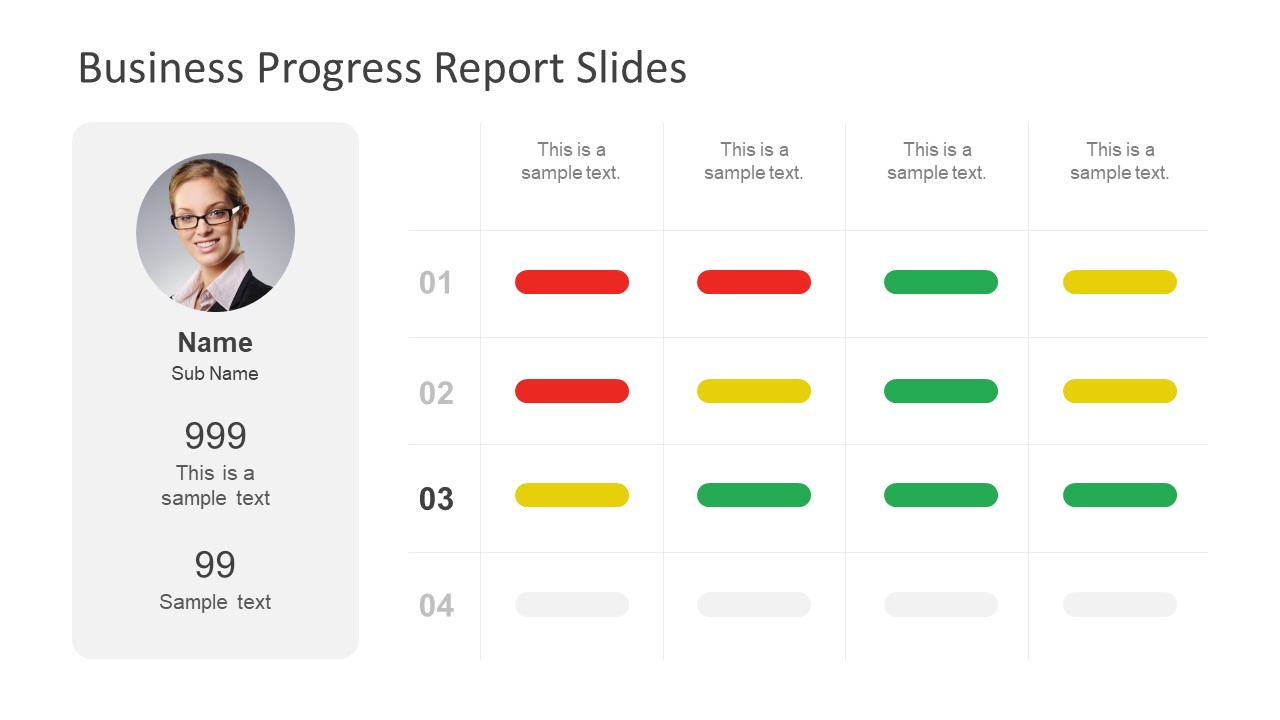
This Business Progress Report Template is designed to track project milestones and performance metrics. Listing a profile section for team members and a color-coded progress indicator allows for clear visualization of project status. It is ideal for team meetings, stakeholder updates, and performance reviews, ensuring a concise and effective presentation.
3. Book Report Presentation Slide Deck for PowerPoint
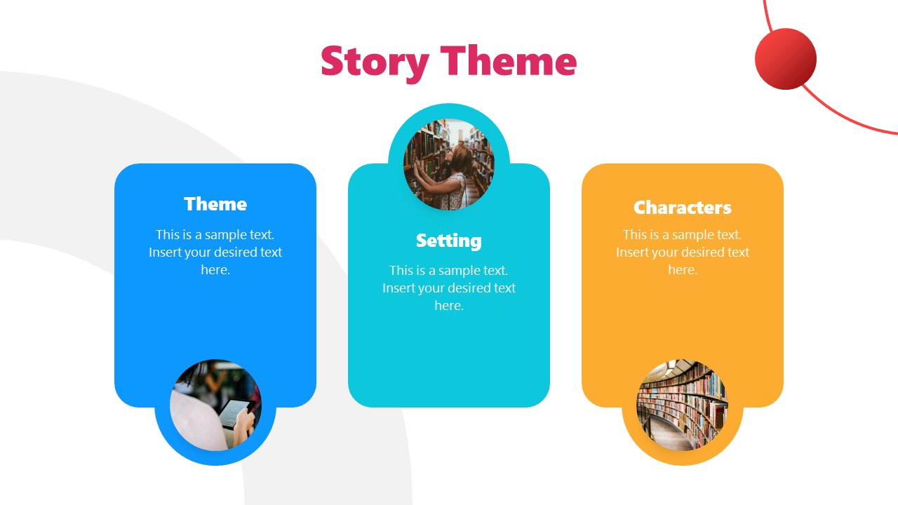
This Book Report PPT template is ideal for structuring narrative elements in presentations. We can outline a story’s theme, setting, and characters with visual aids to enhance understanding. This template is perfect for writers, educators, and marketers to convey story concepts effectively, ensuring a cohesive and engaging presentation.
4. Annual Report Template for PowerPoint
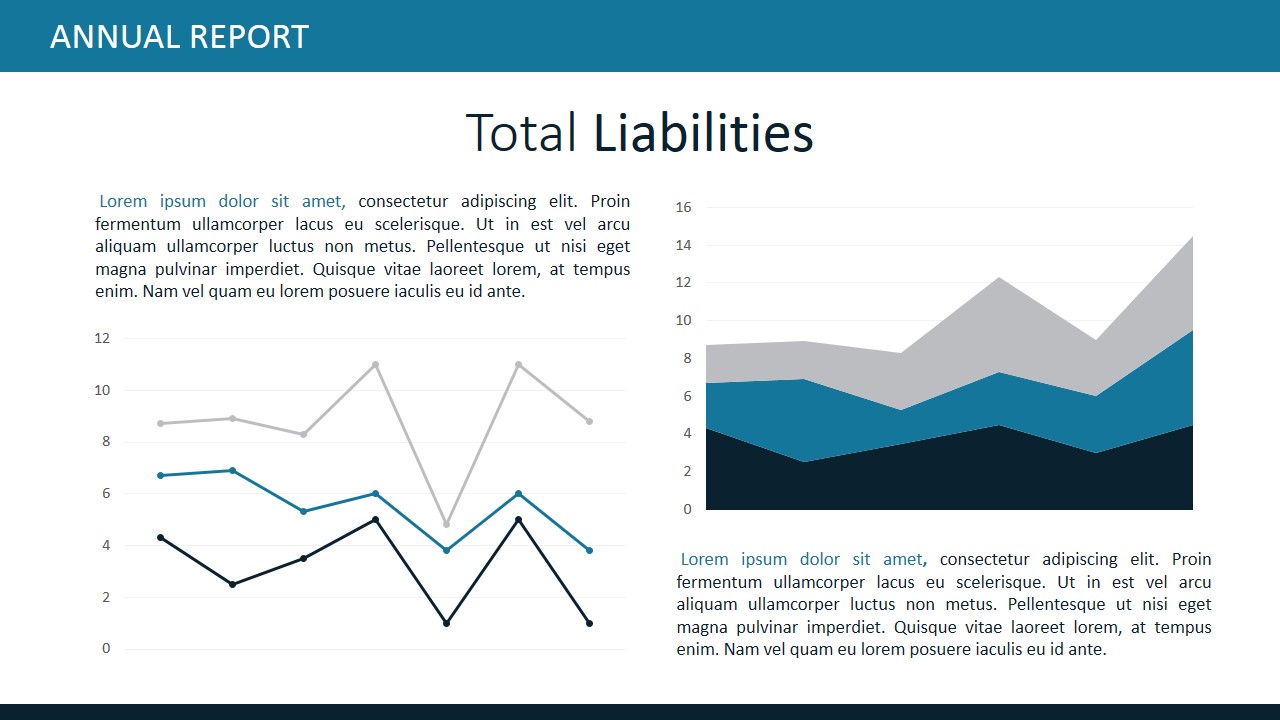
This Annual Report slide deck is designed for clear financial analysis. It features sections for detailed descriptions, bar charts, and pie charts to represent expense data visually. Perfect for financial reviews, investor presentations, and budget meetings, this template ensures a comprehensive and professional overview of total expenses, facilitating informed decision-making.
5. Business Annual Report PowerPoint Template
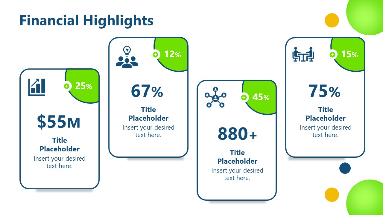
A slide deck designed to showcase key financial metrics and achievements. We include sections for displaying significant figures, percentages, and growth indicators, making it perfect for annual reports, investor meetings, and financial reviews. With clear and visually appealing graphics, this template ensures a concise and impactful presentation of financial performance highlights.
6. Financial Dashboard Report Template for PowerPoint
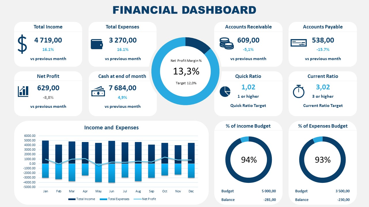
Accurately represent financial information that’s critical for your organization by implementing this PPT report template. It is a data-driven layout containing different boxes to showcase KPIs; managers and team leaders can use this template to align organizational efforts toward a strategic goal.
Like this article? Please share
Consumer Reports, Design, Executive Reports, Financial Report Filed under Business
Related Articles

Filed under Google Slides Tutorials • September 30th, 2024
How to Draw on Google Slides
Learn how to make drawings or hand-drawn annotations in your presentations by mastering drawing on Google Slides.
Filed under PowerPoint Tutorials • September 17th, 2024
How to Work with Slide Master in PowerPoint
Create design changes across your slide deck by learning how to work with Slide Master in PowerPoint.

Filed under Google Slides Tutorials • September 13th, 2024
How to Wrap Text in Google Slides
Text and images don’t need to dispute design decisions in Google Slides. Learn how to wrap text in Google Slides with this guide.
Leave a Reply
Reporting Strategy for Multiple Audiences: 6 Tips for Getting Started

Table of contents

To see what Databox can do for you, including how it helps you track and visualize your performance data in real-time, check out our home page. Click here .
Sending the same report to everyone is a rookie move. Instead, you need to cater your report to the things that each key stakeholder cares about.
A great reporting strategy builds trust among internal teams, board members and investors and answers the following:
- Who are the key stakeholders that need to read this report?
- What’s the story you are telling with this report?
- What data do you need to include?
- What format conveys the narrative best (i.e. dashboard, deck, spreadsheet, etc?)
- When and how often should you send out your report?
In this post, we’re sharing the top tips to help you create a bulletproof reporting strategy, including:
- Get buy-in from all key stakeholders
- Make your reports interactive
- Keep it simple
- Alter your report format based on your audience
- Adjust your tone and language you use for different audiences
1. Get Buy-In From All Key Stakeholders
This all starts by making sure that everyone is aligned on your company’s mission, vision, and north star metrics.
“In my opinion, It is impossible to create strategic alignment among multiple stakeholders if external and internal communications departments do not operate together as a team,” says Edward Mellett of Wikijob.uk . “Furthermore, just 14% of employees are aware of their company’s strategy and goals. Employees can do a better job attaining their goals and understanding the broader business plan if internal communications perform a good job telling them about what external communications departments are working on.”
Then, work with each key stakeholder (or group of stakeholders) to identify the specific metrics and data they care the most about. After all, if you are reporting to multiple in-house management teams , how you present the report will (and should) look different than the report you deliver to investors and board members or the report an agency delivers to the client’s senior management team.
Eden Cheng of PeopleFinderFree adds, “During internal communication with the employees, information flow might go upwards, downwards, diagonally, and horizontally within the company structure. On the other hand, during an external communication with the external audience, such as clients, the information exchange could go outside the company and remain within it. In brief, the best way to organize reporting to internal and external audiences is by two-communication method, transparent communication, consistency, emailing and newsletters, website content creation and target them, and social media.
Responding in a timely manner while reporting to different internal and external audiences is my approach for the best outcome. Let it be my internal employees or external vendors, I report to them once a week and make faster communication without fail.”
2. Make Your Reports Interactive
63.4% of our survey respondents use a centralized dashboard(s) as part of their reporting strategy. Also, live dashboards are one of the most popular report formats, according to Databox’s study about business reporting . And there is a great reason for that. A well-designed dashboard is interactive and easy for a busy person to see what’s happening in a matter of minutes.
“Reports for multiple audiences are often most useful when created with interaction in mind,” says Lee Wilson of Vertical Leap. “This enables the layering of information, and more importantly the visualization of the data in more meaningful ways.
It’s necessary to lead the reports with impactful narrative, to make sure the salient messages are being reviewed by the right people. The use of summary and conclusion screens and dashboards can help theme the report and reinforce the key takeaways.”
PRO TIP: How Well Are Your Marketing KPIs Performing?
Like most marketers and marketing managers, you want to know how well your efforts are translating into results each month. How much traffic and new contact conversions do you get? How many new contacts do you get from organic sessions? How are your email campaigns performing? How well are your landing pages converting? You might have to scramble to put all of this together in a single report, but now you can have it all at your fingertips in a single Databox dashboard.
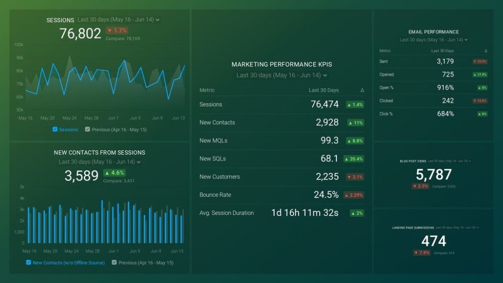
Our Marketing Overview Dashboard includes data from Google Analytics 4 and HubSpot Marketing with key performance metrics like:
- Sessions . The number of sessions can tell you how many times people are returning to your website. Obviously, the higher the better.
- New Contacts from Sessions . How well is your campaign driving new contacts and customers?
- Marketing Performance KPIs . Tracking the number of MQLs, SQLs, New Contacts and similar will help you identify how your marketing efforts contribute to sales.
- Email Performance . Measure the success of your email campaigns from HubSpot. Keep an eye on your most important email marketing metrics such as number of sent emails, number of opened emails, open rate, email click-through rate, and more.
- Blog Posts and Landing Pages . How many people have viewed your blog recently? How well are your landing pages performing?
Now you can benefit from the experience of our Google Analytics and HubSpot Marketing experts, who have put together a plug-and-play Databox template that contains all the essential metrics for monitoring your leads. It’s simple to implement and start using as a standalone dashboard or in marketing reports, and best of all, it’s free!
You can easily set it up in just a few clicks – no coding required.
To set up the dashboard, follow these 3 simple steps:
Step 1: Get the template
Step 2: Connect your HubSpot and Google Analytics 4 accounts with Databox.
Step 3: Watch your dashboard populate in seconds.
3. Keep It Simple
Another reason why centralized dashboards work well is that it makes it easy to distill the data simply. If you are like most of the companies we surveyed, you have a lot of different reports from analytics, website marketing, and sales to paid ads, accounting, and more.
Good marketing reporting software that empowers well-designed dashboards, helps you present the most important business metrics in an easy-to-digest format.
For example, Dan Belcher of Mortgage Relief says, “A company generates a large number of reports. Internal and external users browse some reports to learn more about the business. In a firm, we are generally transparent to information such as profitability and stability. So, isn’t it vital to write a report that everyone understands?
As a business owner, I can say that when developing a report for multiple users, remember to emphasize understandability features. Keep it clear and avoid jargon phrases in your report so that everyone understands it.
When it comes to writing reports, I always go for “simplicity.” It’s well worth reading because it’s simple but full of depth. Filter the report’s data as well. Ensure that the report benefits or teaches everyone in the audience, not just a select few. Always strive for general understanding.”
4. Alter Your Report Format Based on Your Audience
Just like you adjust your sales and marketing messaging based on different personas, the same philosophy can be applied to your report messaging and formatting.
“Always pay attention to whom you’re reporting to,” says Andre Oentoro of Milkwhale. “If you are reporting to an internal audience, focus on providing as many details as you can. Whereas for external audiences, try to keep your reports short and sweet to prevent confusion and increase efficiency.”
Related : Internal vs. External Reporting: What Are the Differences?
Jordan Brannon of Coalition Technologies agrees, “Client-facing and internal reports differ in that client-facing reports are more geared towards addressing metrics or KPIs that clients care about (e.g., conversions, ROI, etc.). Those metrics are also important to us internally, but our internal reports are mostly focused on technical, actionable aspects that clients may not need to know.
Internal reports are also mostly focused on historical data and involve examining details in minutiae, especially when it comes to troubleshooting.
Moreover, reports for clients include explanations for technical jargon or issues that they may not be familiar with. We also reiterate data-driven strategies that we have created and implemented for them and show how effective they are.
Finally, we include conclusions and recommendations that are backed up by the data.”
Brandon Schroth, Nomad SEO adds, “When organizing reports for an internal audience, it’s important to keep in mind that the purpose of the data is to make decisions within the organization. It should include what was done, what problems or goals were addressed, results, and conclusions/recommendations.
When organizing reports for external audiences the data is focused on their specific needs and goals. You need to deliver information that highlights the purpose of the report and key takeaways.
If possible, avoid overly technical terms and instead use concise, engaging language. The report should be organized in an aesthetically pleasing way that directs the reader to the information that you’d like to stand out.”
For example, Janice Wald of Mostly Blogging says, “Internally, we share our income reports and set new growth goals. Externally, we share our metrics with prospective clients. These metrics include web traffic, Domain Authority, Domain Rating, and Alexa Rank. We share the number on our email list and our number of social media followers. We also share the awards we’ve won depending on the potential client. We might also share testimonials from happy clients.”
5. Adjust the Tone and the Language You Use for Different Audiences
It is not just the format and metrics you include, but also the language you use in each report.
“It’s crucial to adjust your reporting’s language and structure to the audience you’re speaking to,” says Dorota Lysienia of LiveCareer . “You will use a different approach for your team that knows the details of the project and is familiar with the methods and tools you’re working with. In that case, you can go deeper in your analysis and prepare reports that can benefit other team members.
However, such a level of analysis might be unnecessary for upper management. Here, you should explain the general picture of your performance and get other managers on board when discussing your future ideas. For that audience, it’s more important WHY you do certain things than HOW exactly you achieve them. “
For example, Michael Sena of Senacea adds, “A hands-on Operations Director may require real-time data presented in a way that helps them act quickly. At the same time, investors may prefer a high-level summary that shows quarterly trends with optional drill-down to more granular cases.”
6. Be Concise
Regardless of who you are presenting to, it is always a good idea to keep it as short as possible. The shorter the report is, the more likely someone will read it.
“The shortest good thing is twice as good,” says Natalia Brzezińska of Photo AiD. “If you can tell something in 50 pages, don’t tell it in 250. You don’t want to cram all your rhetoric into your report. And take it for granted that if you have produced a fantastic 400-page report, you may have already included the formula for eternal youth, which no one will read.
Related : Business Report: What is it & How to Write a Great One? (With Examples)
If the message is dense and confusing, the reader will give up, so keep it short, direct, clear, and easy to understand.
And if you want to be read by senior management, remember that you only have five minutes.
You need something simple, visual, and straightforward, where it is clear what your document brings to the table that was not previously known.
A picture is worth a thousand words. A report that you open and everywhere is text, more text, and only text will be much more tedious than one in which there is graphic material.
Be original and creative. Use photos, diagrams, data presentations, illustrative tables, diagrams, etc. But don’t overdo it. It’s a support, not a contest. Graphics and images are not only an aesthetic resource but also great cognitive support. They help visualize the ideas you want to show and make the document more attractive, easier to understand, and inviting your audience to read on.”
To sum it up, the best reporting strategy is simple, concise, and interactive. The best reports are also not one-size-fits-all documents. They take into consideration the specific metrics that each stakeholder(s) cares about.
Want to up-level your reporting strategy in minutes not hours? With more than 70 integrations, you can create reporting dashboards with Databox for free .
- Databox Benchmarks
- Future Value Calculator
- ROI Calculator
- Return On Ads Calculator
- Percentage Growth Rate Calculator
- Report Automation
- Client Reporting
- What is a KPI?
- Google Sheets KPIs
- Sales Analysis Report
- Shopify Reports
- Data Analysis Report
- Google Sheets Dashboard
- Best Dashboard Examples
- Analysing Data
- Marketing Agency KPIs
- Automate Agency Google Ads Report
- Marketing Research Report
- Social Media Dashboard Examples
- Ecom Dashboard Examples

Does Your Performance Stack Up?
Are you maximizing your business potential? Stop guessing and start comparing with companies like yours.

A Message From Our CEO
At Databox, we’re obsessed with helping companies more easily monitor, analyze, and report their results. Whether it’s the resources we put into building and maintaining integrations with 100+ popular marketing tools, enabling customizability of charts, dashboards, and reports, or building functionality to make analysis, benchmarking, and forecasting easier, we’re constantly trying to find ways to help our customers save time and deliver better results.
Do you want an All-in-One Analytics Platform?
Hey, we’re Databox. Our mission is to help businesses save time and grow faster. Click here to see our platform in action.
Jessica Malnik is a content strategist and copywriter for SaaS and productized service businesses. Her writing has appeared on The Next Web, Social Media Examiner, SEMRush, CMX, Help Scout, Convince & Convert, and many other sites.
Get practical strategies that drive consistent growth
8 Client Reporting Best Practices for Agencies and Consultants (with Examples)

Streamlining Sales Processes with HubSpot and Databox

Marketing Reporting: The KPIs, Reports, & Dashboard Templates You Need to Get Started

Build your first dashboard in 5 minutes or less
Latest from our blog
- How Companies Use HubSpot to Drive Growth and Value [Insights from 160+ Teams] November 8, 2024
- Top 15 Social Media Analytics Tools for 2025 October 31, 2024
- Metrics & KPIs
- vs. Tableau
- vs. Looker Studio
- vs. Klipfolio
- vs. Power BI
- vs. Whatagraph
- vs. AgencyAnalytics
- vs. DashThis
- Product & Engineering
- Inside Databox
- Terms of Service
- Privacy Policy
- Talent Resources
- We're Hiring!
- Help Center
- API Documentation

November Special: Business Transformation PPT Templates
7 Visual Frameworks for Strategy Analysis Presentation
- June 13, 2017
- Management , Strategy Management
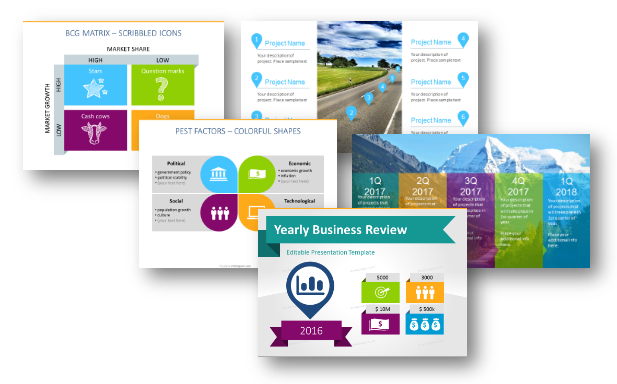
There are dozens of frameworks you can use for strategy analysis, from the classical SWOT model to the BCG matrix. The question is which one to choose and how to illustrate the strategy engagingly and understandably for your audience. As usual, the simplest way is the best 🙂
Transform your business presentations with our expert resources. Discover more on our business performance presentations webpage.
Frameworks for Strategy Analysis and Planning
Below is the list of key tools used for strategic management. Starting with techniques for analyzing the current business situation and market opportunities and finishing with methods for planning the next company moves:
- SWOT analysis
- Porter’s Five Forces
- Business Review
- PEST and PESTEL analysis
- SMART goals
- Roadmaps for strategy planning
Choose the strategy model that fits your market and situation. We used those models in our business, however, we are not management consultants ourselves. But as presentation designers, we can advise you on how to present the selected model using simple diagrams .
Check out those books for entrepreneurs and managers , they will help you define the strategy you need and the tools to use.
In this article, you will find various ways to show and illustrate these strategy frameworks.
1. Business Review – visual summarizing KPIs and results
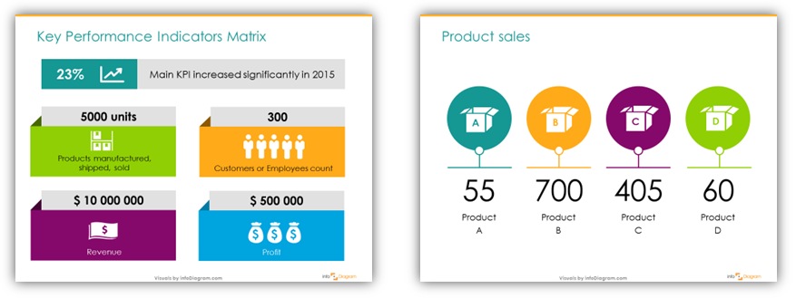
Have you ever thought that financial data can be interesting and not boring? 🙂 There is a way to make financial results more interesting, show sales, production, accounting data, and other KPIs in eye-catching visual form. What is more, the solution is simple: just add a few simple shapes and change plain numbers to colorful, simple infographics. Example of business review visual slides
If you want to find more inspiration on making similar diagrams, check this blog article “ How to Make Attractive Annual Company Review “.
2. SWOT Analysis – diagrams for understanding strong and weak points
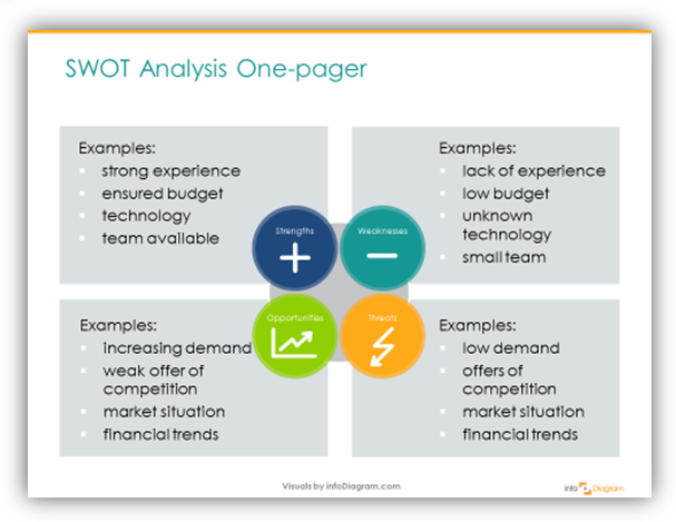
A SWOT analysis is a useful tool for brainstorming and strategic planning. You’ll get more value from a SWOT analysis if you conduct it with a specific objective or question in mind. The crucial step is to move away from usually busy SWOT findings notes to clean and eye-catchy slides presenting all SWOT areas. Illustration of SWOT one-pager
Do you need to add more details to your SWOT presentation? Reuse the same graphics. A slide costs you nothing so don’t be afraid to split busy slides into several ones. You can assign a color and symbol to each of the 4 SWOT areas to identify them in your presentation.
For more inspiration on using SWOT check this article with examples of how to grab attention to all issues of SWOT presentation. If you prefer conducting your SWOT analysis online, there are also a bunch of mobile and cloud apps for personal or company SWOT as well.
3. PEST Analysis – testing your external environment
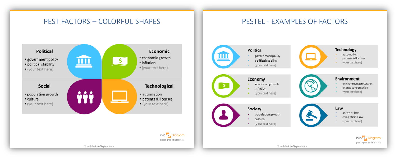
PEST analysis is commonly used in strategic and marketing planning or product development. If you are looking for more PEST visualizations, read our article on How to create a great PEST slide or presentation.
4. Porter’s Five Forces – a framework for identifying a company’s environment
Porter’s Five Forces is a simple but powerful tool for understanding where power lies in a business situation. This model helps you understand both the strength of your current competitive position and the strength of a position you’re considering moving into.
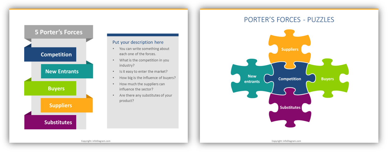
Here are some ideas on how to present Porter’s 5 forces creatively . You may also search for a more detailed explanation of how to analyze the competitive environment in this article.
5. BCG Matrix – identifying customer segments
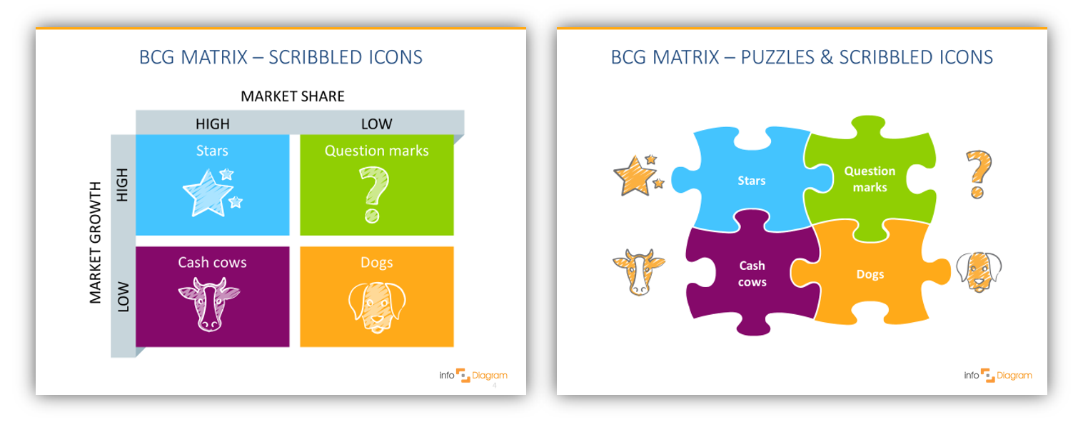
BCG matrix is designed to help a business consider growth opportunities by reviewing its portfolio of products to decide where to invest, discontinue, or develop products. More ideas on how to present the BCG matrix.
6. SMART Goals – ensuring your objectives are clear and reachable
To set effective goals, use the S.M.A.R.T. method of defining them. If you present the goals in nice eye-catching ways, you can reach better engagement by your audience. Design templates of SMART goals benchmark tables
If you write your plans and targets in text only, people will not be eager to read and remind them often. On the other side, if you present them in a clear aesthetic way, people will remember them longer (we wrote more about it in this blog How to make SMART goals visually engaging).
7. Roadmaps – presenting a long-term vision
A well-designed strategic roadmap is like a GPS for your business . It’s one of the best tools to lift the fog and make your vision clear for everyone on the team.
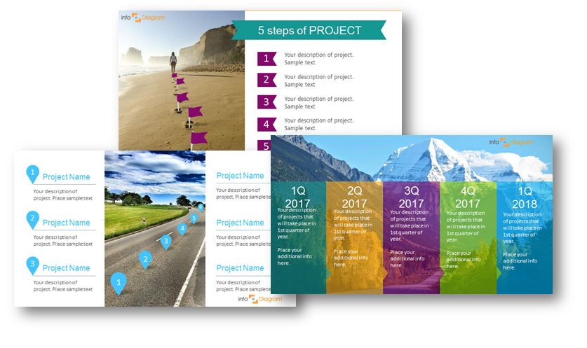
Roadmap slide deck illustration for project planning
I recommend using those five steps (Forbes article) to create an effective long-term or short-term strategy:
- Check where you are
- Prioritize what’s important
- What to achieve
- Who will do it, who’s accountable
Once you have it, it’s time to pack it into a nice engaging presentation design. See the blog Three Creative Ways to Do a Roadmap slide .
Whatever your planning level and context are, the visual roadmap can be one of the best weapons in your communication arsenal.
Those are seven essential tools for strategic planning and implementation. Check specific framework graphics in the infoDiagram business diagrams collection to find what you need.
You may want to create your own slides and use more models than we suggested. For this purpose, we recently created an infographics do-it-yourself collection: Flat Infographic Presentation Templates.
For more inspiration, subscribe to our YouTube channel:
Explore our blog to get ideas for Strategic Planning Presentations.
Conclusion – Make Your Strategy Visual
As you can see, all those strategy tools can be pretty easily visualized. Even if using plain simple PowerPoint shapes – 4 colorful rectangles for the matrix or a wide arrow for roadmaps.
Here’s what a professional management consultancy principal told us about using such visual frameworks in her work:
“As a management consultant, it is important for me to visually display my slides in a way that not only appeals to my clients, but also sets the quality of my work apart and gives more life to my message.”
Astrid Malval-Beharry from StratMaven Operations Consulting Firm
Stay updated
Get new presentation ideas and updates sent directly to you! Plus, if you sign up for our free newsletter now, you’ll receive a Creative slide design guide for free, as well as hand-drawn shapes you can start using right now.
What tool do you use the most in the strategic analysis? Drop us a line in the comments 🙂
infoDiagram
Related posts.

Design Tips to Present Business Transformation Strategy Visually
- October 8, 2024

How to Present Balanced Scorecard Framework: PowerPoint Design Tips
- June 10, 2024
Presenting Monthly Business Report with Charts and Tables in PowerPoint
- May 26, 2024

COMMENTS
Strategy reporting refers to the process of documenting and communicating the progress and effectiveness of a company's strategic plan. This typically includes financial and operational metrics, as well as key performance indicators that measure progress toward achieving the company's strategic goals and objectives.
With so many ways to spin and distort information these days, a presentation needs to do more than simply share great ideas — it needs to support those ideas with credible data.
The presentation. This is the distinctive, structured, and clear way that strategy consultants build their slide decks. Without this, even the most powerful insights lose their force. In this guide, we show you how to do both those things.
In this article, we will guide you through the process of creating a good report presentation, from general aspects to specifics by niche, recommended PowerPoint templates to use, and which aspects you should avoid in the presentation design process.
In brief, the best way to organize reporting to internal and external audiences is by two-communication method, transparent communication, consistency, emailing and newsletters, website content creation and target them, and social media.
7 Visual Frameworks for Strategy Analysis Presentation. infoDiagram. June 13, 2017. Management, Strategy Management. There are dozens of frameworks you can use for strategy analysis, from the classical SWOT model to the BCG matrix.